My photography journey has taken me from simple selfies to photographing cityscapes and experimenting with light for portrait work. Portrait work has always held a fascination for me because these photographs convey information about the subject. It's like looking through a window revealing information about their identity. In this project I want to explore this theme further, looking at a range of photographers, each with differing styles. My aim is to use this research as my inspiration so I can produce a response which portrays identity through a range of different techniques.
The topic I have chosen to focus on is Identity and how I can capture Identity in photography. I am interested in identity due to the many ways you can show identity such as photographing people, personal possessions, buildings or even forms of art that people have created to show their identity through the art. As part of my investigation into the topic of identity I will explore many ways that I can show identity through the photographing of people and using many Photoshop techniques. A photographic technique that I will be using are playing with shadows and lights. I will use shadow and lights as in photographs are very important as they can determine what the focus is in the image and what looks dramatic. Light is important as it not only determines the brightness and darkness of an image, it also determines the tone, mood and atmosphere of the photograph. I will also be using photographers that have inspired me to investigate the topic of identity who are John Rankin Waddell, Jim Golden and David Russell.
Research from other photographers
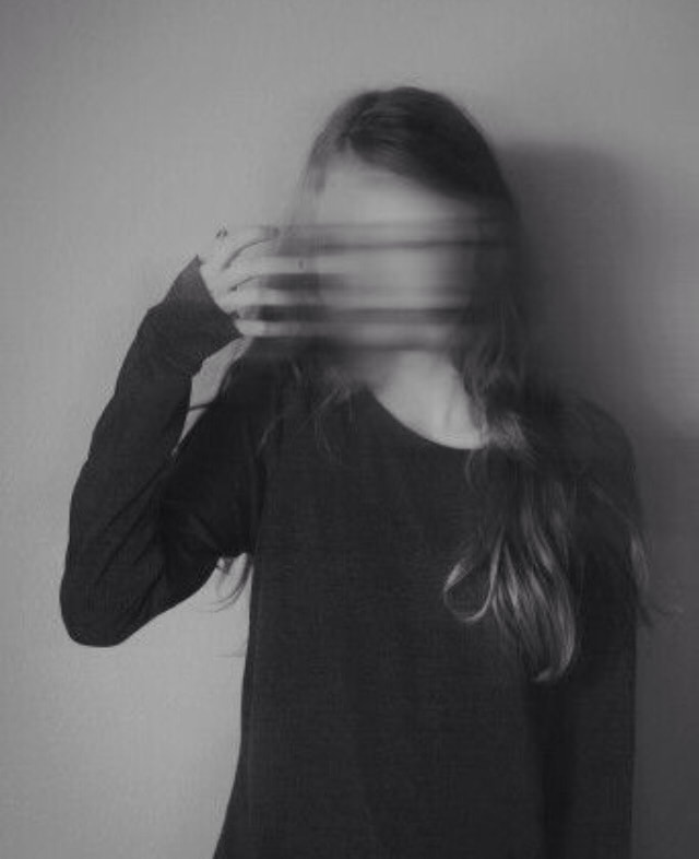
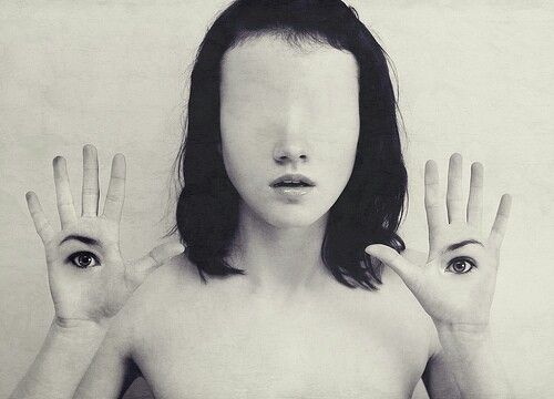
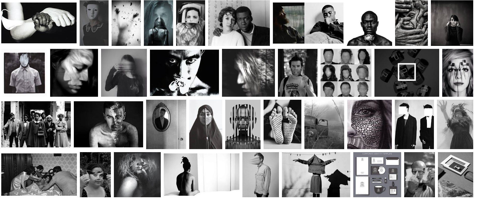
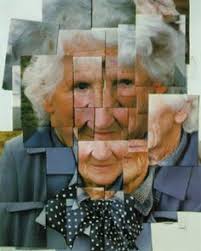
Here are images that I have found as part of my research into Costume, Identity, Disguise Photography. A lot of these images are black and white which is good because I am a fan of using black and white. Therefore I will be using this technique a lot in my work as I feel that it makes photos a lot more dramatic.
Rankin
John Rankin Waddell is a photographer is mainly focuses on portrait and fashion photography. Rankin’s work is not the normal type of portrait photography as with a lot of his work, he lets the model choose what Rankin should do with the photograph.
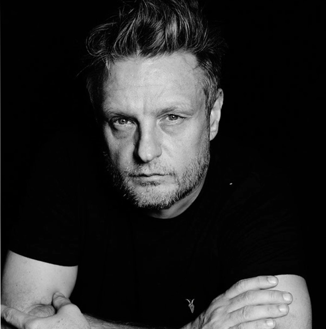
Rankin was born in Glasgow in 1966 and is an English fashion and portrait photographer. He grew up in Hertfordshire and while studying at Brighton Polytechnic, he realised that his interest lies in photography. So, he joined the Barnfield College, Luton, United Kingdom and later went to London College of Printing. Meanwhile, Rankin met Jefferson Hack and once they graduated, together they started a magazine titled Dazed & Confuse. In 1999, the two became the founder of a production company known as, Dazed Film & TV. It was the first to broadcast a mast-head television special, Renegade TV Gets Dazed. Rankin then in 2000 launched RANK, a quarterly fashion magazine. The Dazed Group also publishes Another Man, HUNGER and Another Magazine. My favourite part of Rankin’s work is his destroy project. In this destroy project, Rankin will take a photograph of the model or celebrity and then give the photograph back to the celebrity so that they can destroy the photograph themselves. This is a really good idea but the aspect that allows this idea to work is that the quality of the photograph at the start is at such a high standard that it allows the work of the celebrity to destroy it really easy. Rankin is so well known that he has been able to work with celebrities like Robert Downey Junior, Cara Delevingne, David Bowie, Jay-Z and many more. To make his work so good Rankin works a lot with the lighting of the photograph as he makes sure that he faces are bright. This allows the photograph to have shadows on a side of the face. Rankin also increases the contrast of the photograph to show the viewer the detail in the models face. I really enjoy the composition of his work and this is why I have took inspiration from him and hope to replicate some of his work from the destroy project.
Rankin was born in Glasgow in 1966 and is an English fashion and portrait photographer. He grew up in Hertfordshire and while studying at Brighton Polytechnic, he realised that his interest lies in photography. So, he joined the Barnfield College, Luton, United Kingdom and later went to London College of Printing. Meanwhile, Rankin met Jefferson Hack and once they graduated, together they started a magazine titled Dazed & Confuse. In 1999, the two became the founder of a production company known as, Dazed Film & TV. It was the first to broadcast a mast-head television special, Renegade TV Gets Dazed. Rankin then in 2000 launched RANK, a quarterly fashion magazine. The Dazed Group also publishes Another Man, HUNGER and Another Magazine. My favourite part of Rankin’s work is his destroy project. In this destroy project, Rankin will take a photograph of the model or celebrity and then give the photograph back to the celebrity so that they can destroy the photograph themselves. This is a really good idea but the aspect that allows this idea to work is that the quality of the photograph at the start is at such a high standard that it allows the work of the celebrity to destroy it really easy. Rankin is so well known that he has been able to work with celebrities like Robert Downey Junior, Cara Delevingne, David Bowie, Jay-Z and many more. To make his work so good Rankin works a lot with the lighting of the photograph as he makes sure that he faces are bright. This allows the photograph to have shadows on a side of the face. Rankin also increases the contrast of the photograph to show the viewer the detail in the models face. I really enjoy the composition of his work and this is why I have took inspiration from him and hope to replicate some of his work from the destroy project.
Research of other photographers: Rankin


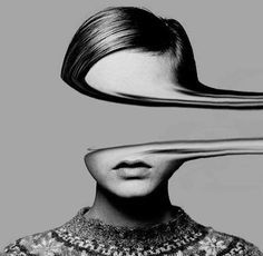
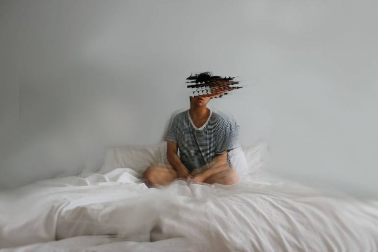
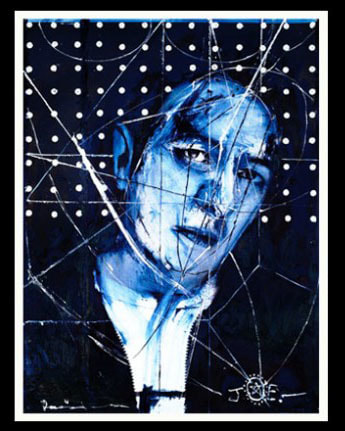
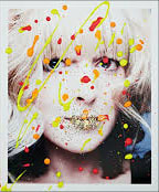
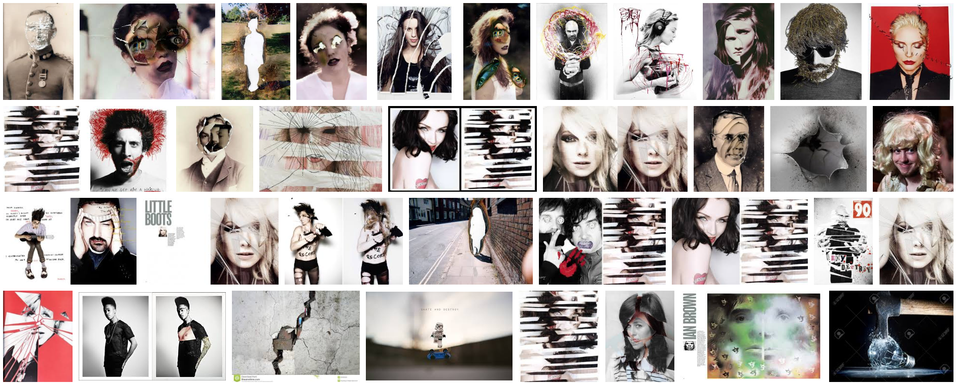
Here are a few images that I gathered when researching the Rankin Destroy project. I chose these images as I found them odd yet interesting and that I could replicate some of this work for myself to use in my own work.
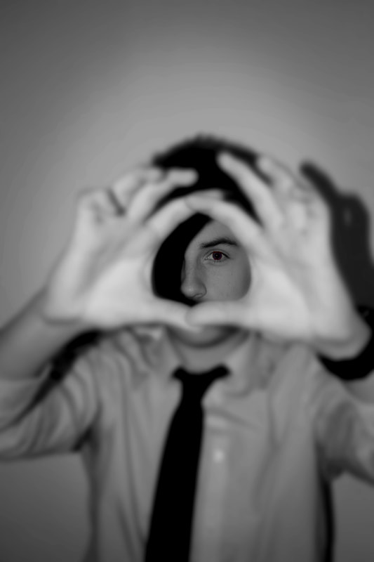
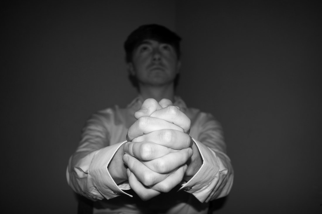
Own images
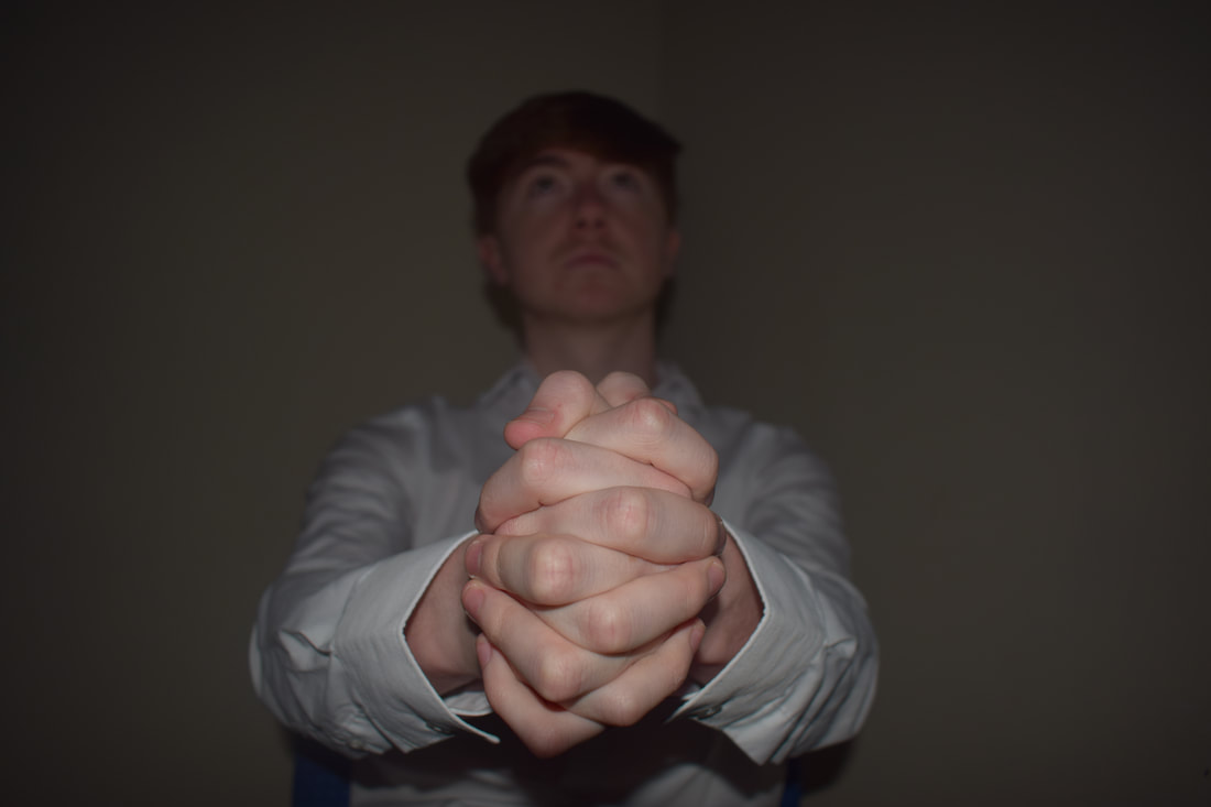
Here are my initial response images where I simply turned them black and white and maybe added something else like adding a vignette. With one I simply just turned it black and white and then inverted the colours. As this was my initial response, there is not a lot of development in the images.
Edited Work using Photoshop
This is an example where I tried to experiment with my images and I believe that this is a cool and unusual look for an image and I think that it works well.
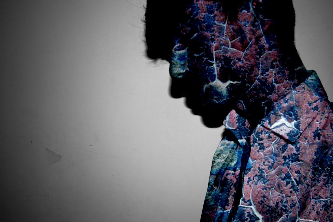
Here are two more images that where part of my initial response and here is the edited versions of them. One I simply turned black and white and masked to keep some colour in the image. The other I blended a colour texture onto the original image and then inverted it to create a weird looking effect.
Here are ore images that I turned black and white but I decided to edit these a bit more as I adjusted the levels and brightness on the images to make them look better than they originally was. In some of the images I added a vignette and some images a keep some colour to the image by using the mask tool. I believe these images are more interesting than my initial response images as with these I have the model of the images doing more interesting posing and faces.
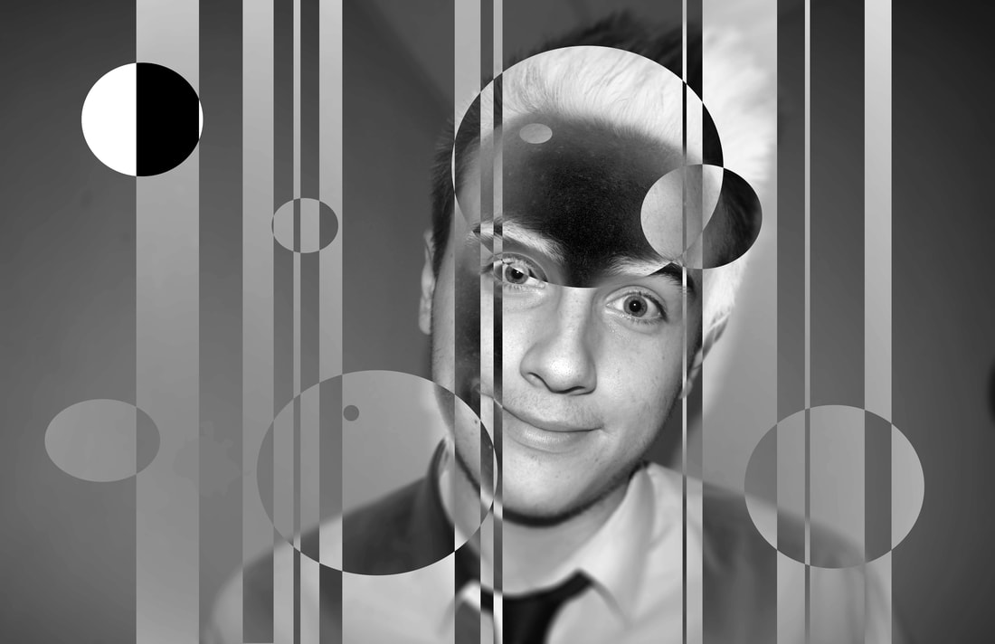
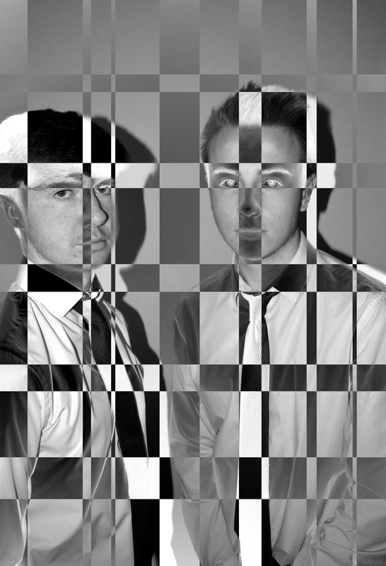
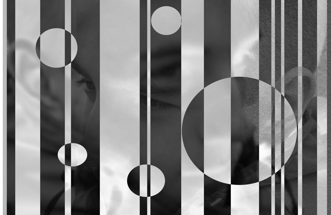
Where are two images that I decided to use the editing technique from before that I found interesting. I decided to do these in two different ways. The first image I turned black and white and then used the circle marquee tool to select different areas, I then inverted these areas. I did this again on the same image but this time I used the rectangle marquee tool. On the second image I basically used the same technique but this time I used the rectangle marquee tool twice, first I used it vertically and then horizontally.
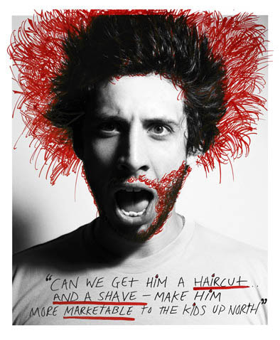
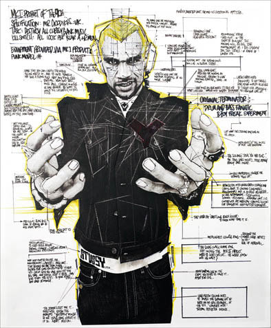
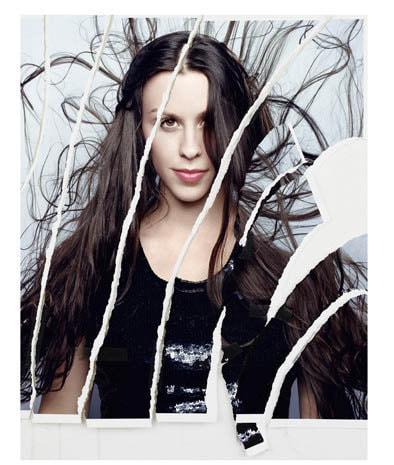
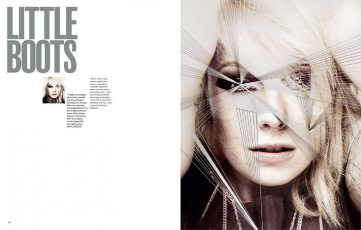
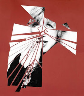
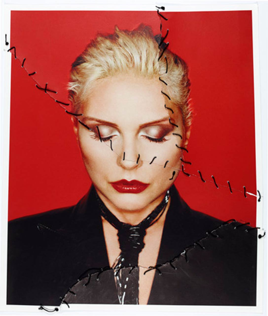
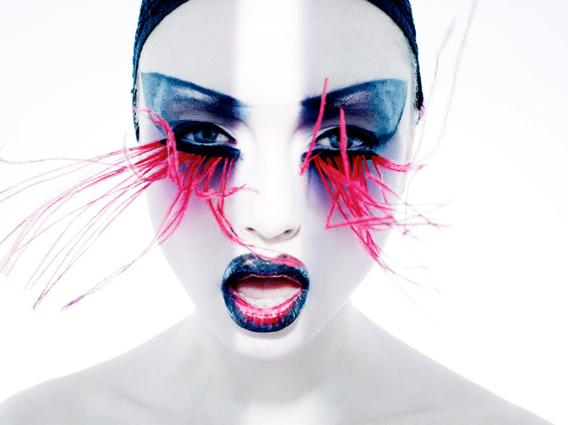
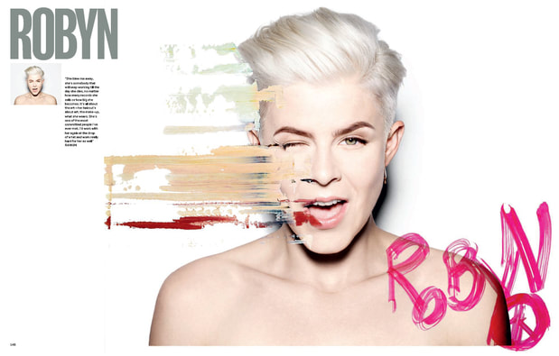
Rankin: Destroy Project
Initial research gallery
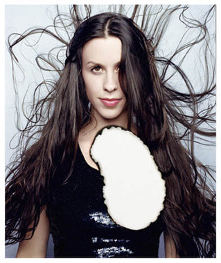
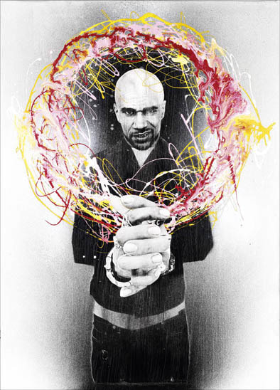
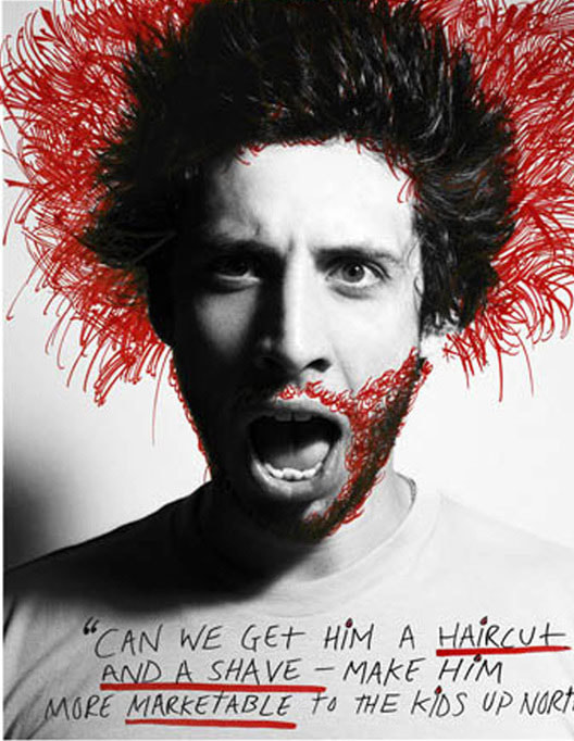
Here are images from the Rankin Destroy project that I will use to inspire my own work on this project. I will use similar techniques like drawing over the image to transform the image. There are varies different styles used here from paint splatters to cutting the image apart and rearranging it. I will try and replicate these images by using similar techniques. All of these images have an original image that is to very high standard making the destroy part of the image look even better.
Research of Rankin's Destroy Project
What I'm going to do next?
I will now take these ideas that I have came up with and take photos using these ideas. This should help with my collection of work from this project.
Initial Response -Felt tip pens
Here is my first response where I took photos of someone doing different posing and trying to recreating the styling of Rankin. tO destroy these images I used felt tip pens and I used these in different ways from outlining the person in the image to drawing symbols on the photo.
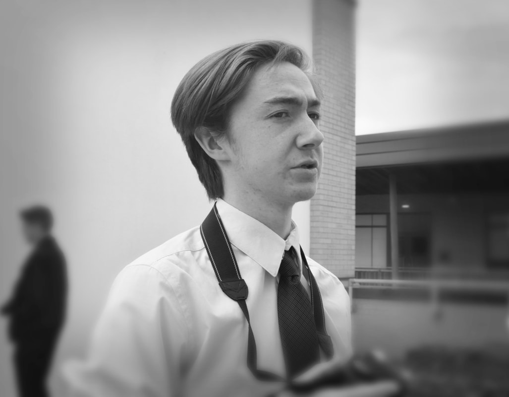
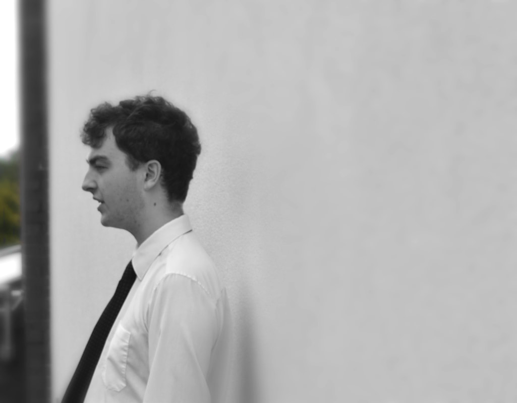
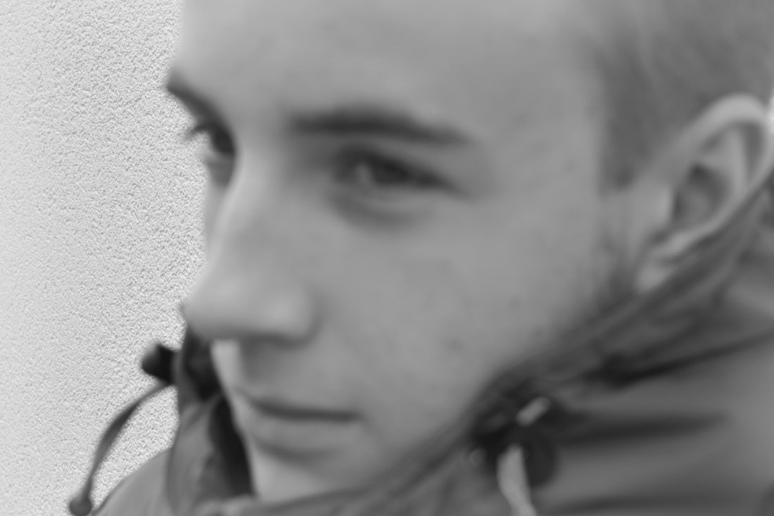
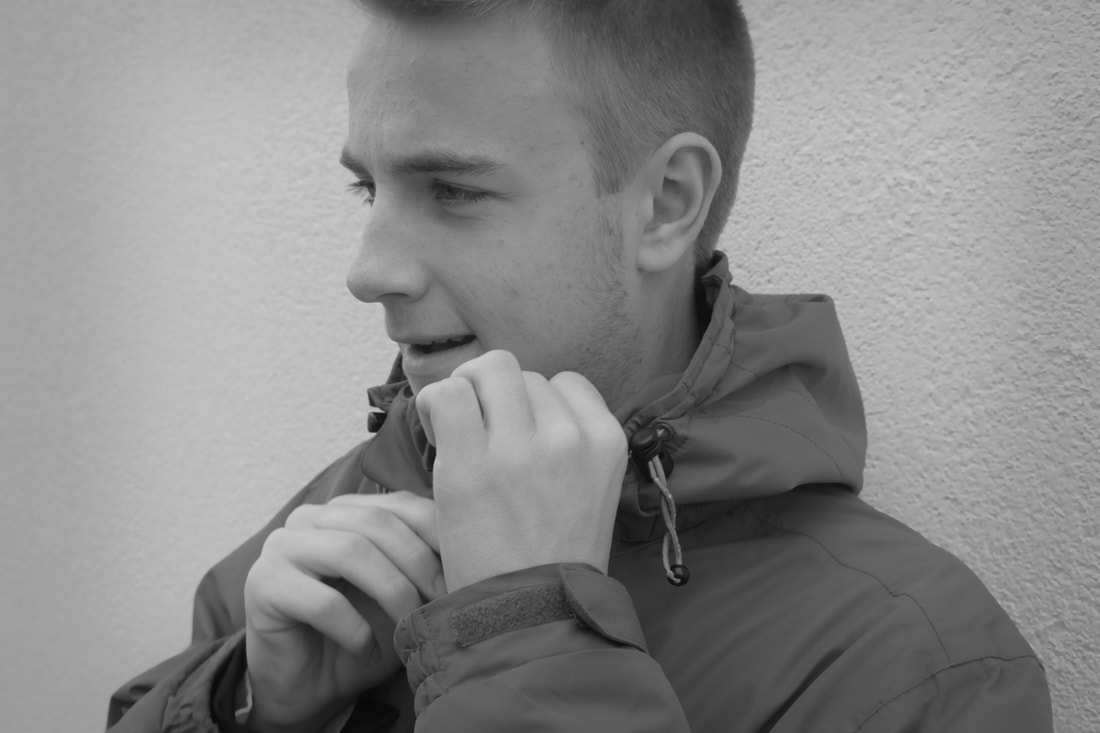
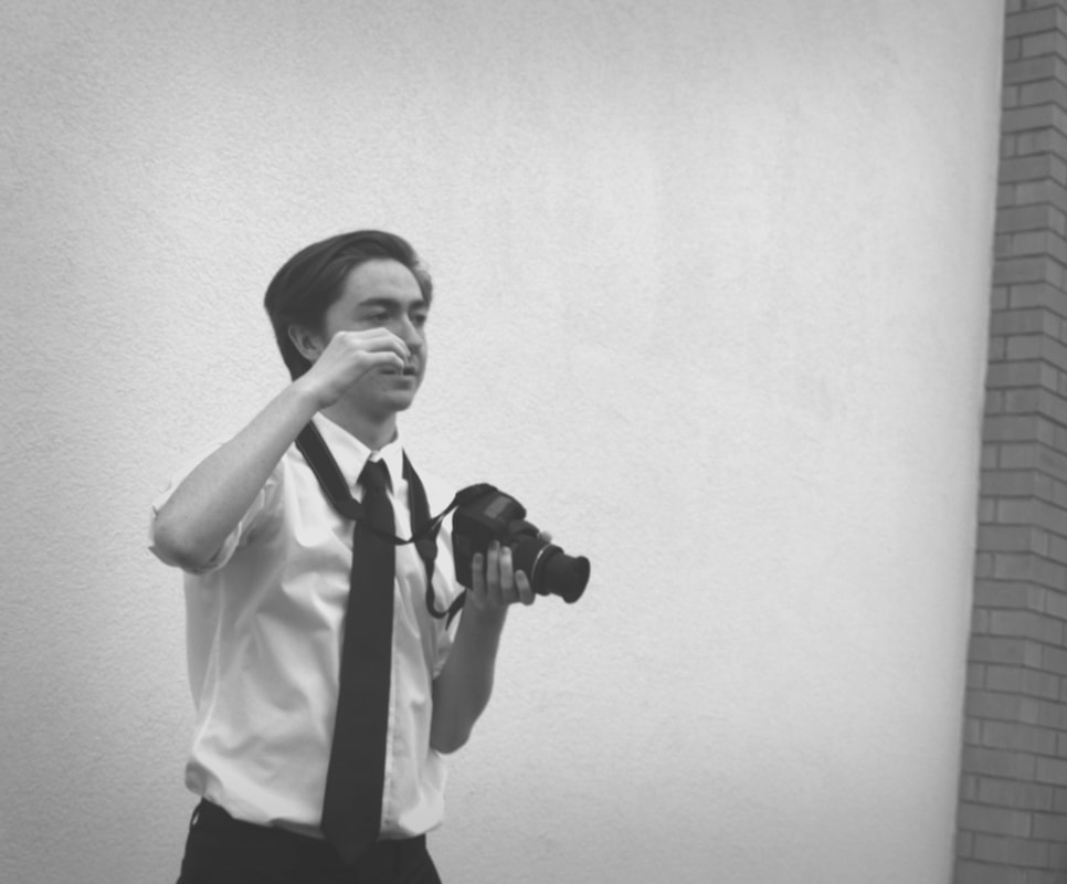
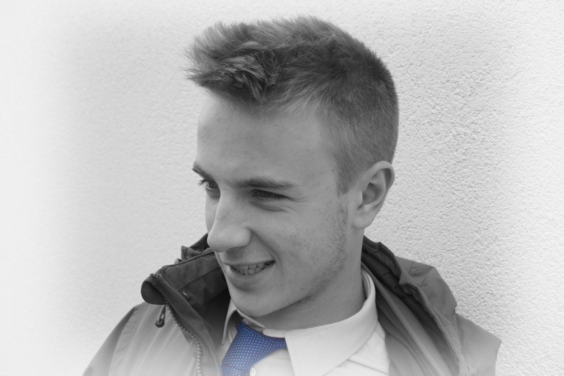
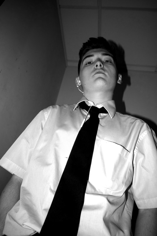
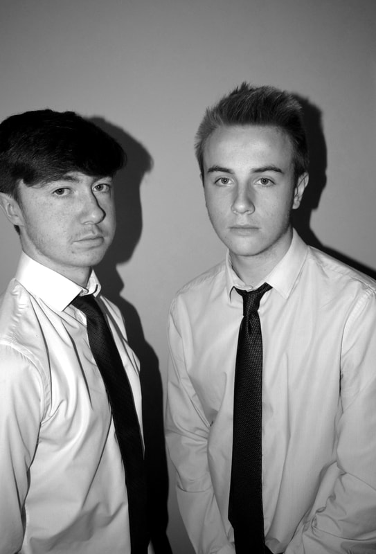
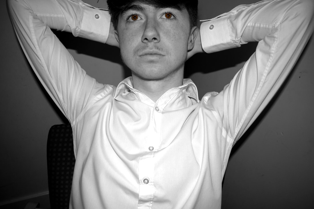
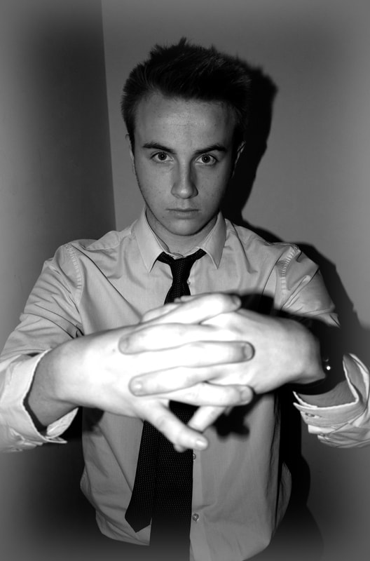
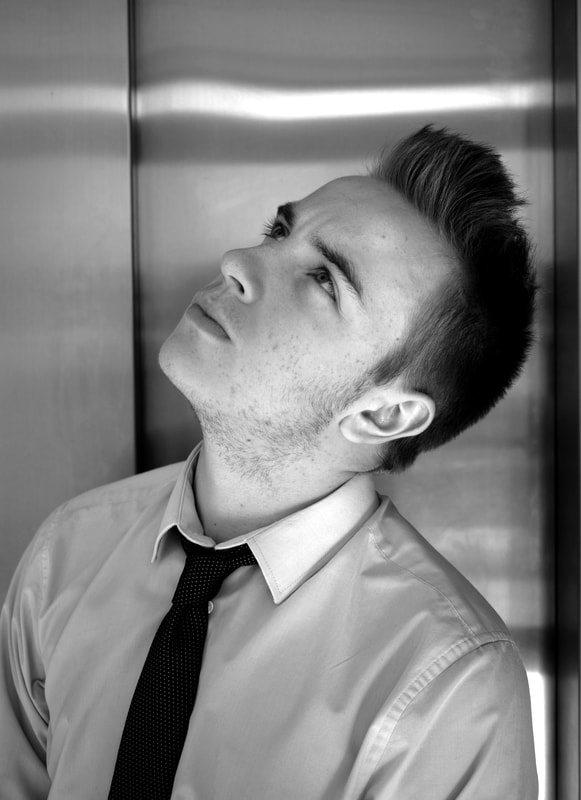
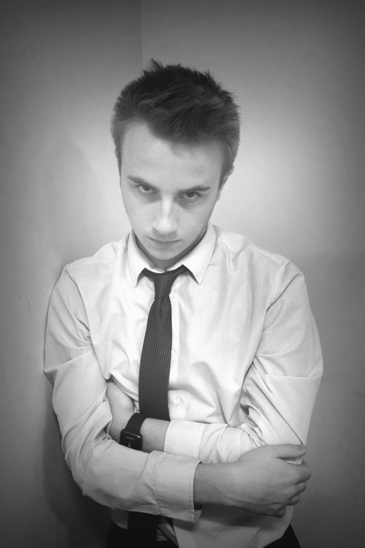
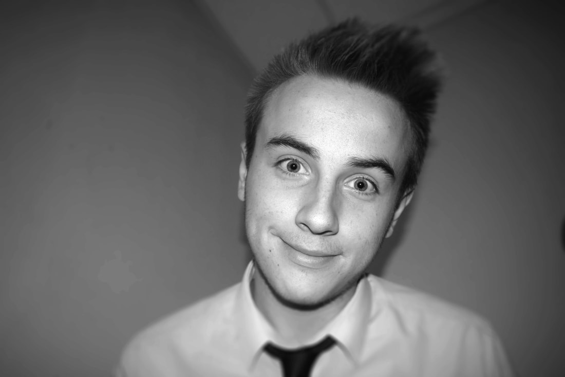
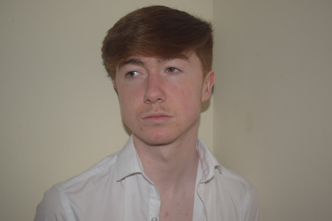
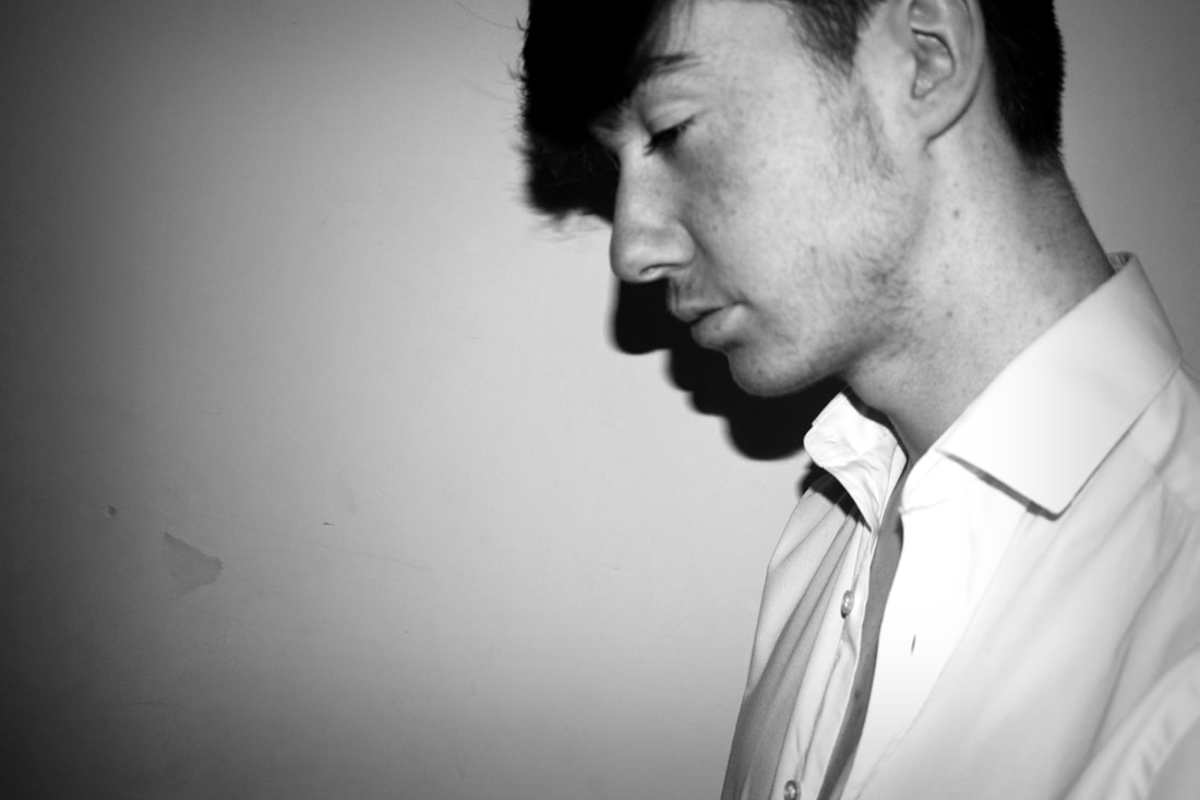
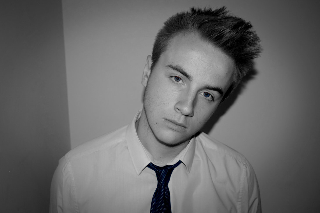
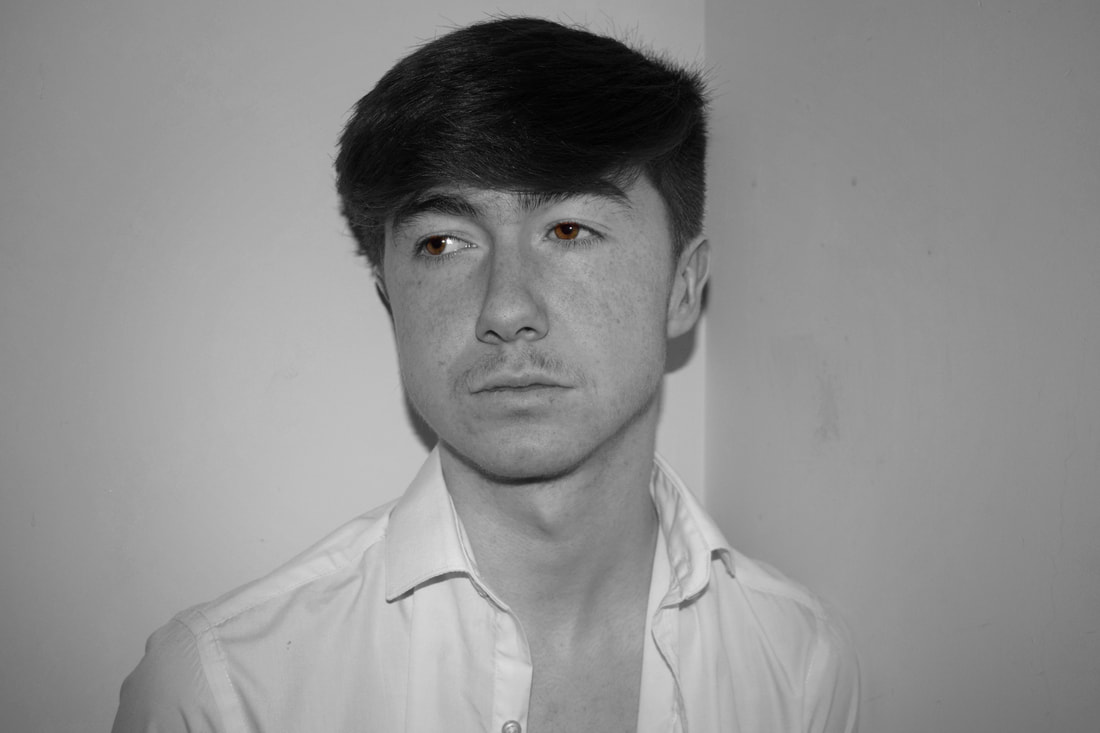
My Initial Photos
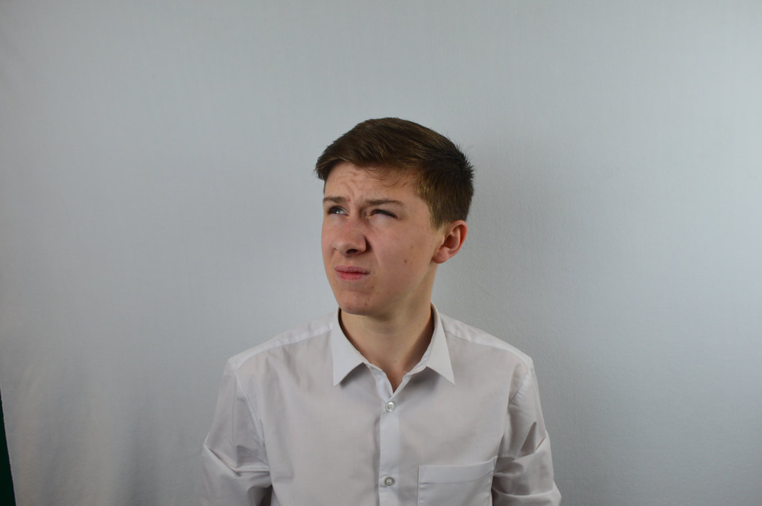
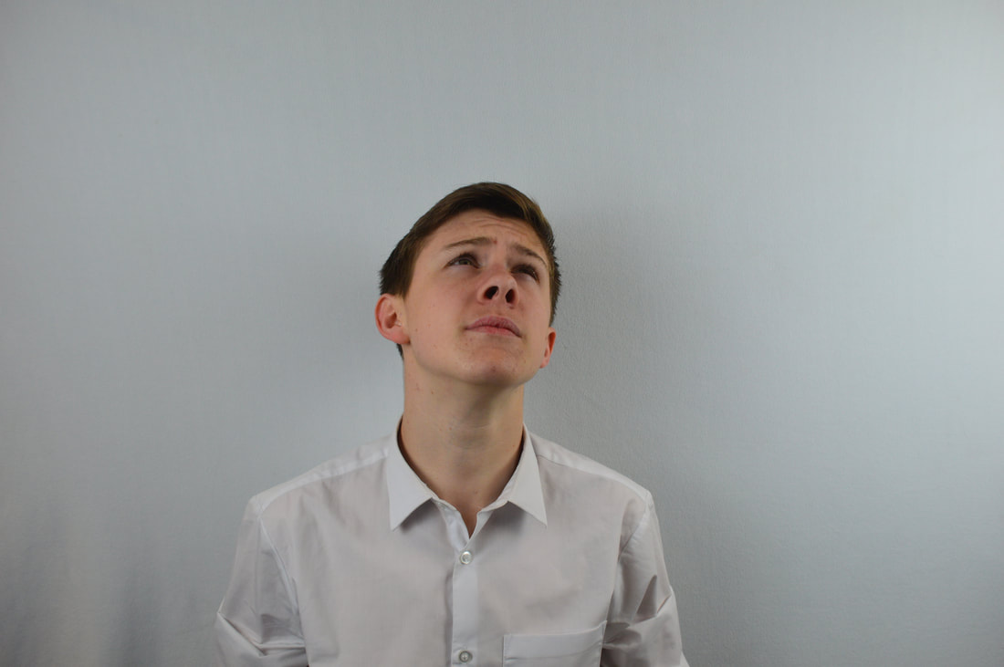
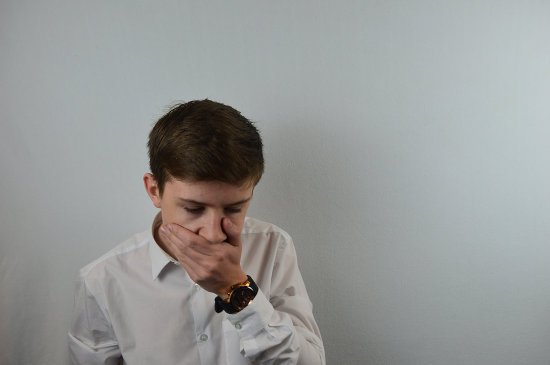
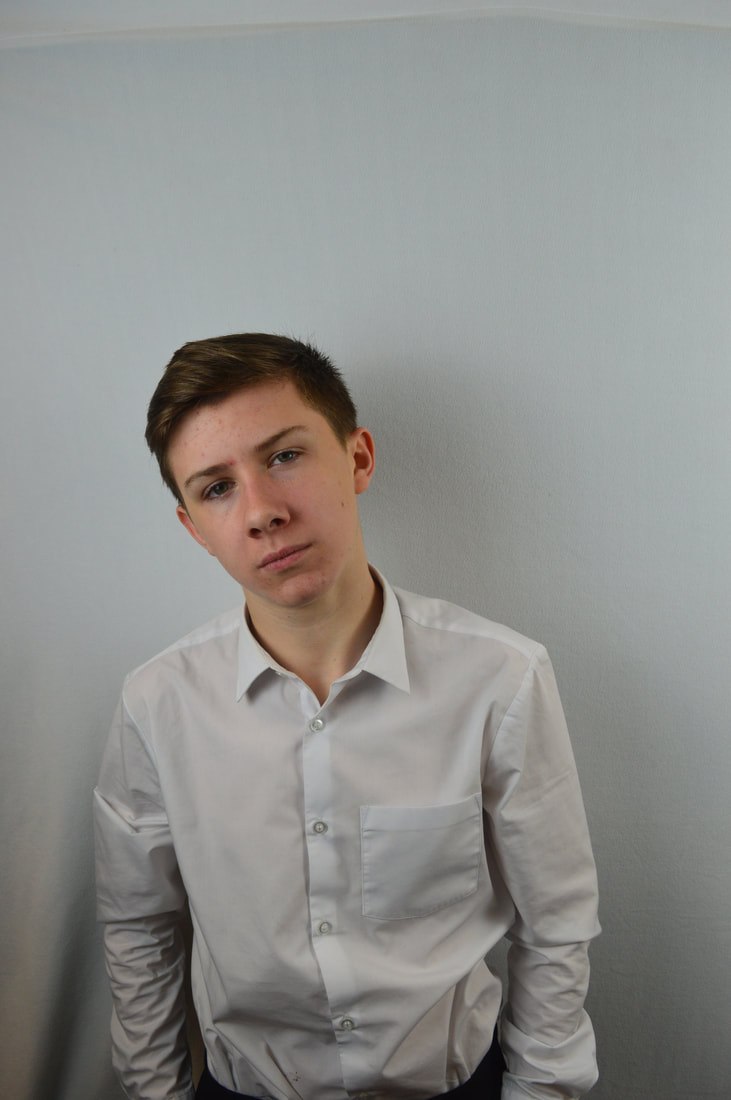
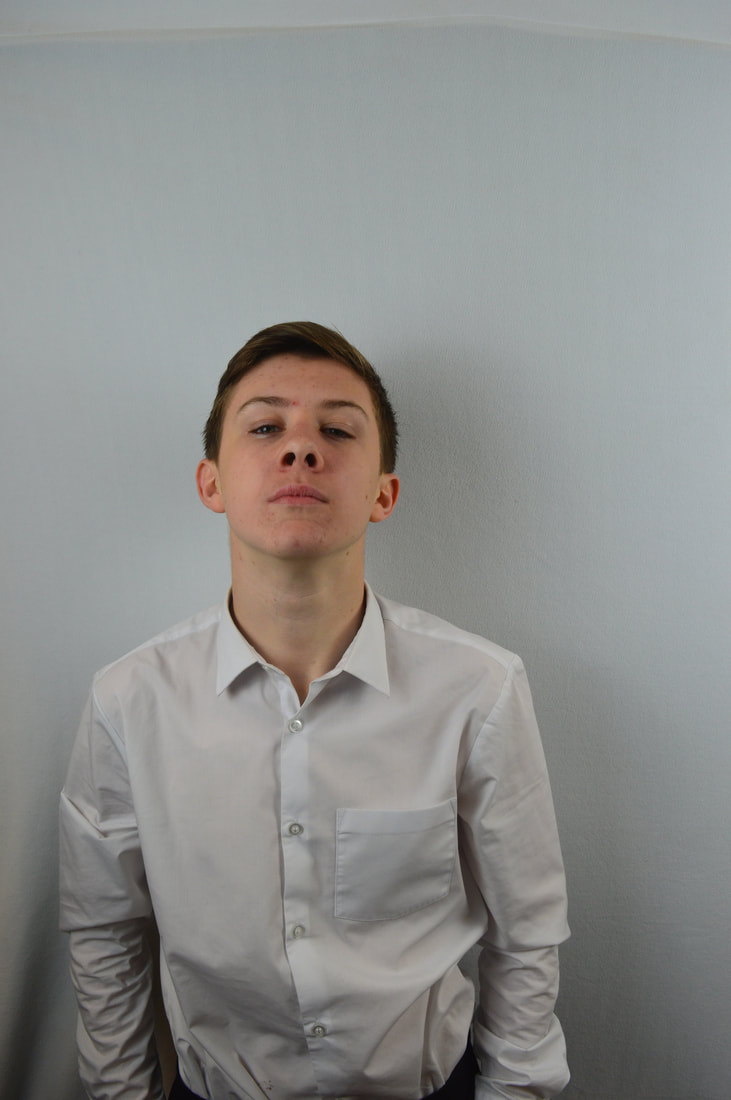
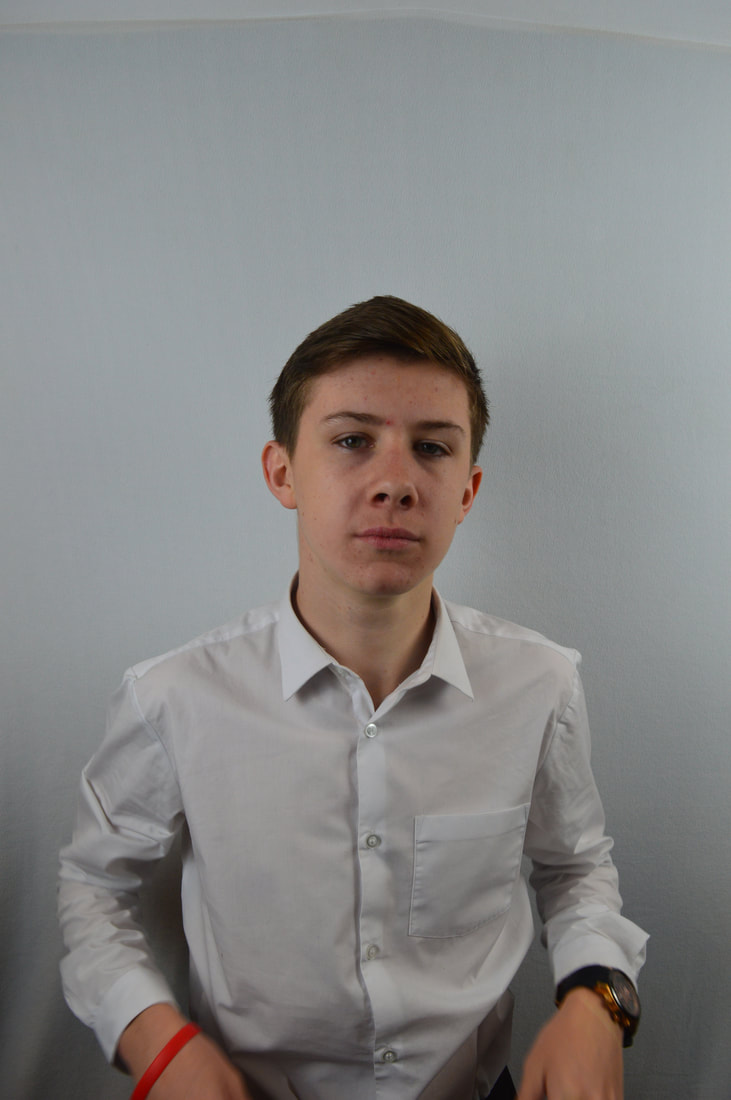
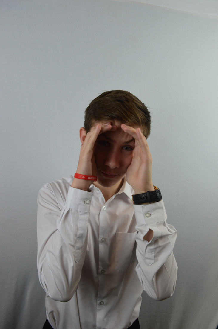
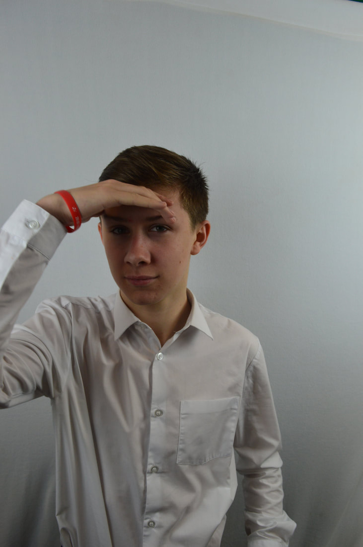
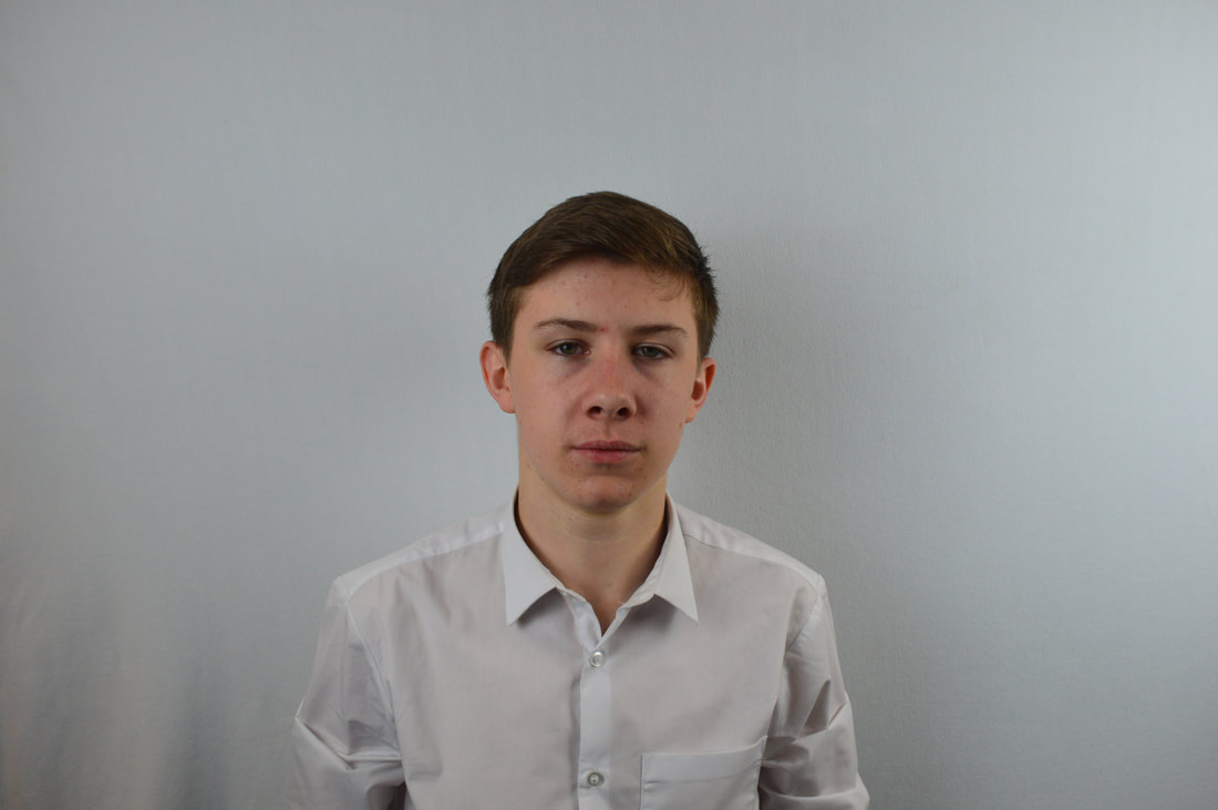
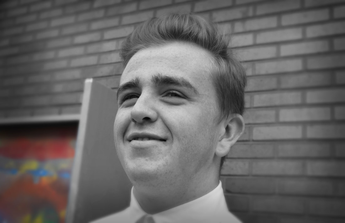
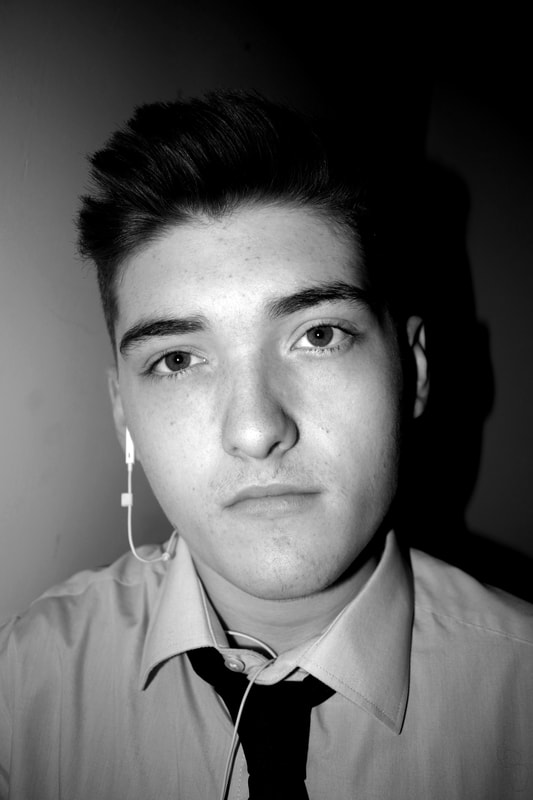
These are the images that I first took to use in this project to use in the style of Rankin. Here I have used different poses to try and make the initial images of a good standard. They aren't of the best standard but are a starting point and I can always develop and improve the image.
Initial Response of Destroy
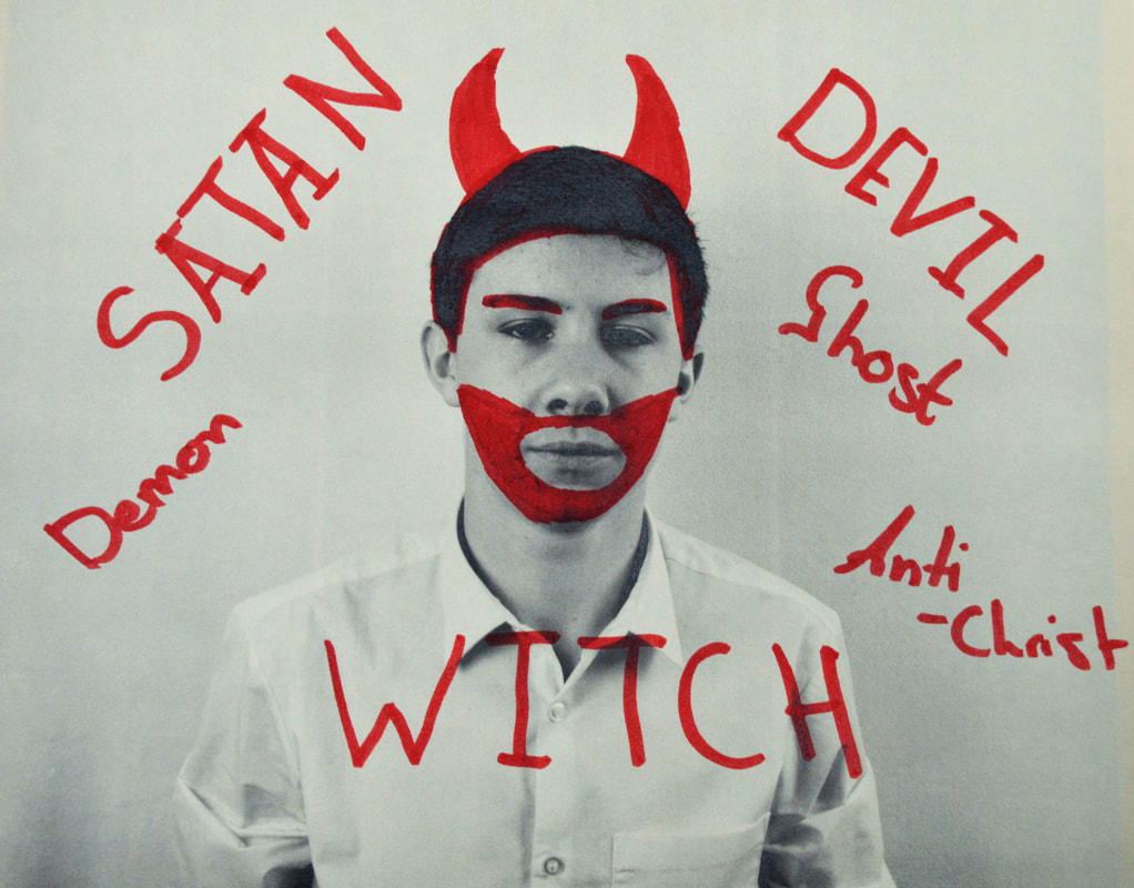
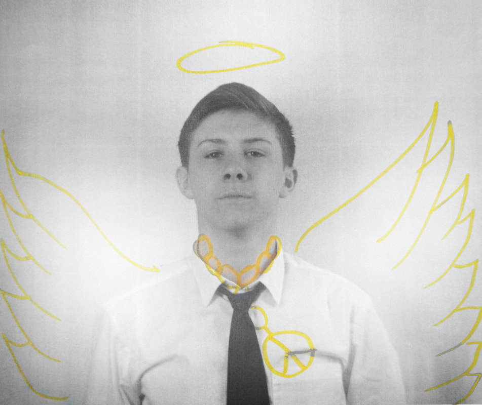
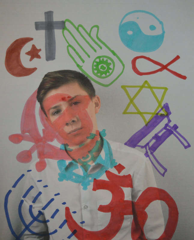
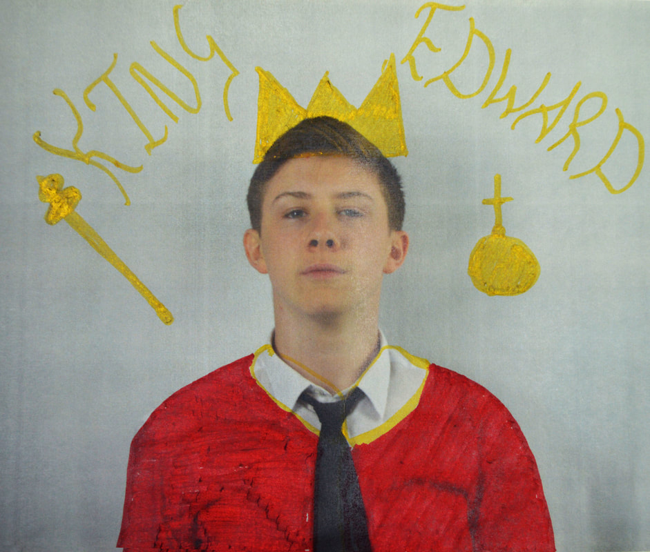
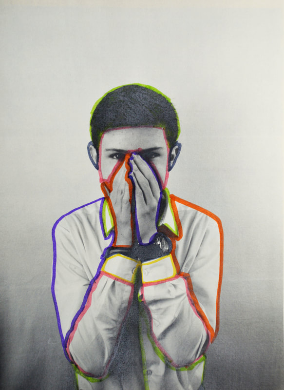
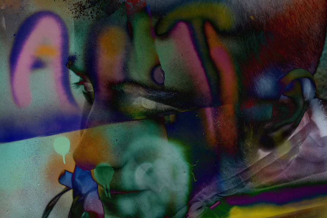
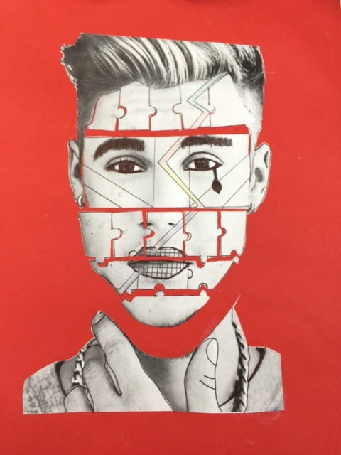
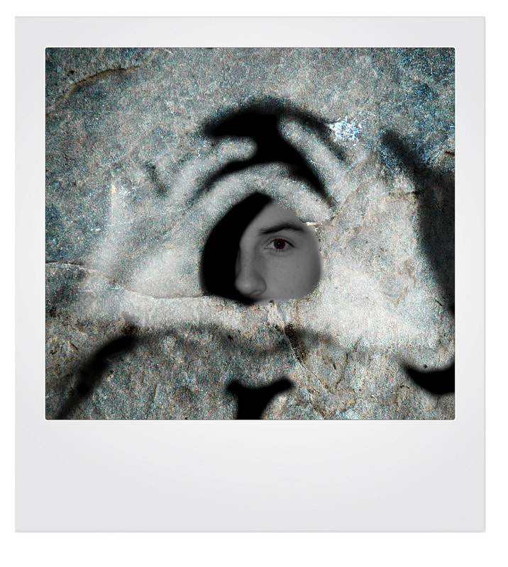
Here are the images that I destroyed myself and I used varies techniques to go for similar photos that Rankin used to show that I gained inspiration from his work. In my first image, I decided to cut strips out of the image and then line these strips on another image. This is to make the first look distorted like the Justin Bieber photo from Rankin. The other images I did, I decided to go for the technique that Rankin used to destroy his images by drawing on them. Four of my images that I used this technique on where in the theme of religion and royalty. I did this as I thought this could be a theme where I can make the model in the image look different in many ways. I also used these as a theme as I thought that these like together quite well as a lot of royal families are quite religious. In the image where I turned the model into an angel, I edited the image in serval ways in photoshop. I turned the image black and white but masked the yellow peace chain and halo to make it stand out. I then added soft patches of white into the background of the image to make it look more white and angel like. In my final image, I decided to do something different whilst still doing the drawing technique. I decided to outline the model in the image but with many different colours. I feel that this makes the image look different but interesting. I don't believe that these images has worked very well and the similarities just aren't good enough.
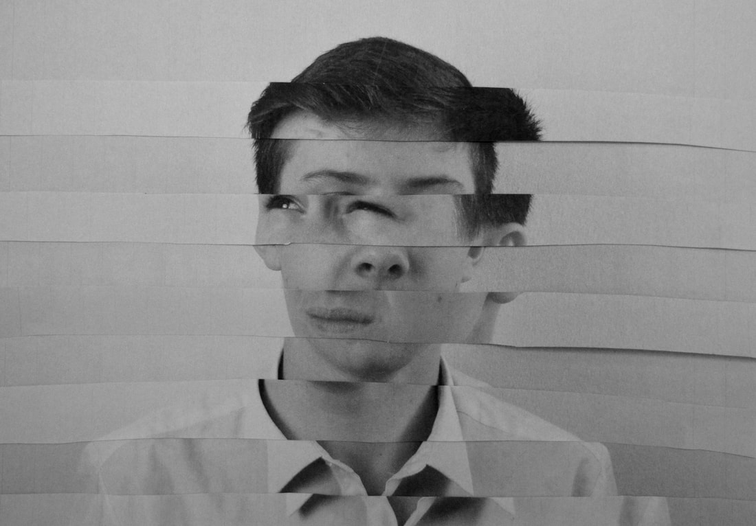
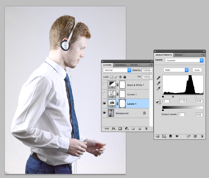
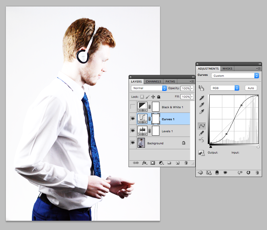
Using Photoshop to Destroy Images - Development
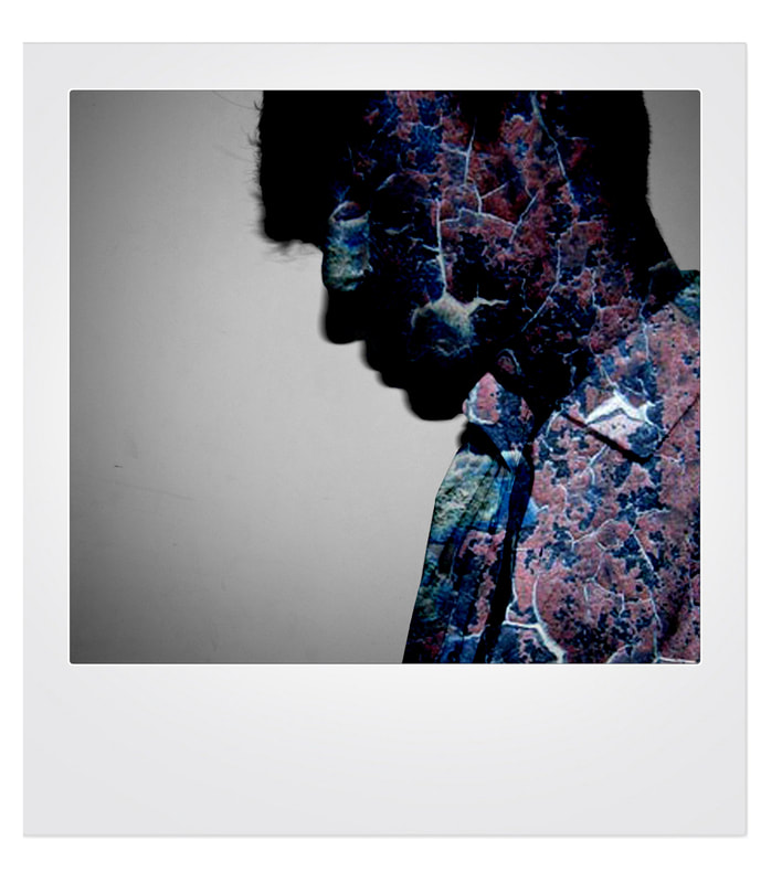
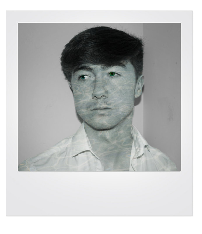
In this gallery here I show the progression I did when editing these set of images. First I started out with the standard photos. I then turned all the images black and white and with some of the images I added a vignette or blur to make the image look more interest. I then added a texture to each image. This is liking back to one of Rankin's images where there is a blue image that looks like it has some sort of odd blue texture on it. I then decided to add each one to a polaroid frame to make it look more professional. These images are really good images to start with and will allow me to create really good destroy images.
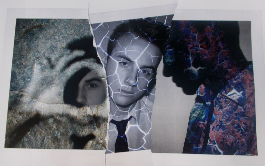
With this image I combine the two techniques that Rankin used; the use of textures and the ripping of the images. I used these here as I used my images that I used textures on and then ripped them up and place them in a order similar to Rankin. I have combined three of the images above by ripping them up and placing them in an order to create a interesting looking image. This was a good image I combined three different images and I have already photoshopped and destroyed. I combined destroyed these images by ripping them up and placing them in a formation which worked well together. This was a good image I combined three different images and I have already photoshopped and destroyed. I combined destroyed these images by ripping them up and placing them in a formation which worked well together. This would of worked better if I would of made more images like this so that I could make this a collection. Also if I would have made more images that I have tried to destroyed in photoshop and blended them together.
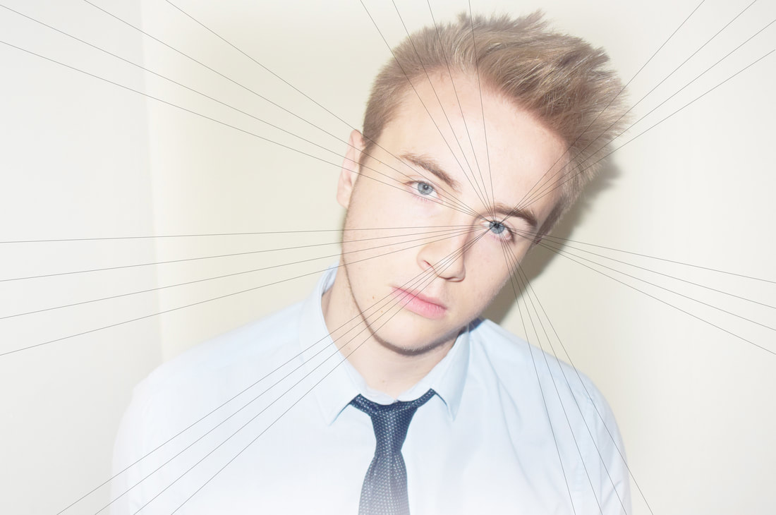
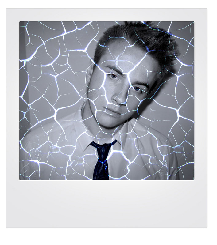
This is another example of me trying to replicate Rankin's work. To make this image, I very easily brightened the image to make it look similar to the image that this image is based on. I then used the lines tool to make a similar effect as the one in the Rankin image. I think that it has worked well and think the image looks very similar to the Rankin image and therefore is a successful attempt. This is a photoshop representation of what the image will look like when I destroy it. For a by hand destroy, for the lines I will simply use a pencil and ruler. This destroy is very simple but can look very unique.
Development
Here I am showing the development of one of my responses and how I created the set of images that I will use.
|
|
Edited Work
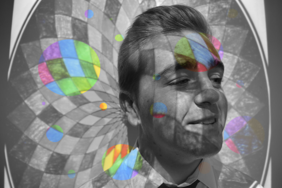
With this image I have used the development from above and turned them black and white. I masked out the paint so that the colour of the paint is still visible. I then changed the hue of the paint in different places to make it look more colourful.
Presentation Work
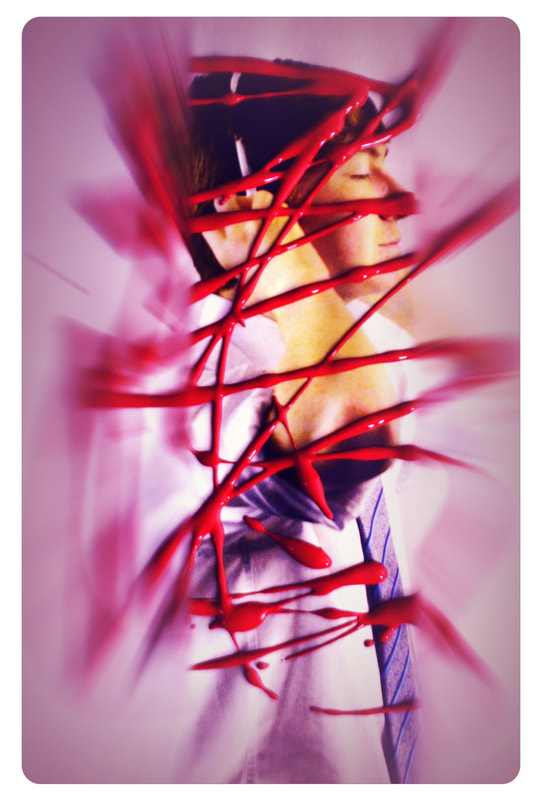
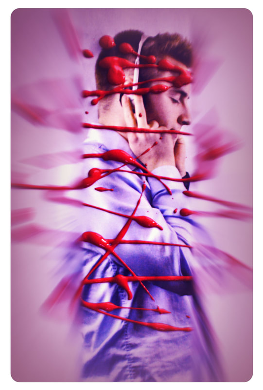
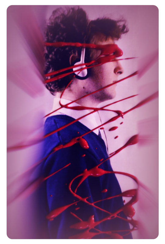
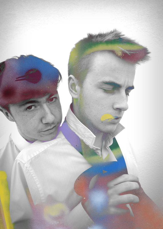
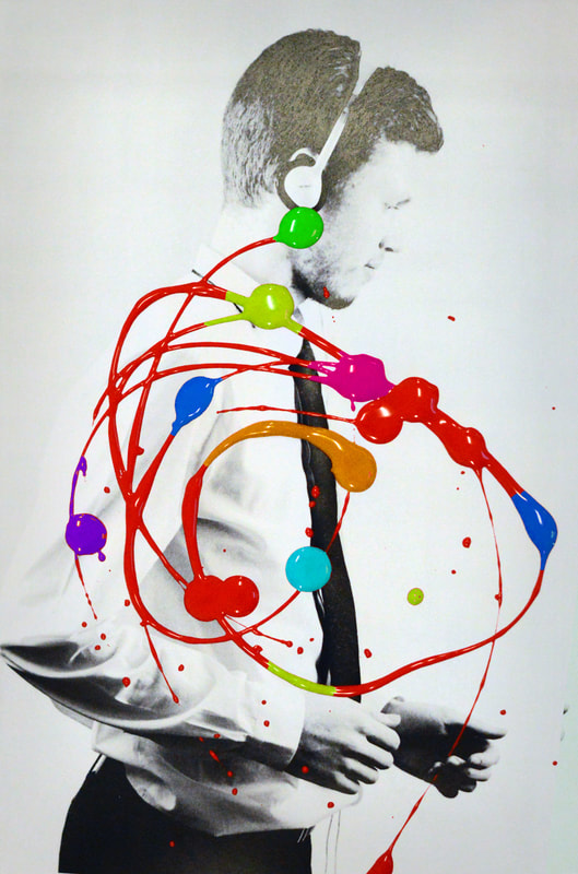
This is my final presentation. I had used the Rankin image of Kylie Monogue and put my own effect onto the image. I tried to replicate the image by having a model wear headphones and putting paint onto them image in a random pattern. I then decided to play with the colours of the image and add a pinkish layer to the image. I then finished the image off by adding a layer of radial blur and masking out the middle strip of the image. This has made a really good collection and links best back to Rankin.
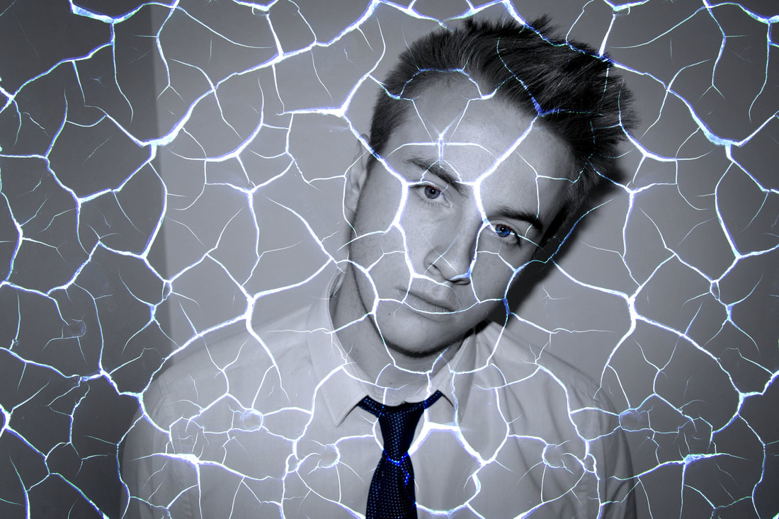
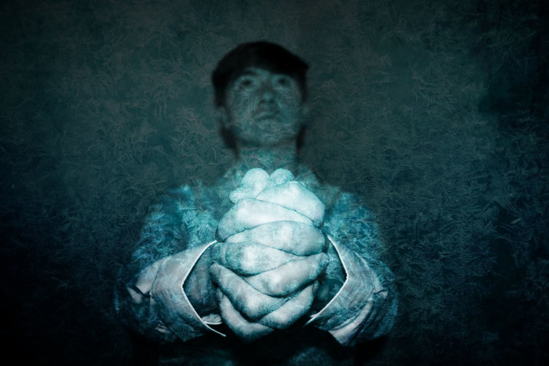
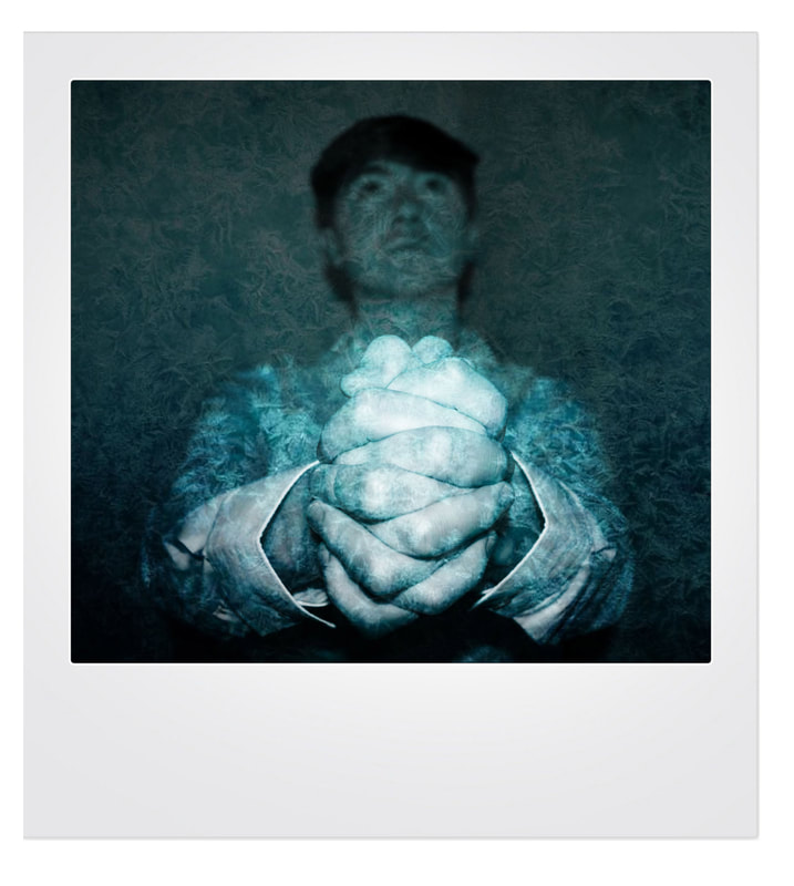
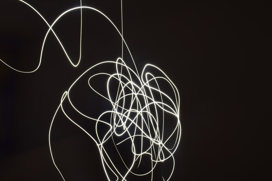
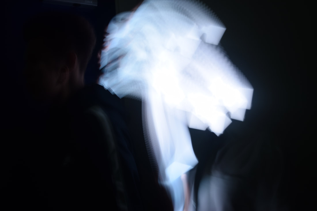
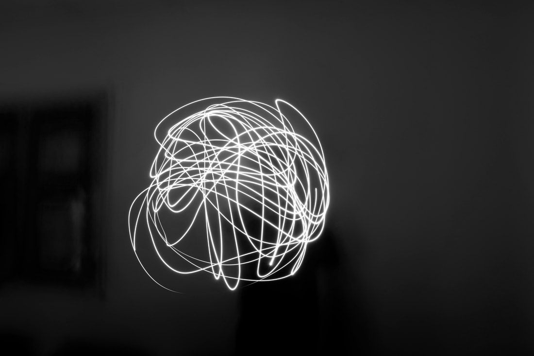
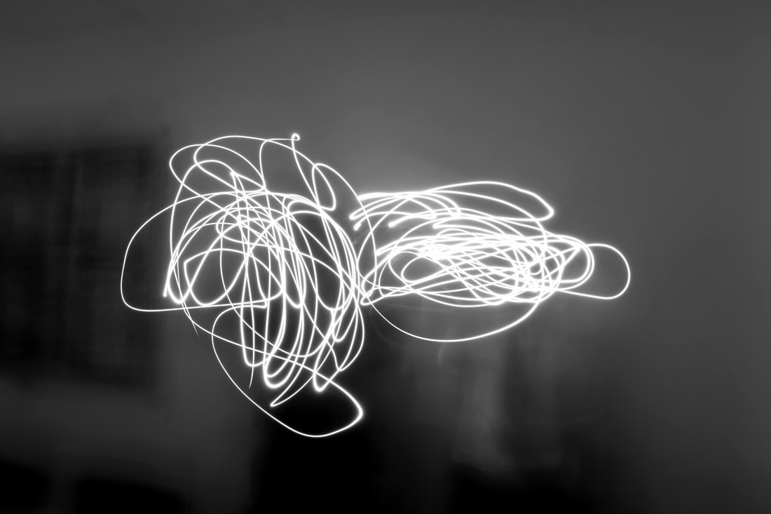
Painting people and faces with light
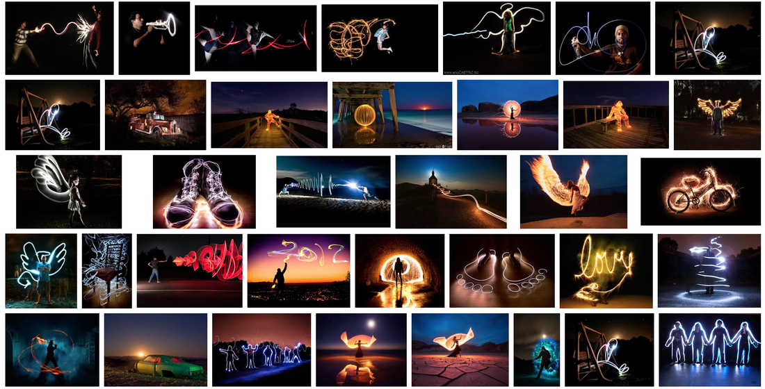
Here is my research of painting with light. This involves many different techniques such as using just a torch and outlining someones body with it and then there are some images that have a different technique like using a sparkler and outlining something or making a random shape with the sparkler. I am really impressed with these images as there is a lot of variety and different things I could possibly do.
My Own Work
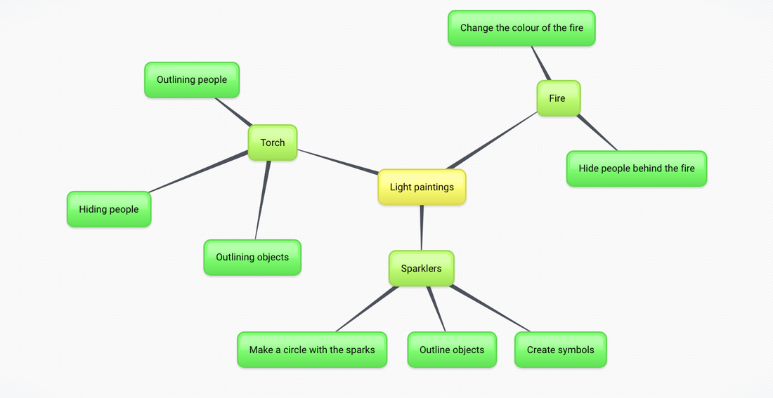
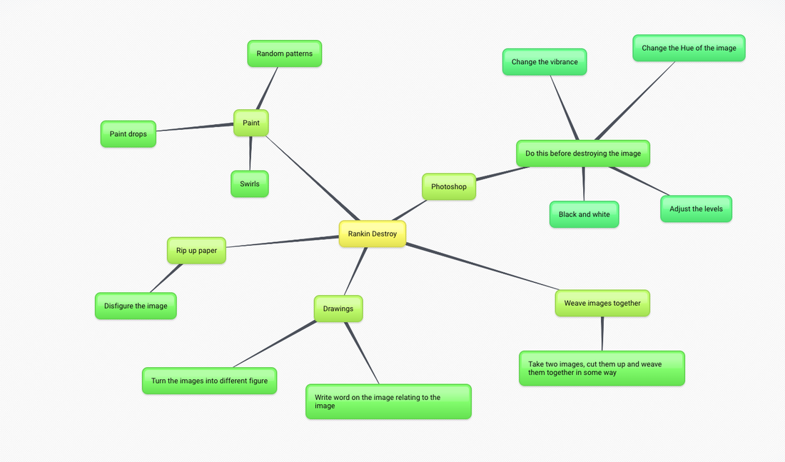
This is a mind map to show what ideas I have for light paintings and how I might approach this topic. This has set me up so that I know exactly what types of images I could do with light paintings.
My Own Photographs
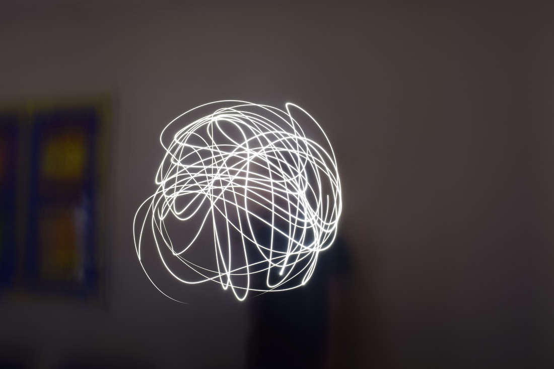
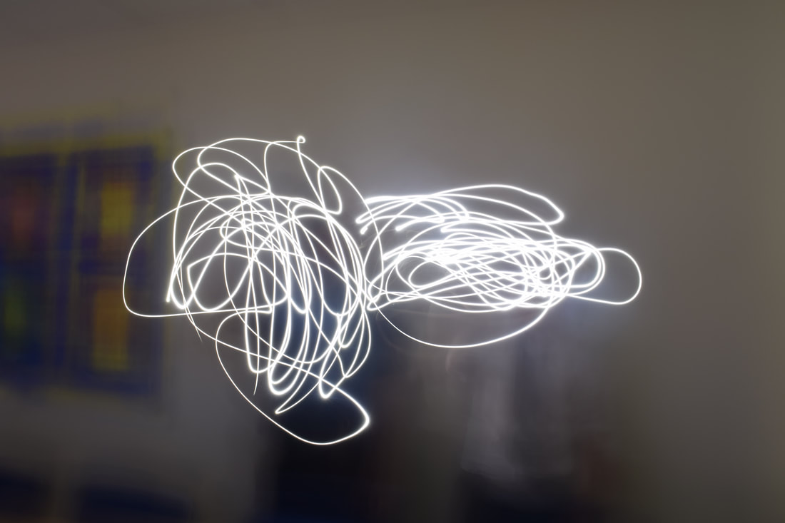
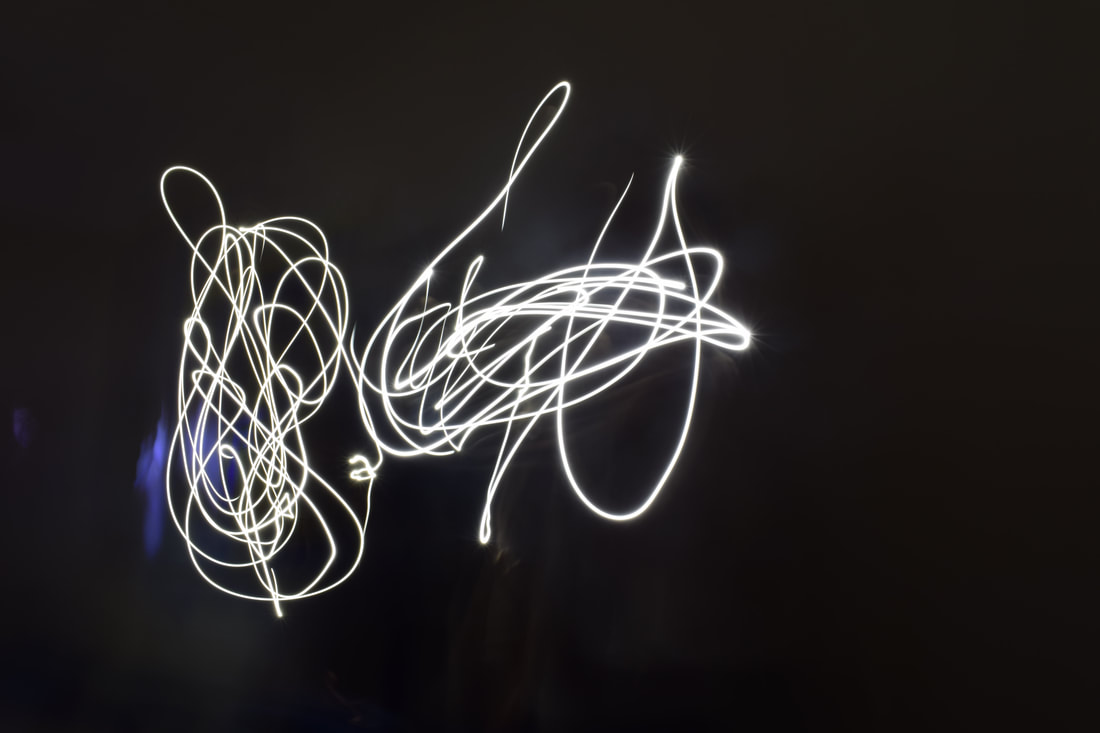
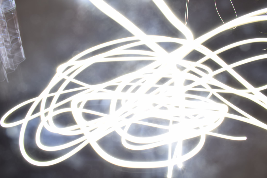
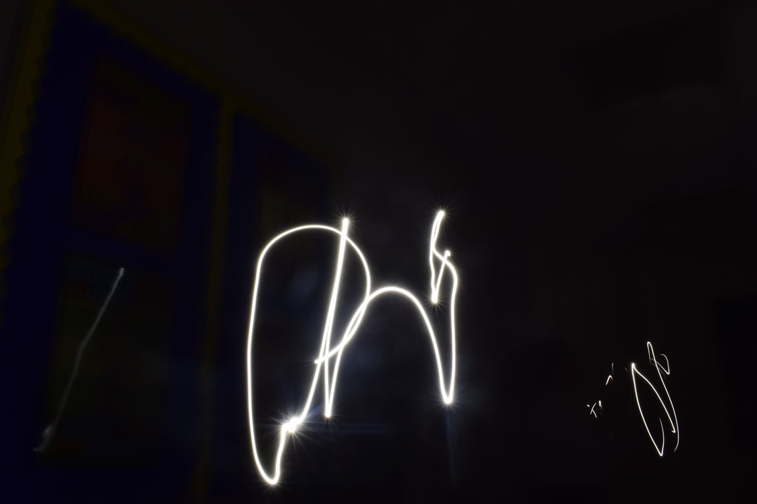
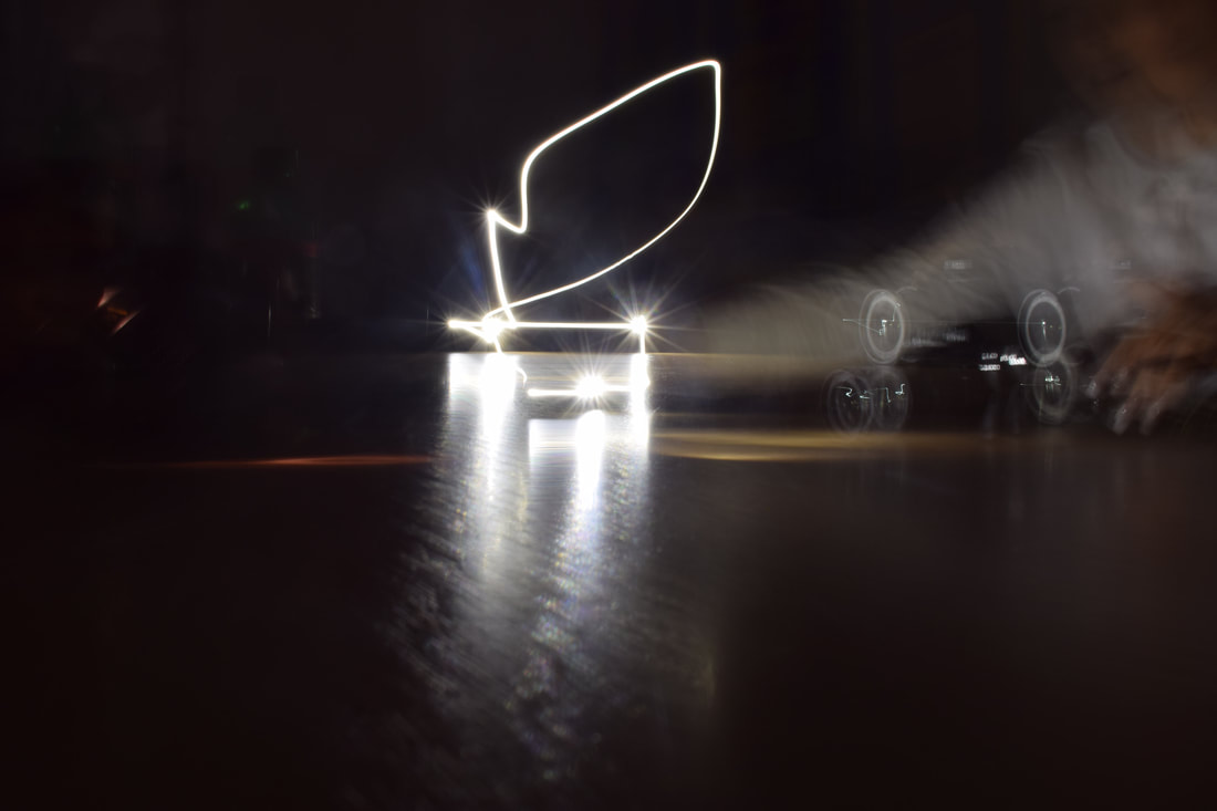
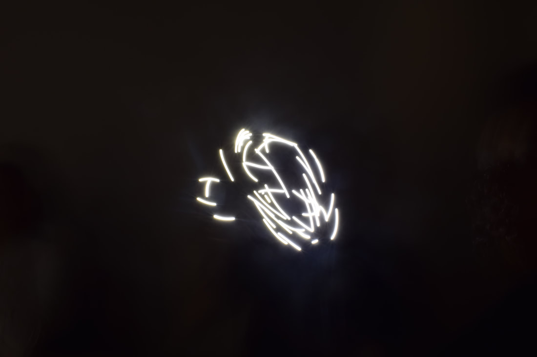
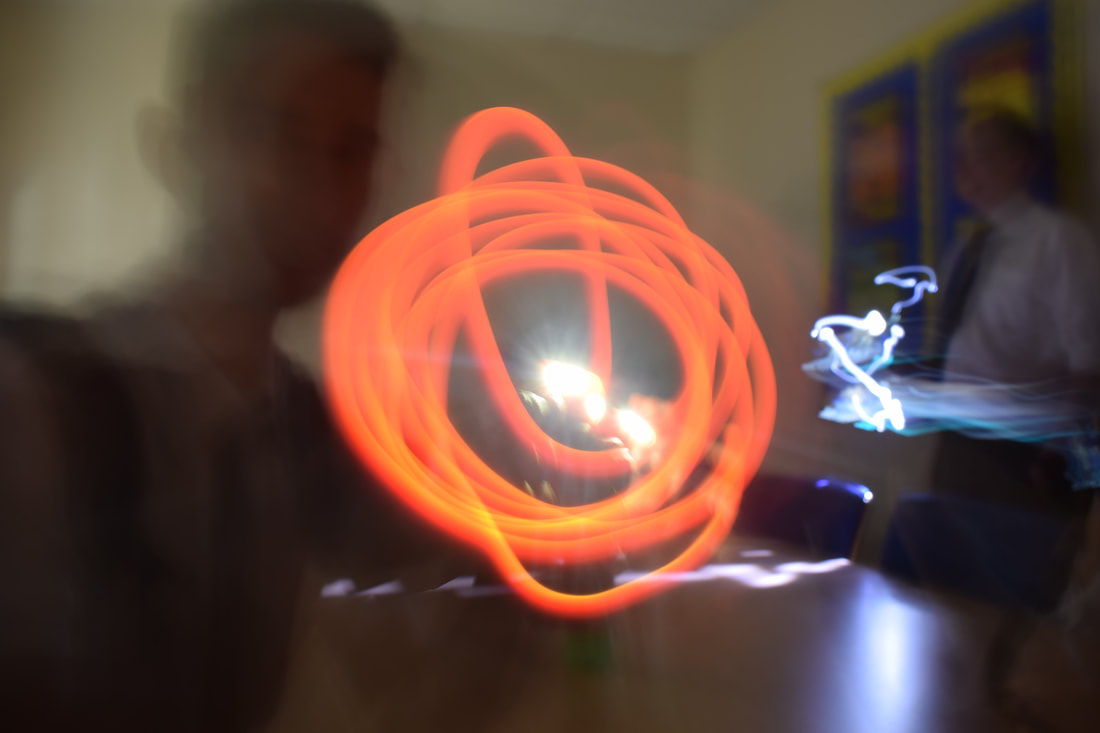
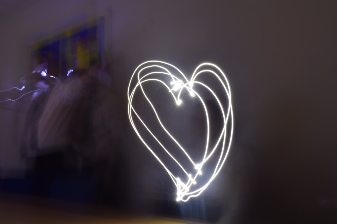
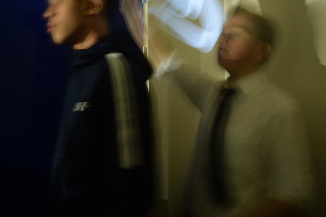
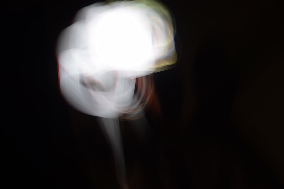
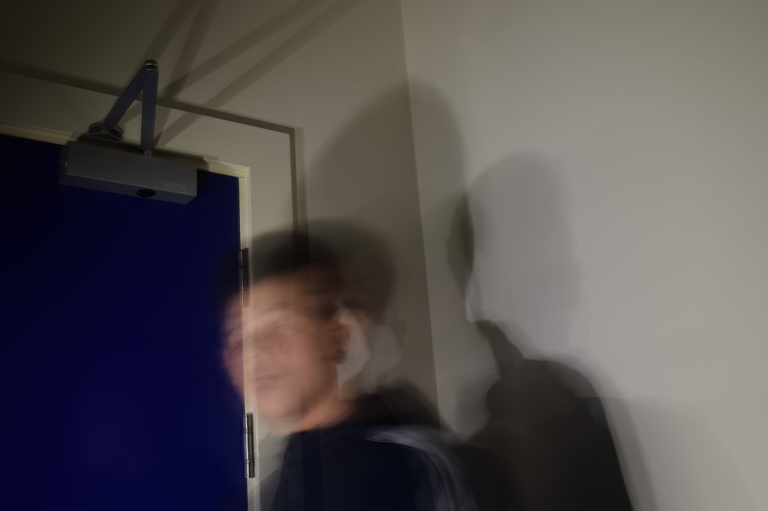
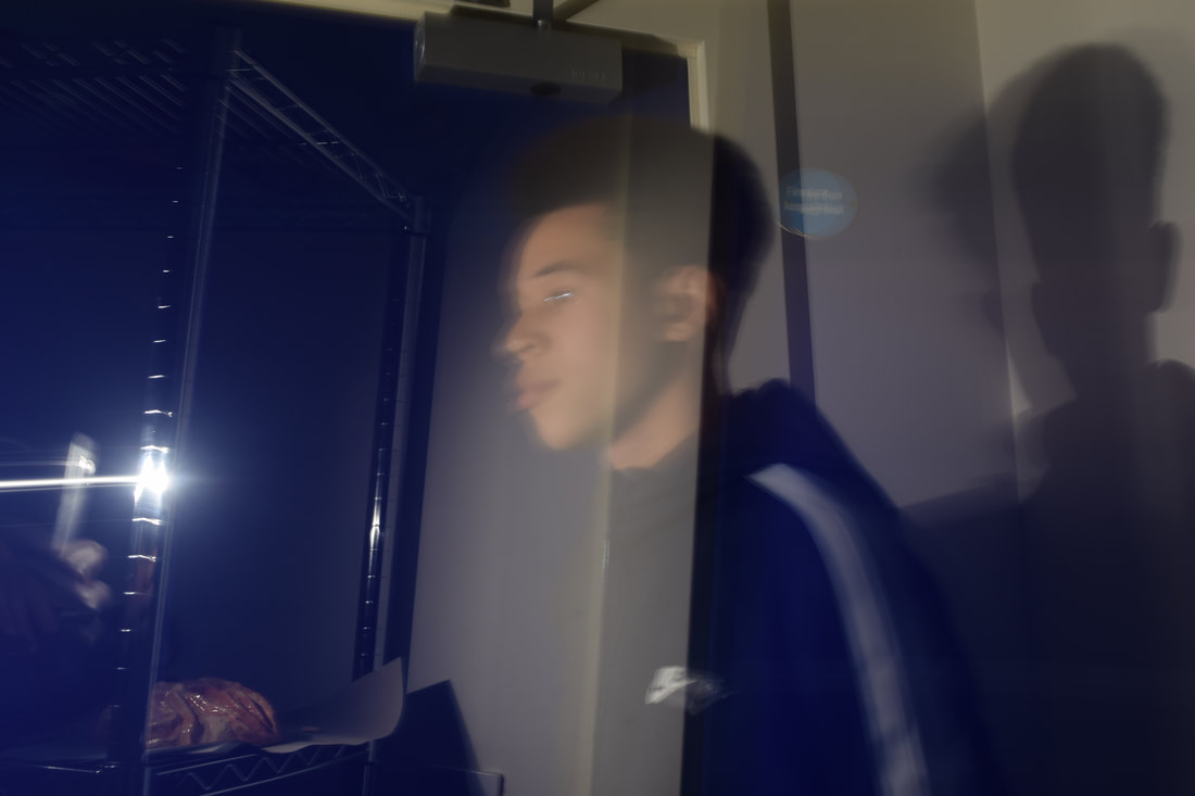
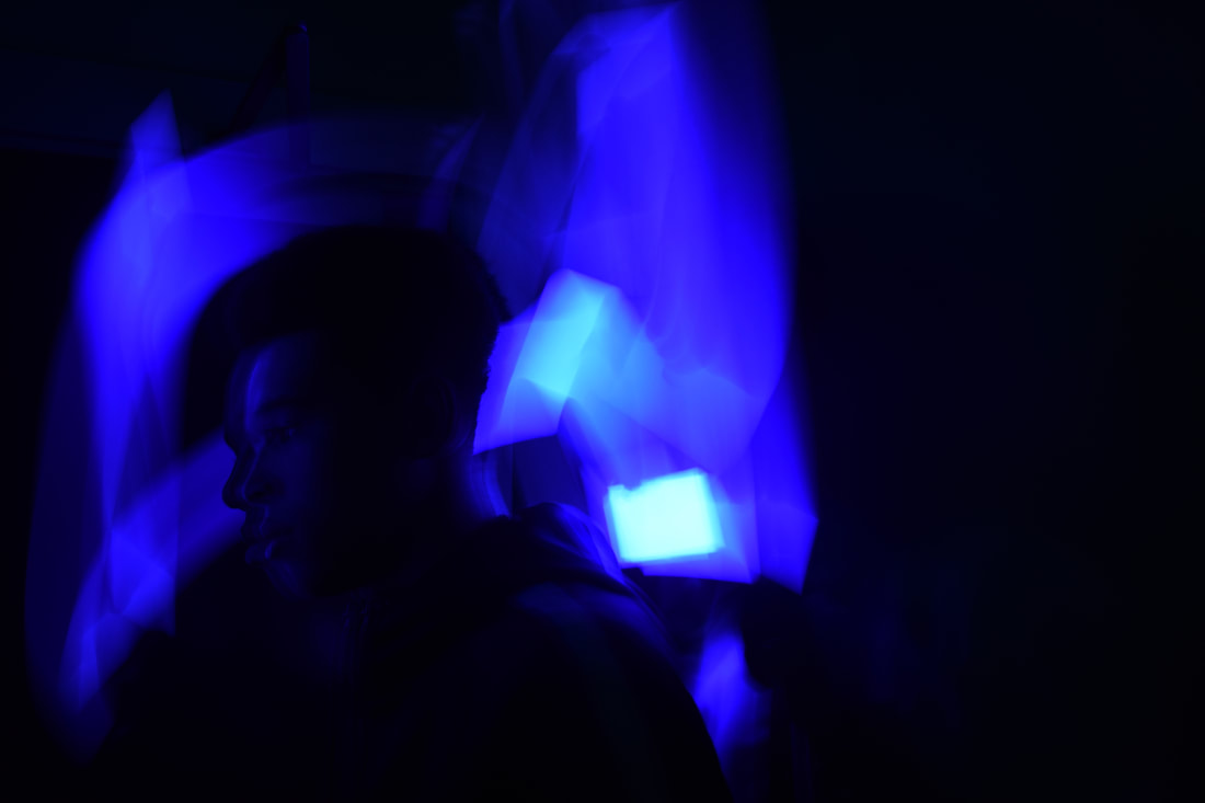
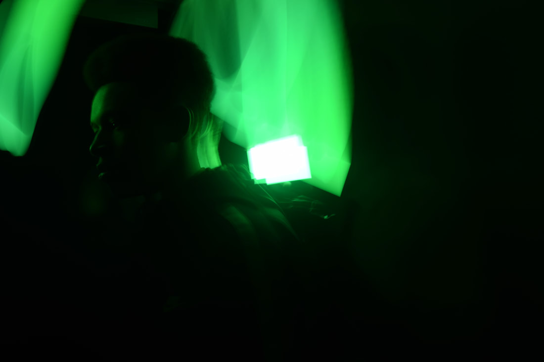
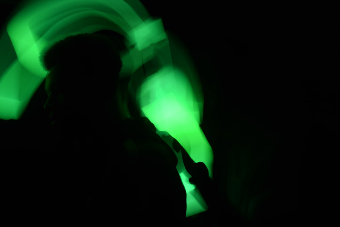
Here is my initial images that I took that are inspired by the research I did. Some of these images are worth using but most of the selection isn't of great quality. I will improve this my trying to get similar images to the ones that i believe to be successful. These images that I am talking are the ones that have coloured light around a dark figure. I believe these are my best work because the different colours make the subject of the image seen by still disguised by the dark.
Edited images of Light
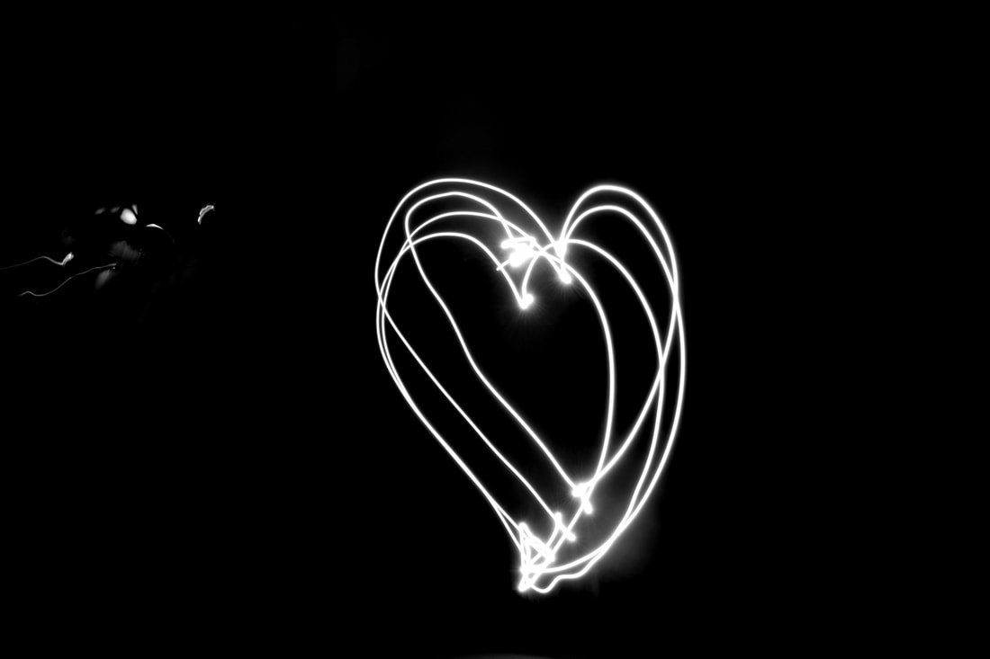
Here are a few full frame images that I believe are a decent attempt to replicate the images seen in the research but could be better if I tried to make a shape or outlined something instead of just drawing random lines in the air. To try and make these images look a bit better, I decided to turn these images black and white and add a blur to them to make the light stand out even more.
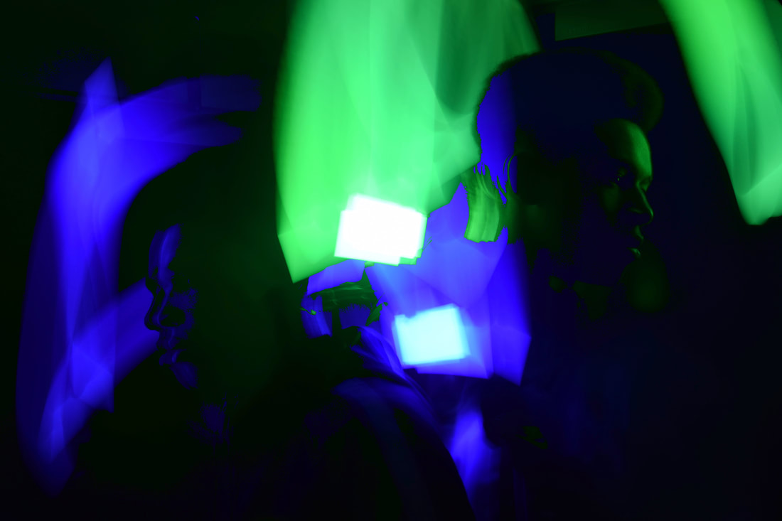
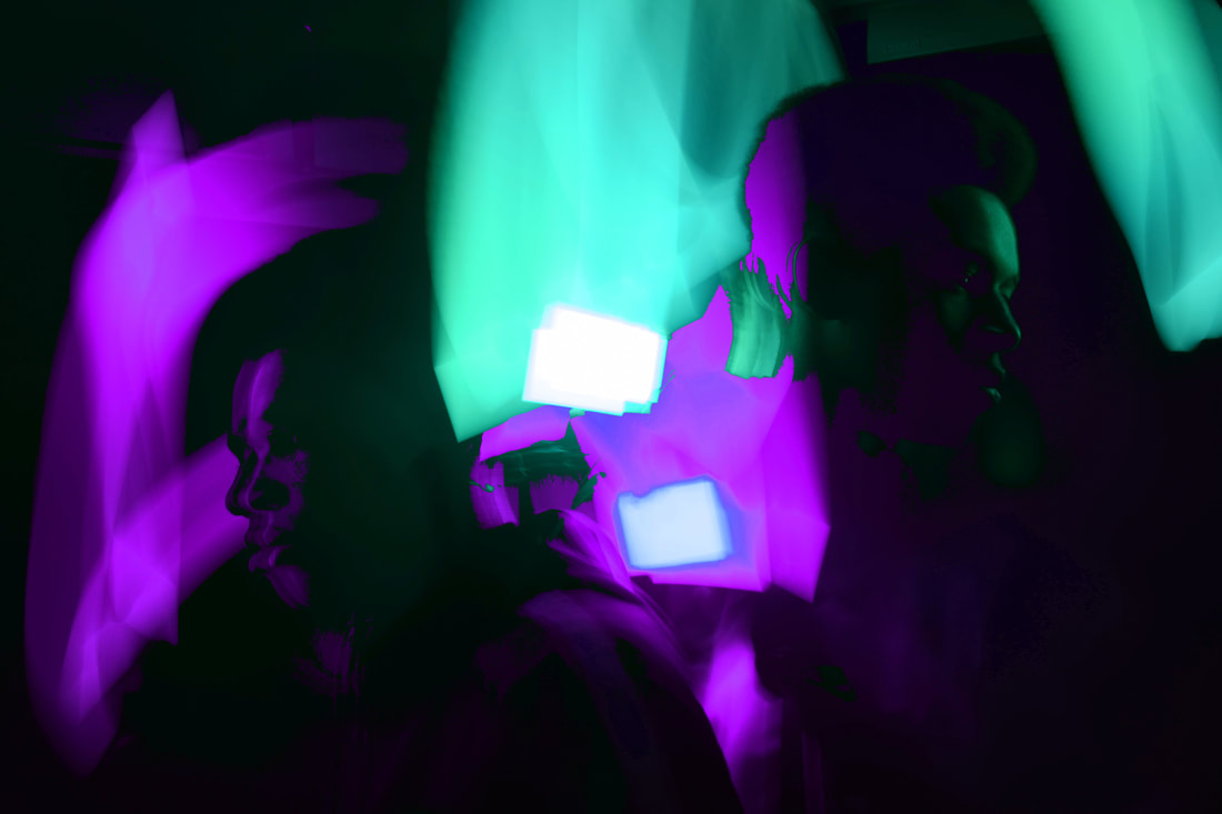
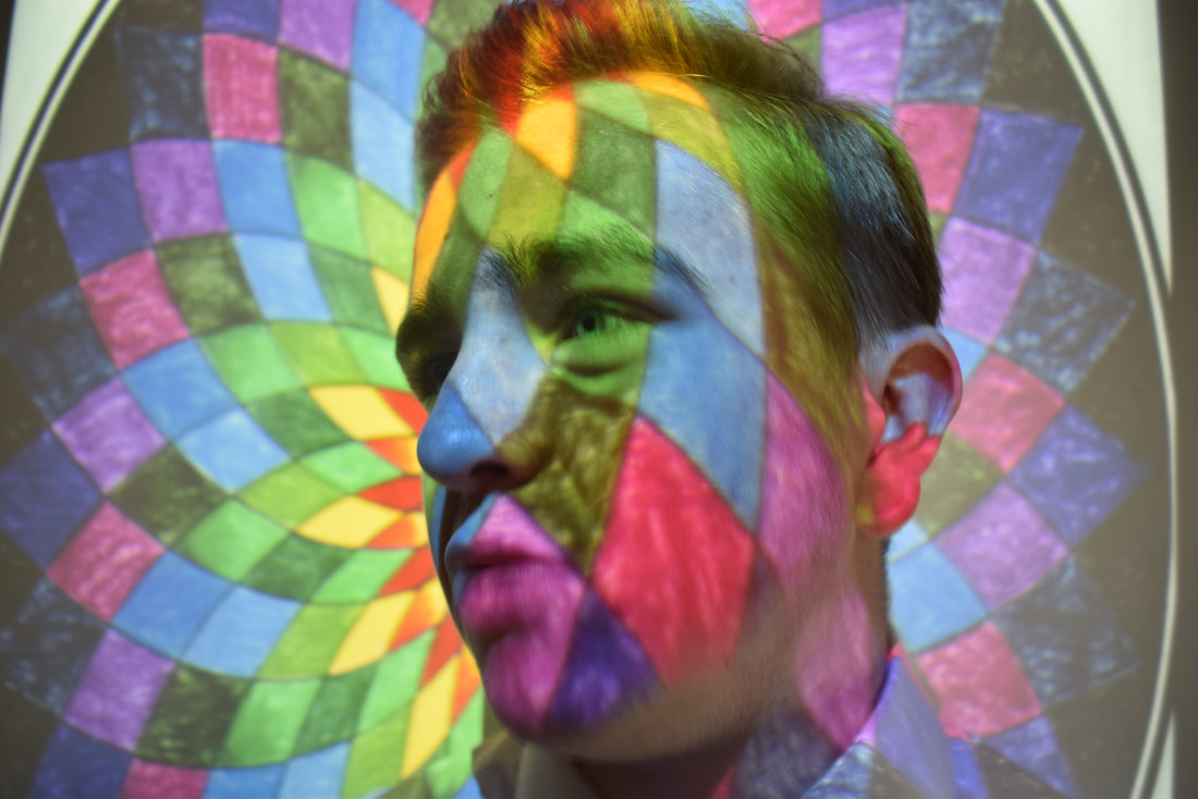
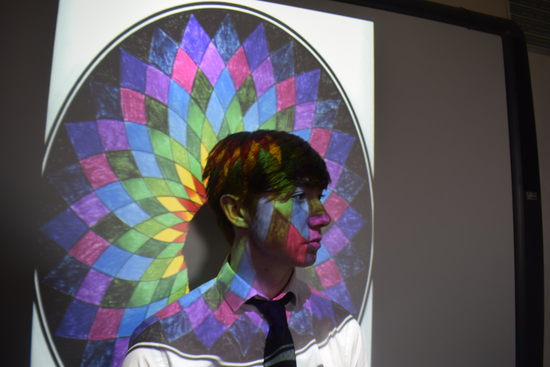
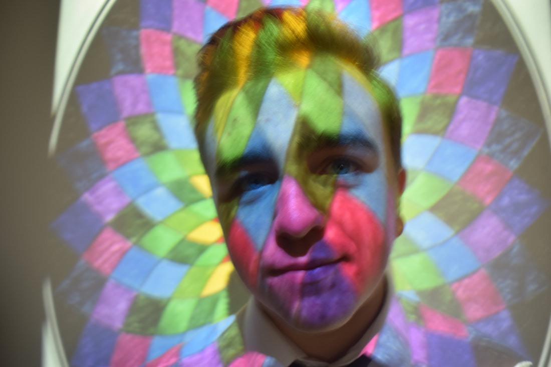
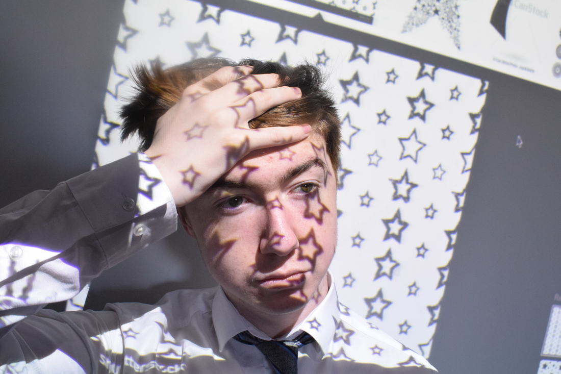
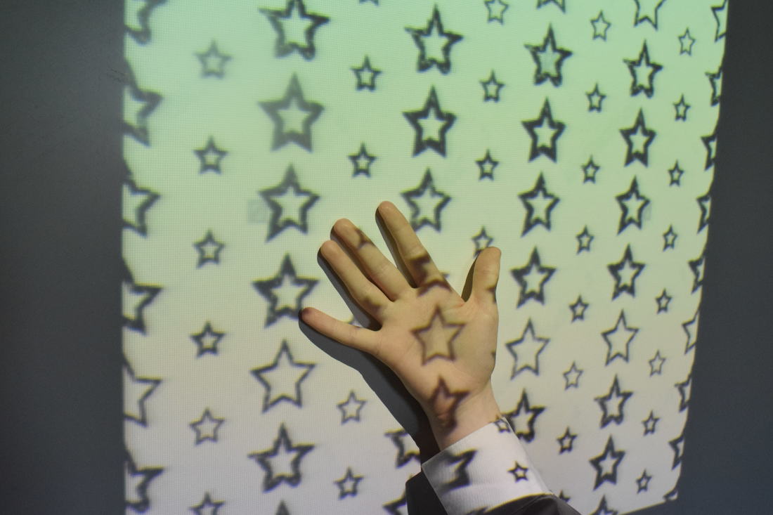
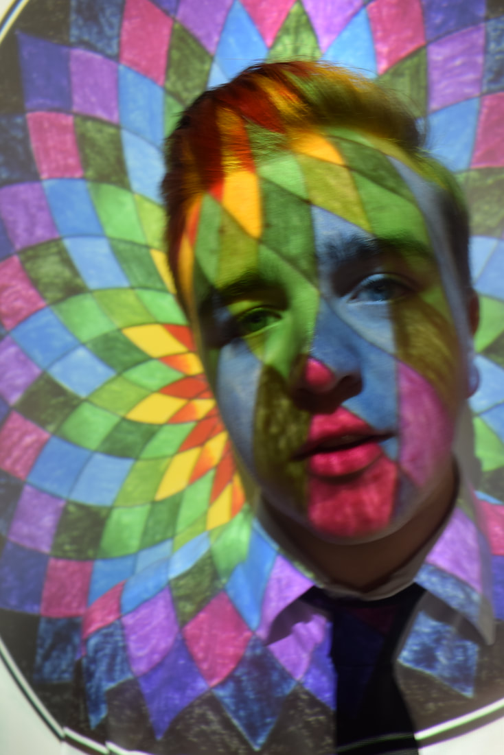
Projections
Research
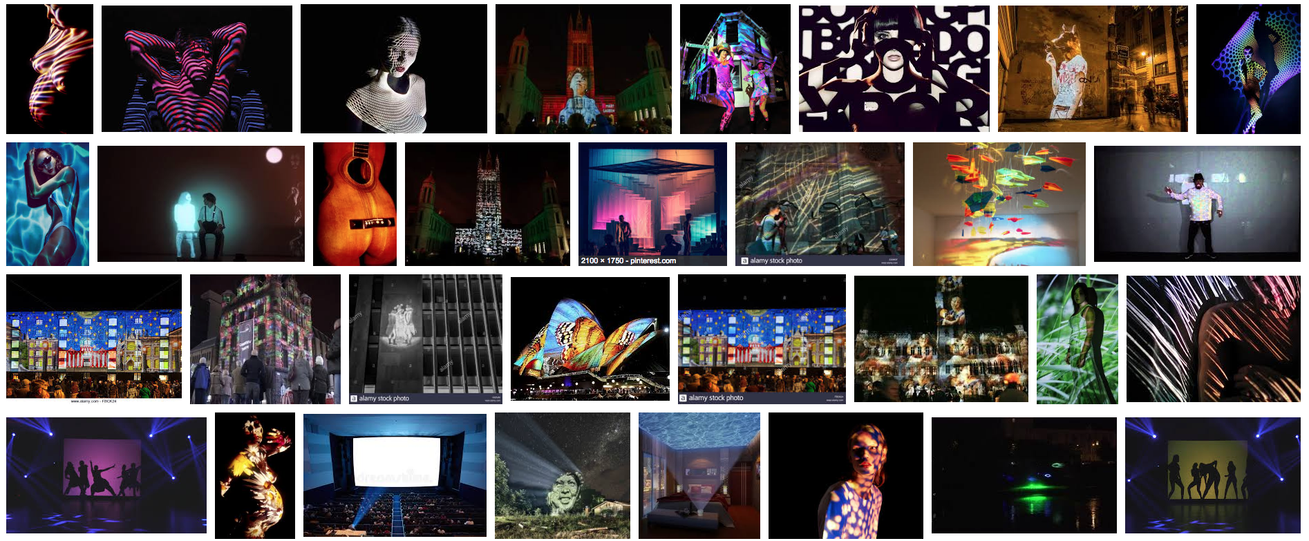
Here is a selection of images that I have chosen as my research for my projections section of light. All these images add a different way of using projections has some have a pattern projected onto someones face and body and then theres an image where there is a group of people behind a screen and there is a projection of light that creates silhouettes. I really like both of these techniques and I will try and find a way to make them influence my work.
My Own Work
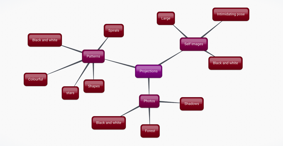
This is a mind map to show how I will aim to go about creating images for projections as there are many possible ways I could go about this. This mind map makes sure that I am prepared for the topic and that I know what I am doing.
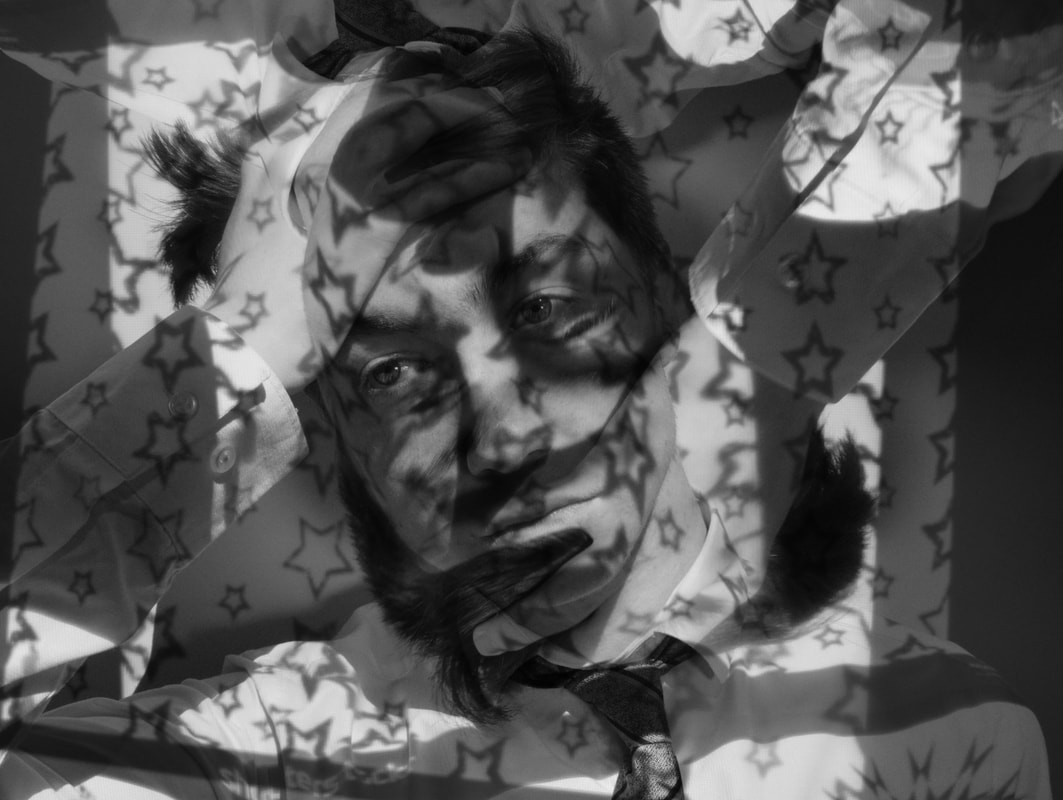
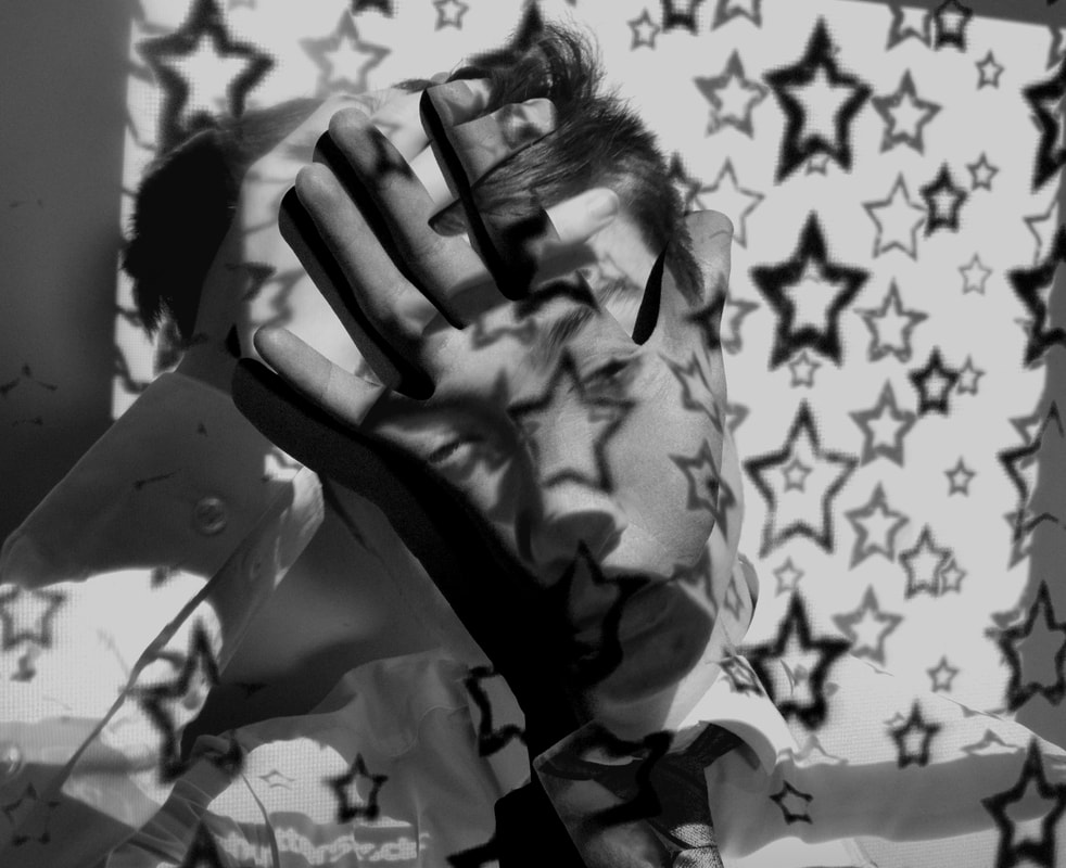
My Own Work using Projections
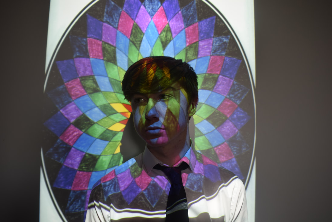
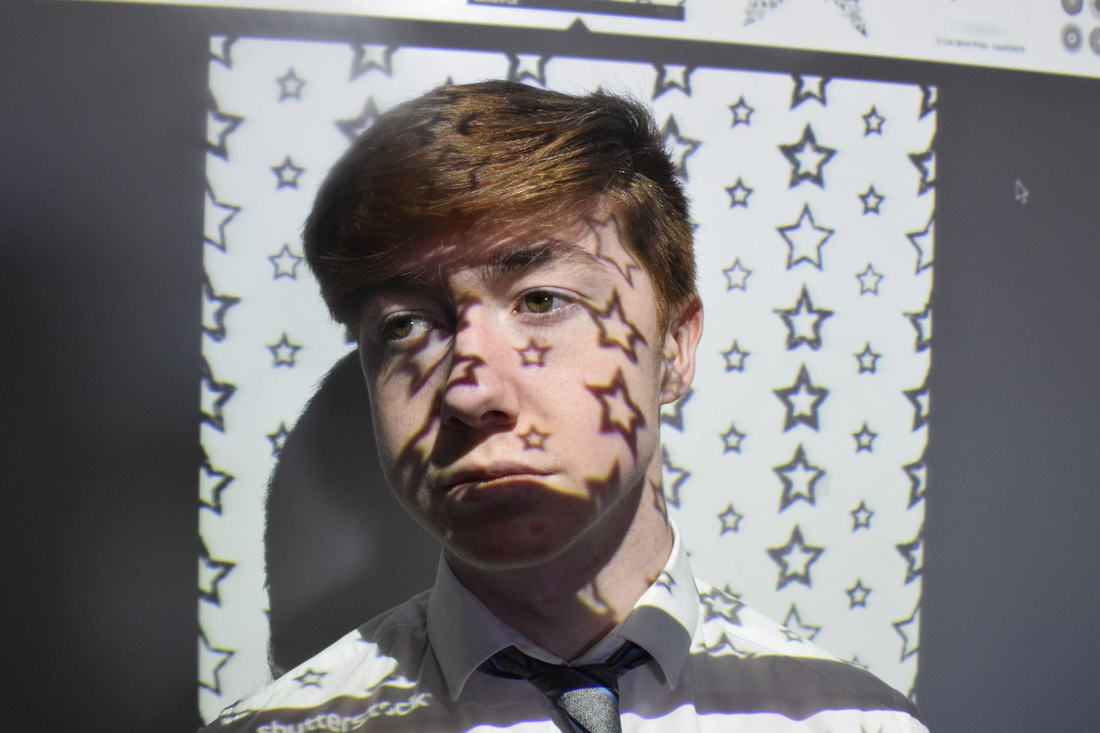
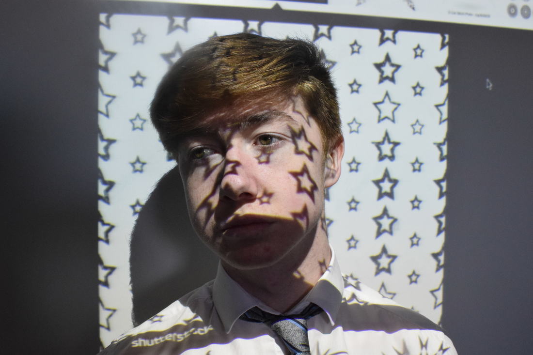
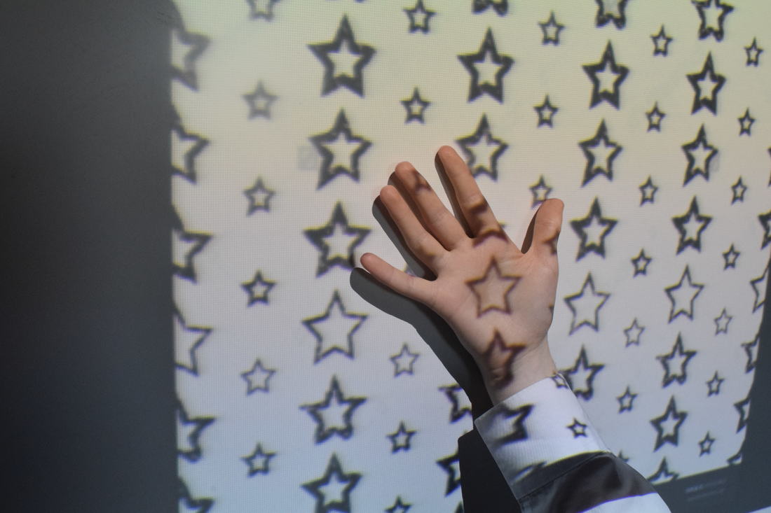
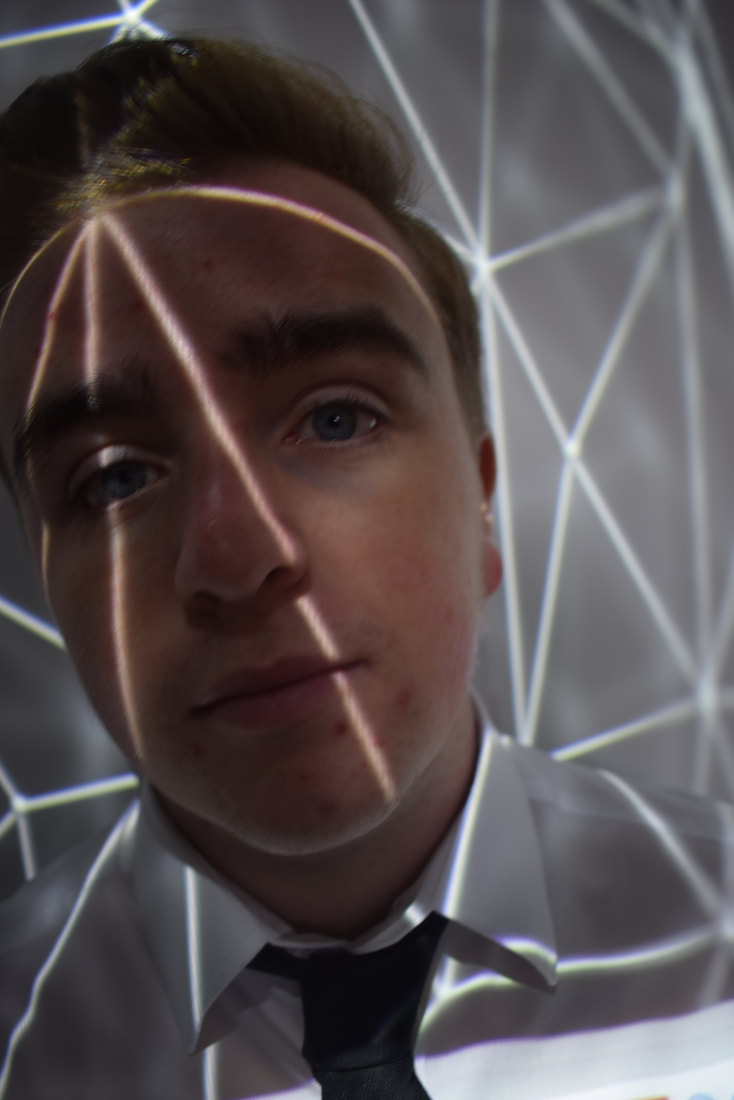
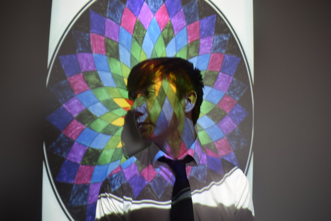
Here are my initial images for projections and I believe with a bit of crop and editing, these images can be really successful. There are many things that I can do with these images from blending two together to turning them black and white or even using the masking tool to create some cool effects.
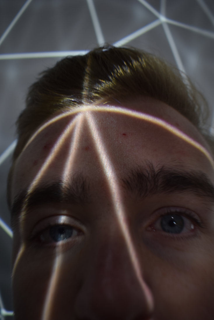
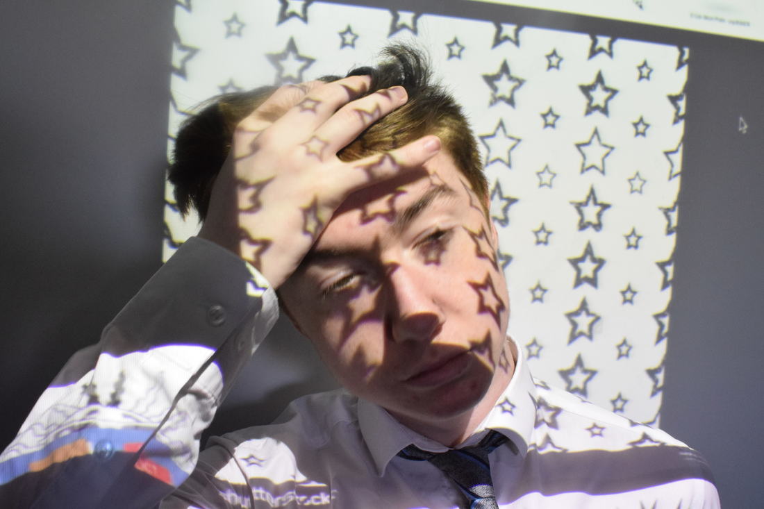
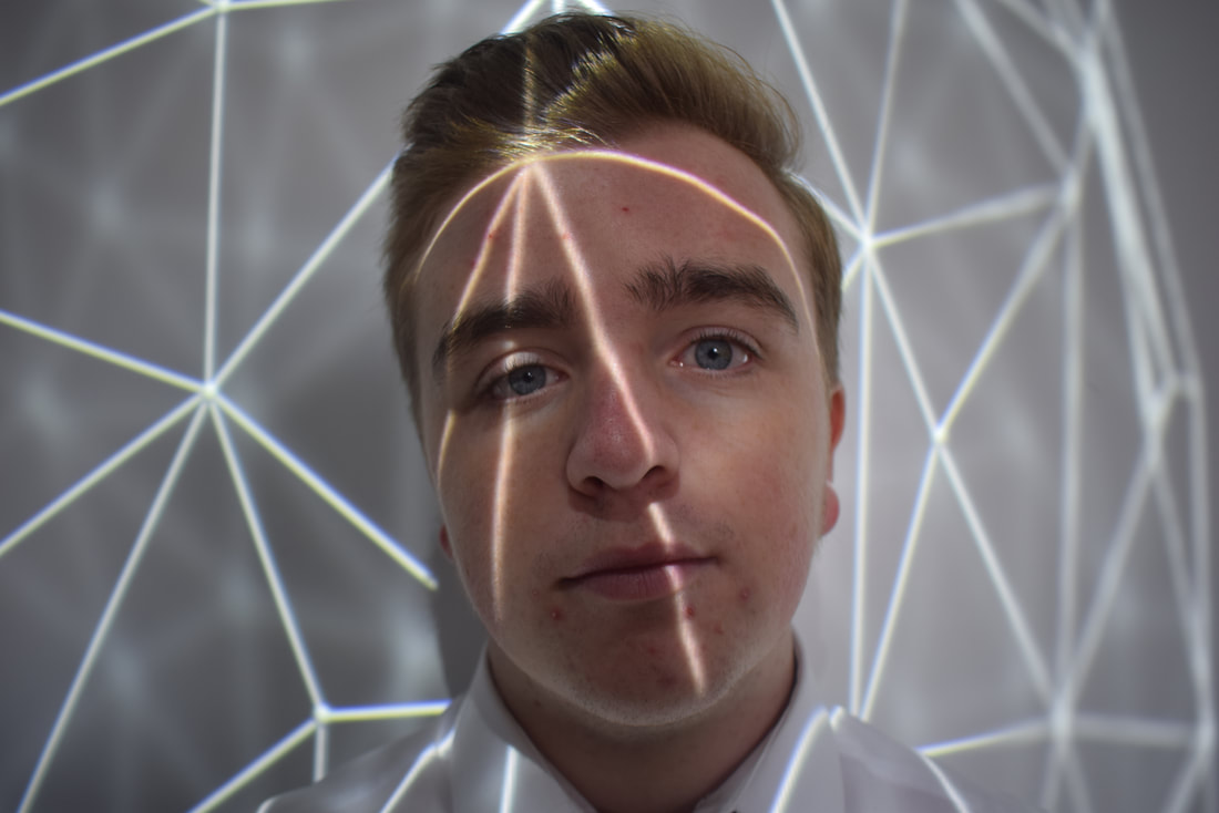
Edited work using Photoshop
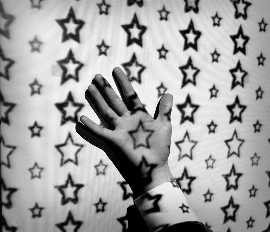
Here are some of many final projection images and I have chosen to do varies different photoshop techniques to create many different styles and effects that have made the images successful through projections. I have used many techniques such as turning the images black and white as I have done this in all of these images. In the first two images I have blended two images together to create a weird but effective looking style. on the third image I have just changed the levels and contrast on the image to make in more detailed in the lighting. In the final image I have used the circle marquee tool and masked the black and white multiple times and with different sizes.
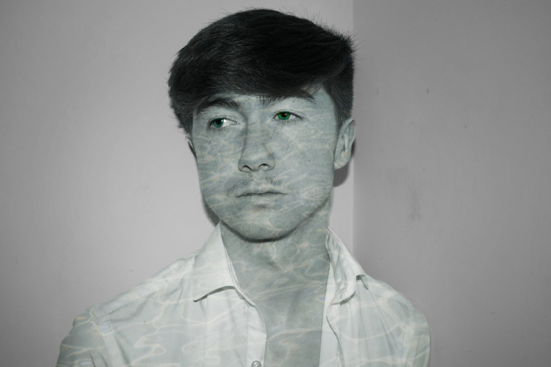
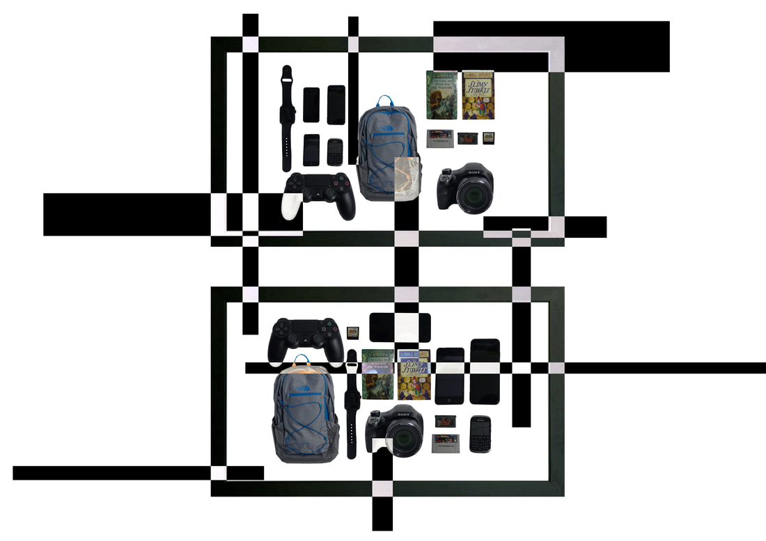
Identity - An autobiographical photographic study
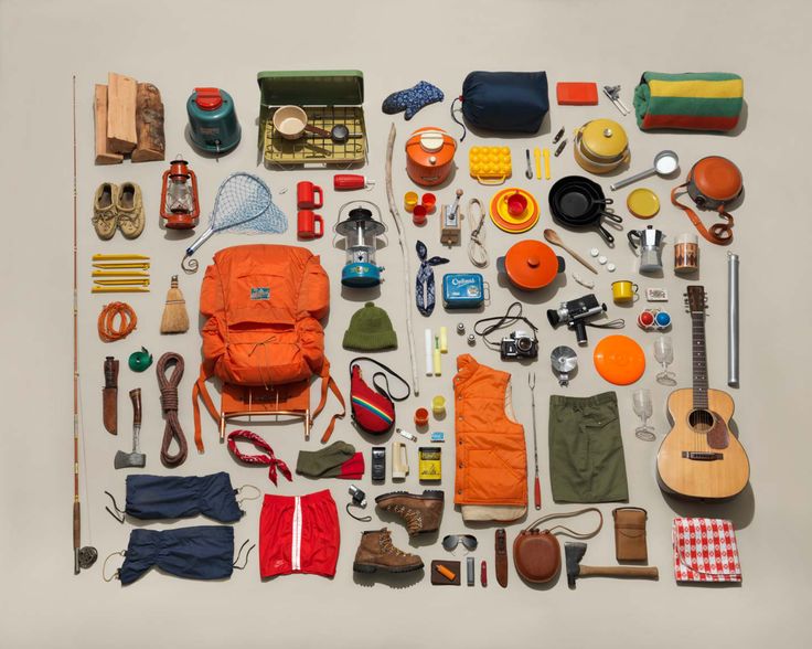
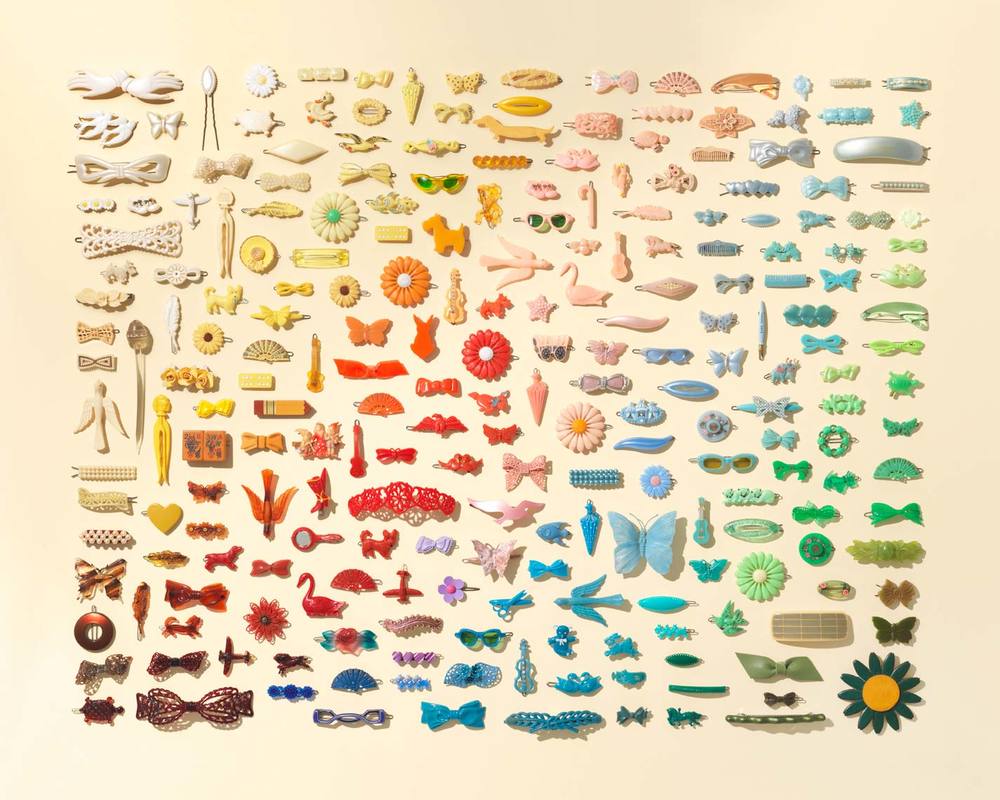
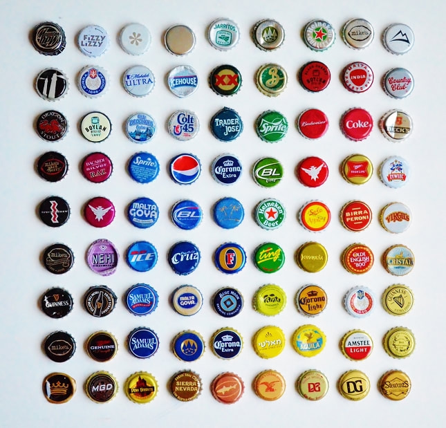
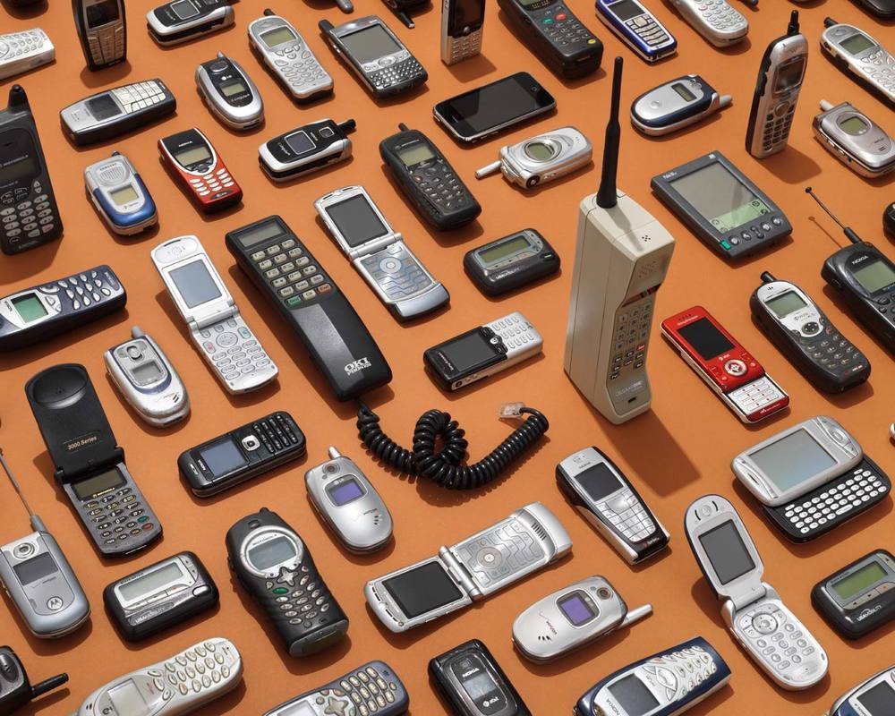
Here is my research to the topic of autobiographical photographic study which I have chose to focus on collections. I have focused on collections as they can link back to identity photography as depending on what the objects are in the image means how the image can link to identity. For my work I will use the idea of collections and use my own personal images and as they are personal to me, it will show my identity as a personal.
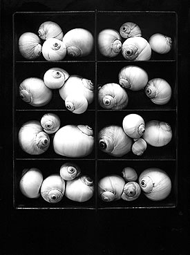
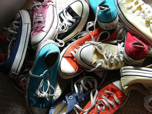
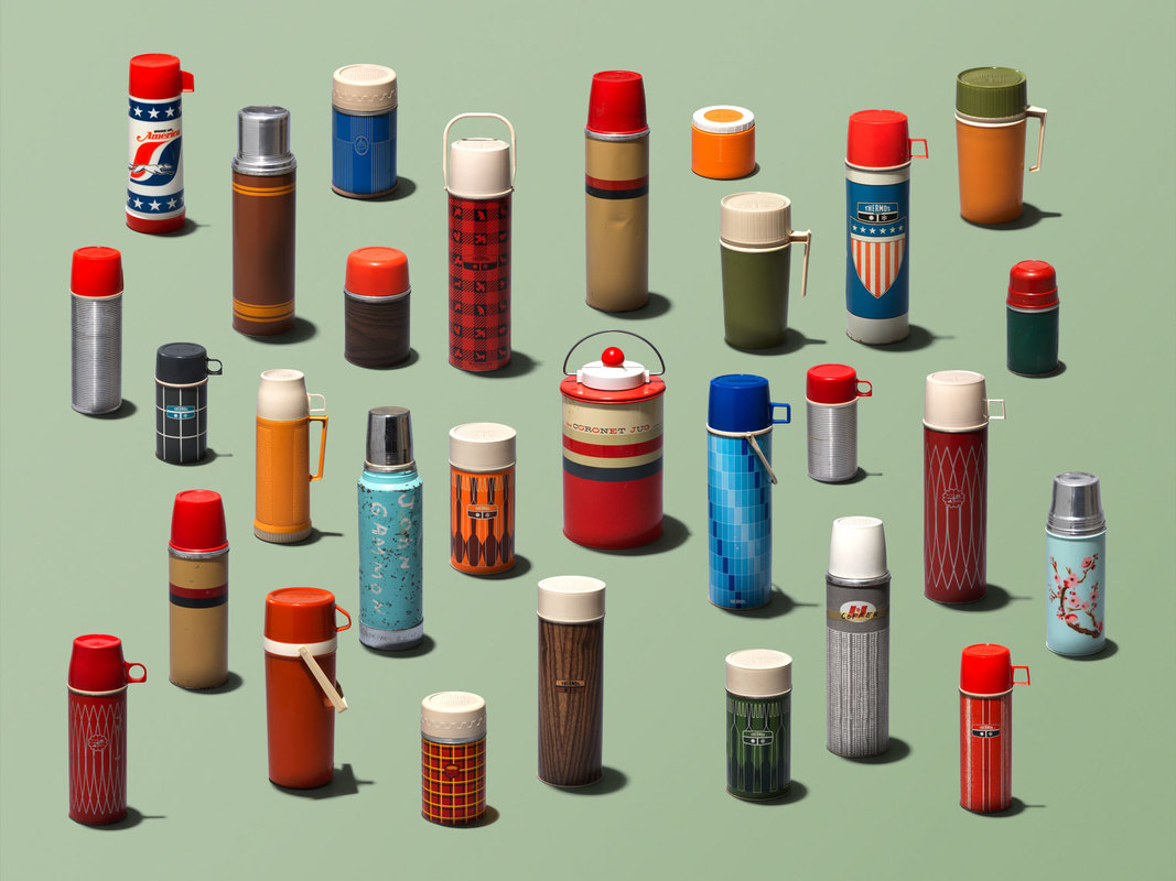
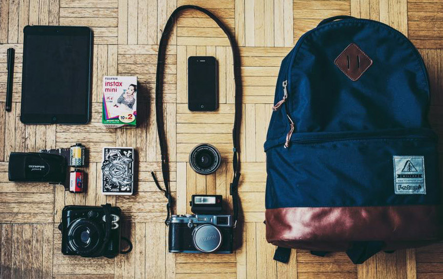
Jim Golden
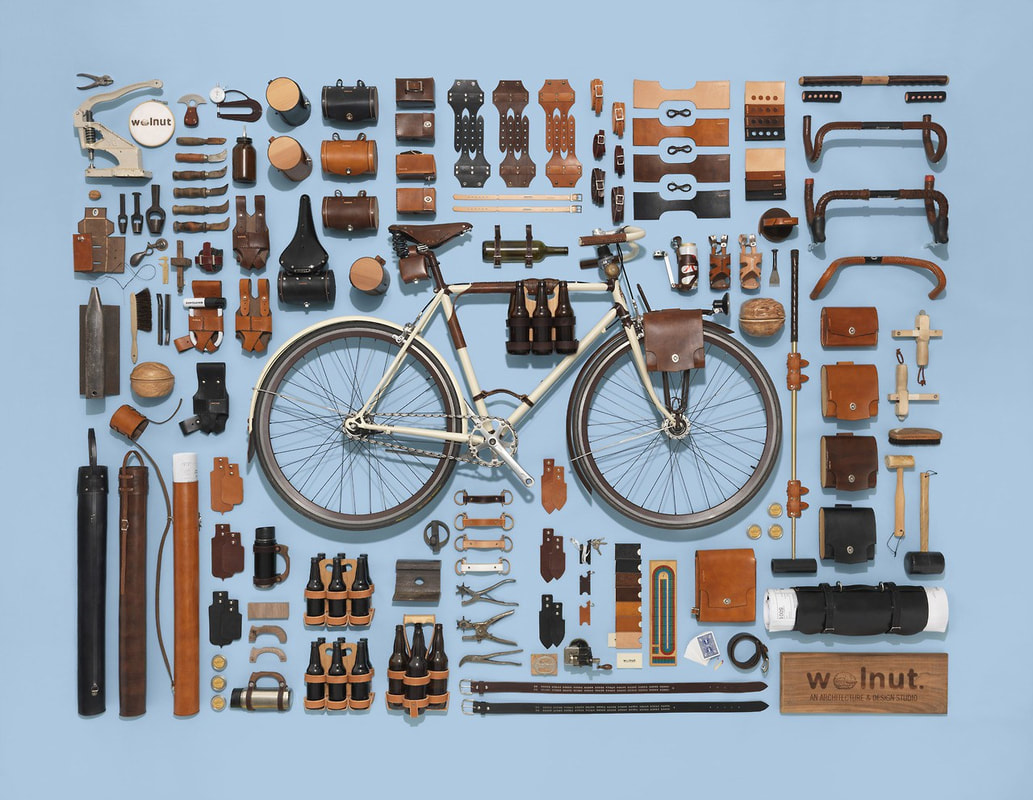
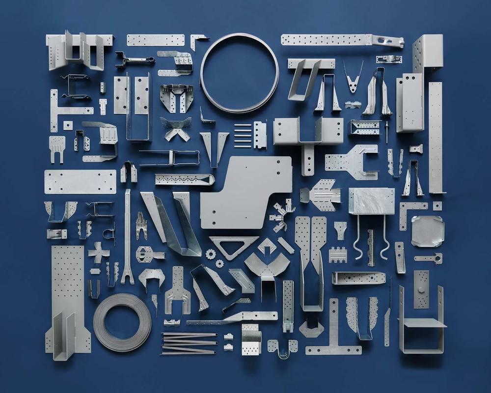
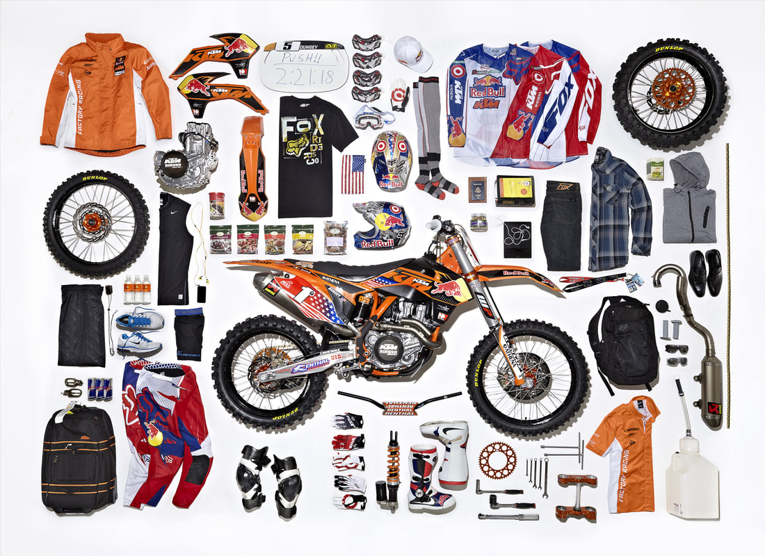
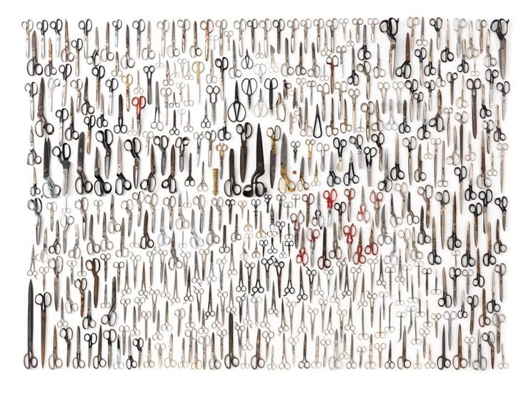
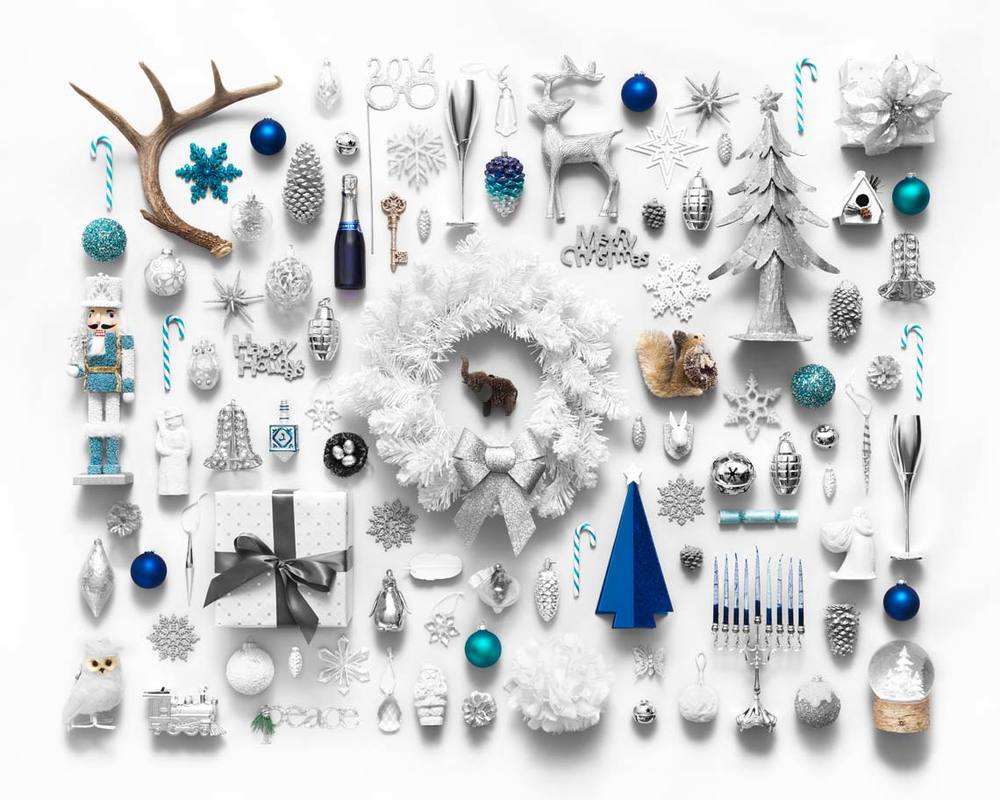
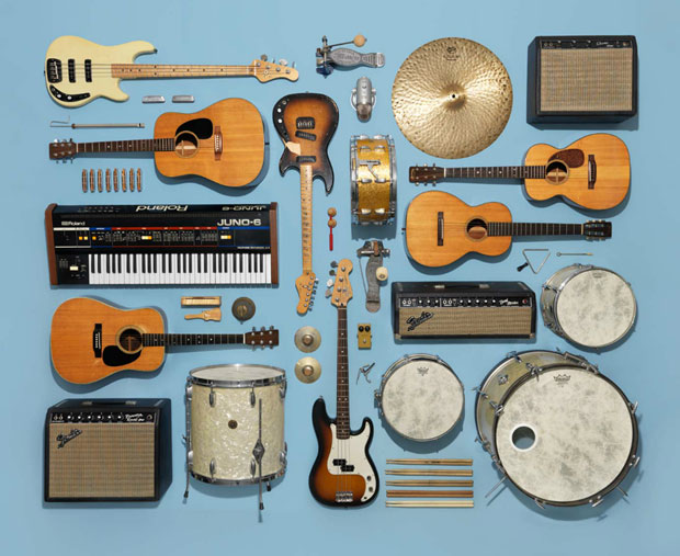
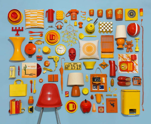
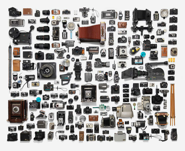
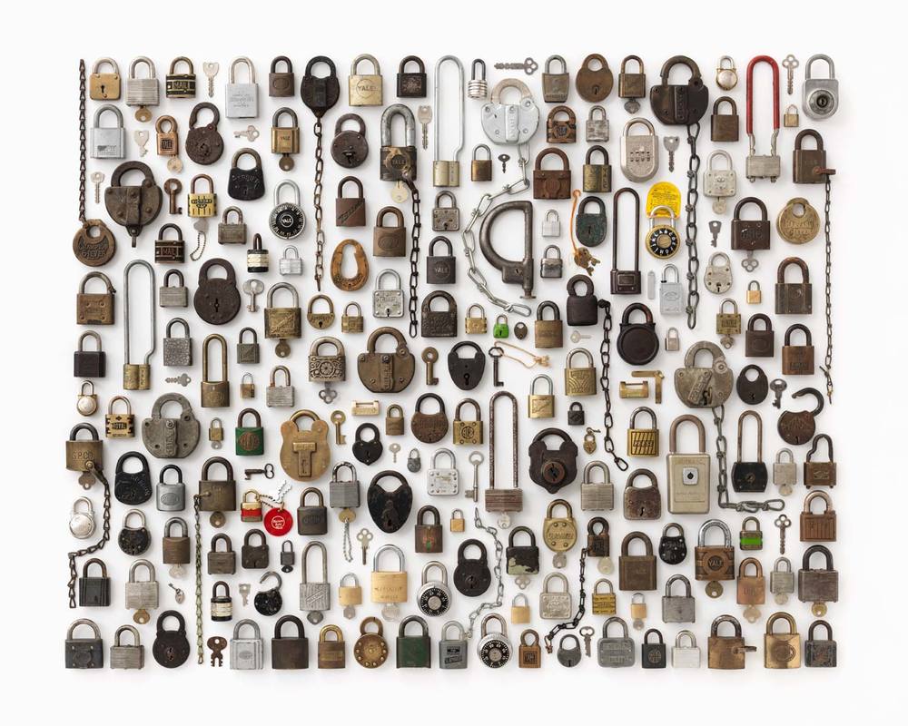
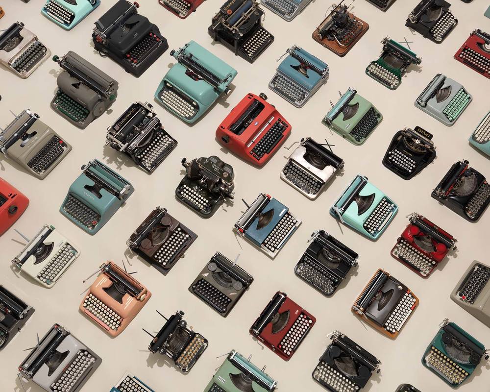
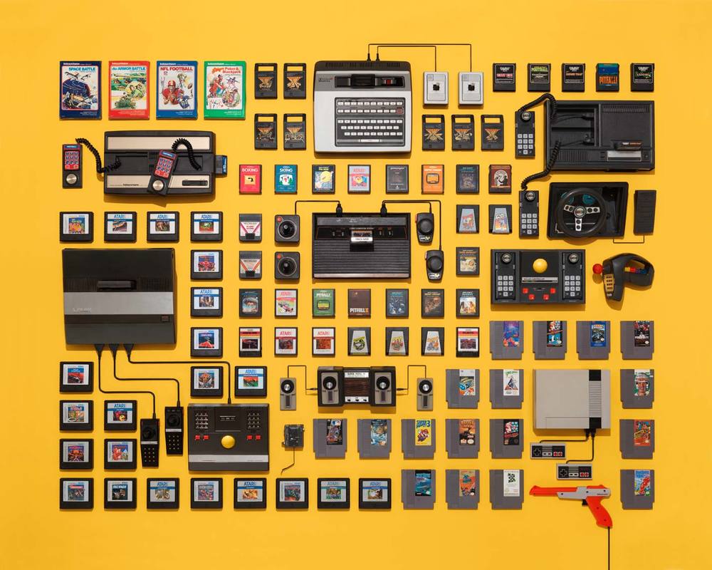
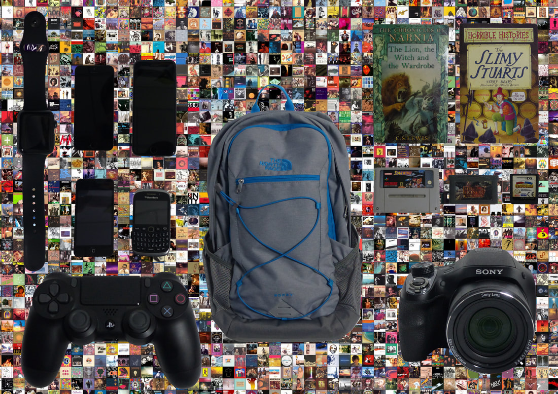
Jim Golden is a photographer who specialises in still life and products. Jim’s passion is to show viewers what objects are like and not to show any false sense of beauty. Jim first learned his craft in the fast-paced New York advertising world, where he spent several years working as a high-end retoucher and visual effects specialist. In 2000, with a sense of manifest destiny, he packed his bags and headed to Portland. Jim is a consummate professional with 20 years of industry experience. His easy-going attitude and sense of humour ensure that clients not only receive top-quality work, but also enjoy the process. As part of Jim’s work with still life, he has done a project on collections which involves using personal items and placing them in a certain way. These items are either similar or a linked in some way. Jim likes to set up the items in a very organised way and allowing spaces between each item and letting the background be shown in the photograph. This adds a very professional look to his work. Jim Golden has worked from many famous brands due to his work being seen as exceptional. Companies that Jim has worked for are Wieden + Kennedy, McKinney, Haworth, Clorox, Simpson Strong-Tie, Soy Vay, New Seasons, Weight Watchers, Yahoo!, Sherwin Williams, Hoka One One, Reebok, Nike, Jordan, Adidas, Keen, Kinfolk, Field & Stream, Outside, Money, Sunset and Audubon Society. This would range of clients show how well known he is in the world and that his quality is deserved. This is why I have took inspiration from him and will hope to do work in a similar style of him.
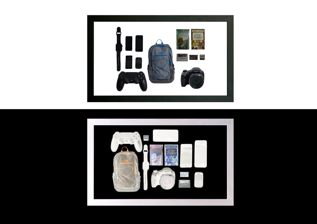
I have been able to develop my work and improve on it by making the photographs have more detail in the form of more personal items. I have also developed on my first piece of work by changing the background from white as white can make the photographs look plain. Instead I have used different colours and textures to make my work more of my own and have my style in it.
I have been able to develop my work and improve on it by making the photographs have more detail in the form of more personal items. I have also developed on my first piece of work by changing the background from white as white can make the photographs look plain. Instead I have used different colours and textures to make my work more of my own and have my style in it.
Where I will go with Collections
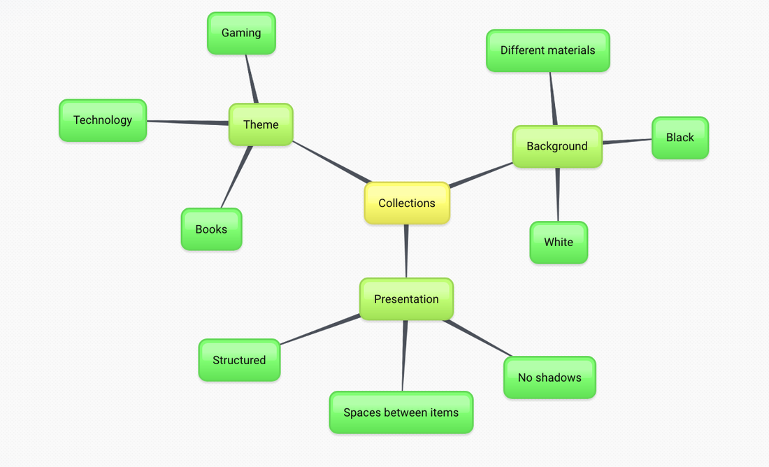
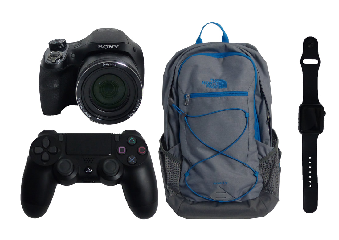
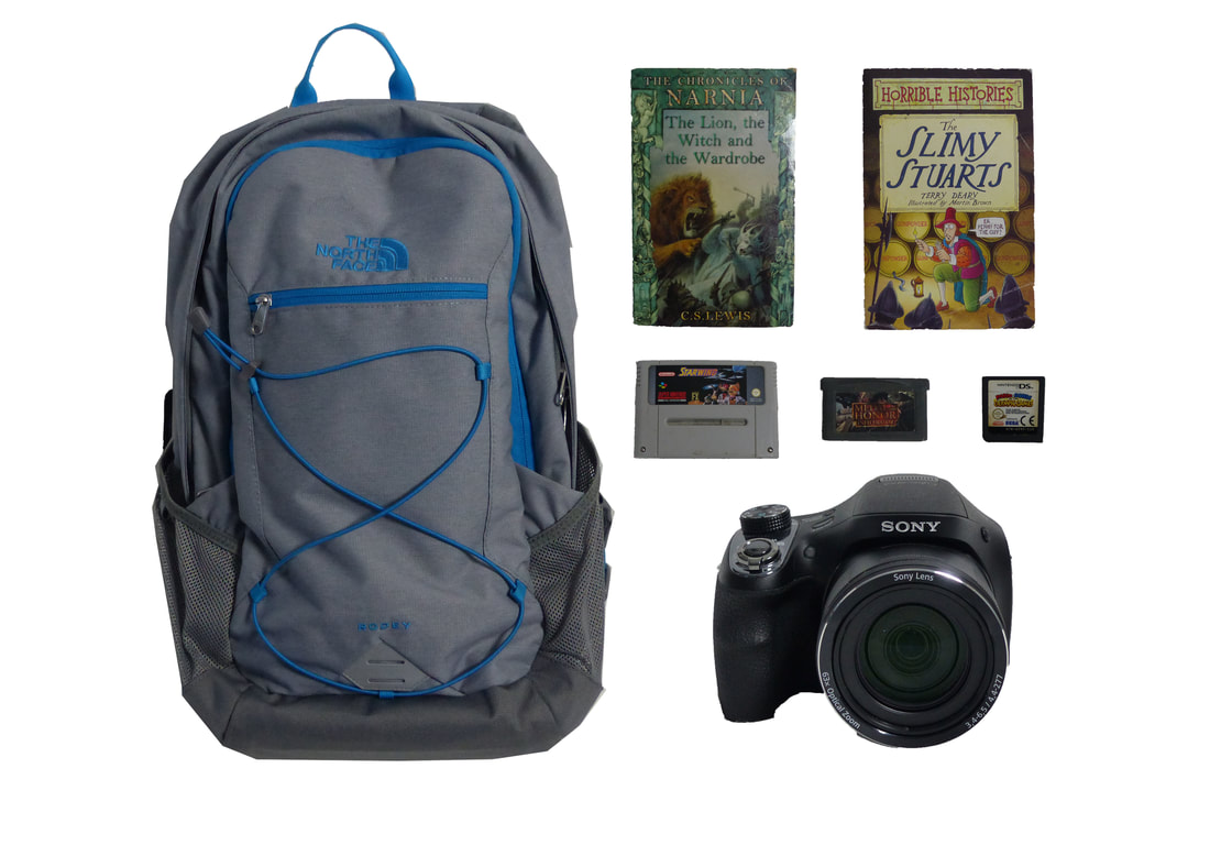
Here is a mind map for the plan of actions for my work as I will look a different themes such as gaming which will include, games, controllers, consoles... I will look at other themes such as technology and books. technology will include phones, tablets, watches, laptops camera ... and books will involve varies different reading materials such as books, magazines, tablets and phones with text on, comics, newspaper. I will also present these images carefully and structure the items with equal spacing and make sure not to have any shadows from the objects. There is also many different backgrounds that I can use and many different material which will create successful images.
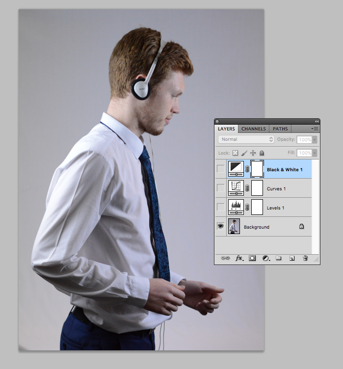
Screenshots of Progress

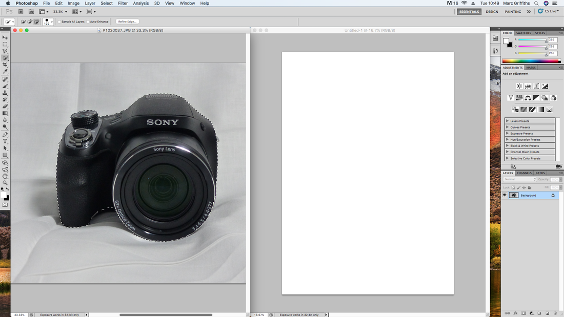
Here is the initial photograph I used.

I selected the quick selection tool.
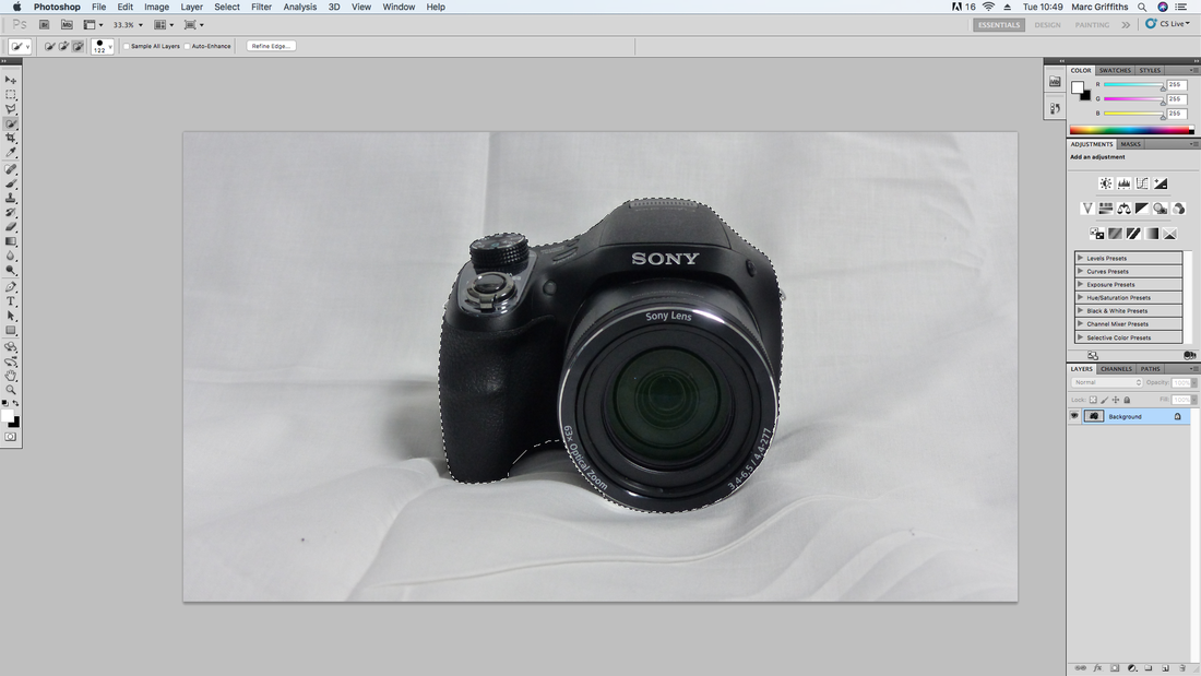
Using the quick selection tool, I have outlined the camera.
I have opened a blank page to which I will drag the outlined camera onto it.
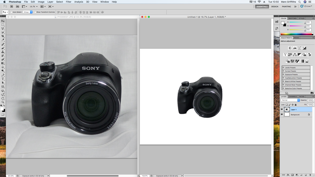
I have dragged the camera onto the blank page.
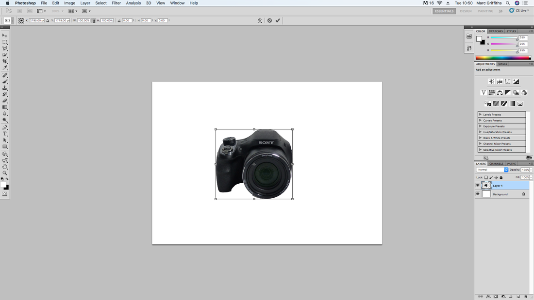
I have selected the transformation tool so that I can change the size of the image.
I have now adjusted the size of the image.
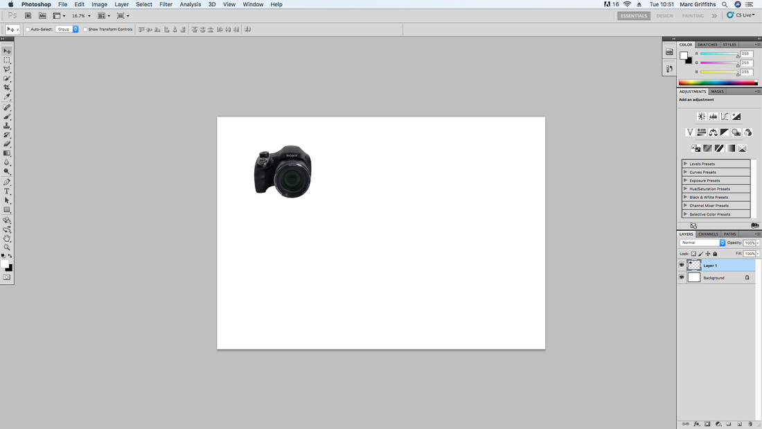
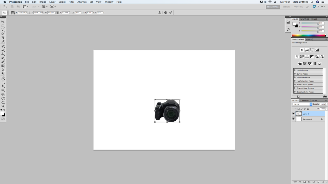
I have now placed the image in an area of the page that I think will work well.
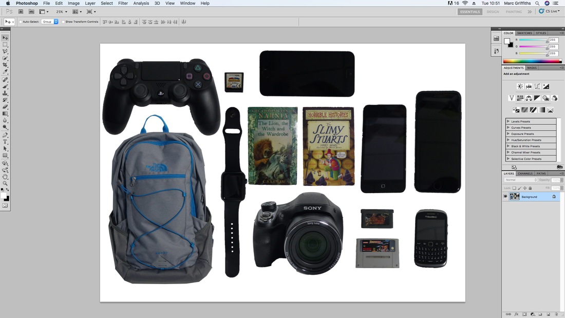
This is the finished work were I used the same techniques for different objects and combined them together.
This is a collection of screen shots switch shows my progress of how I got from my initial image to how I got to my final collection.
My Finished Work of Collections
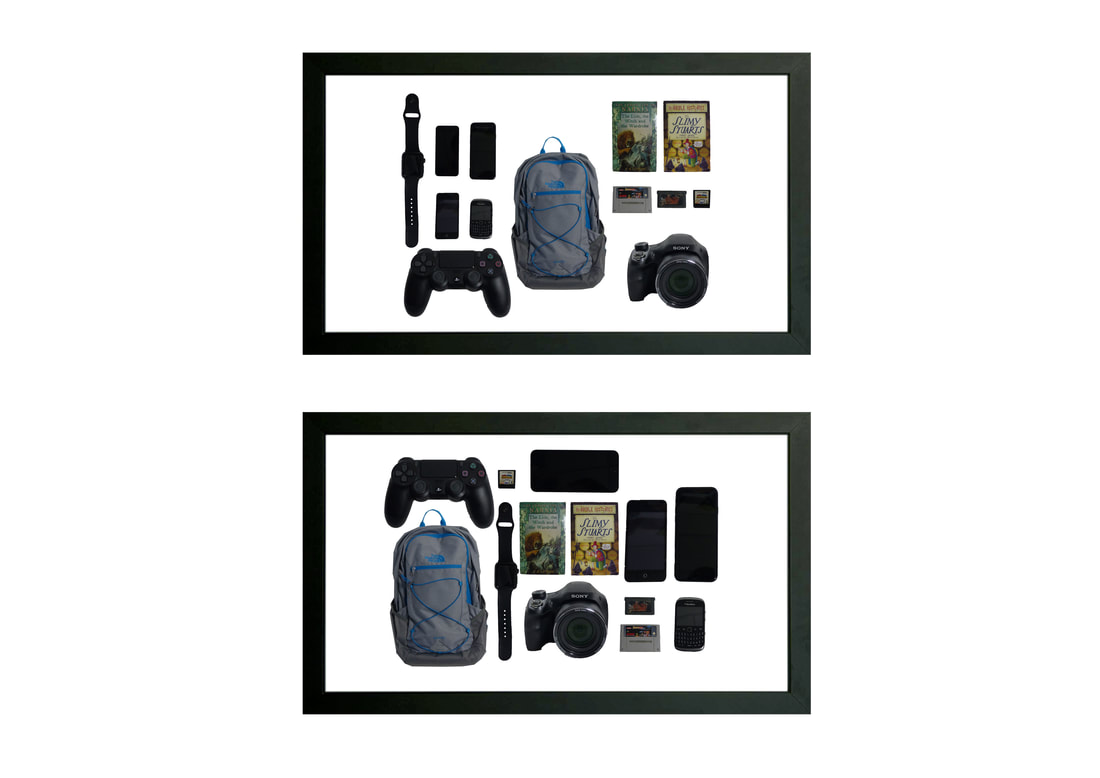
Here is my work that was inspired by the work of Jim Golden. I have used many different layouts to make sure that my work isn't too repetitive. I also used different backgrounds to make my work stand out from others and to shown my own style away from Jim Golden's.
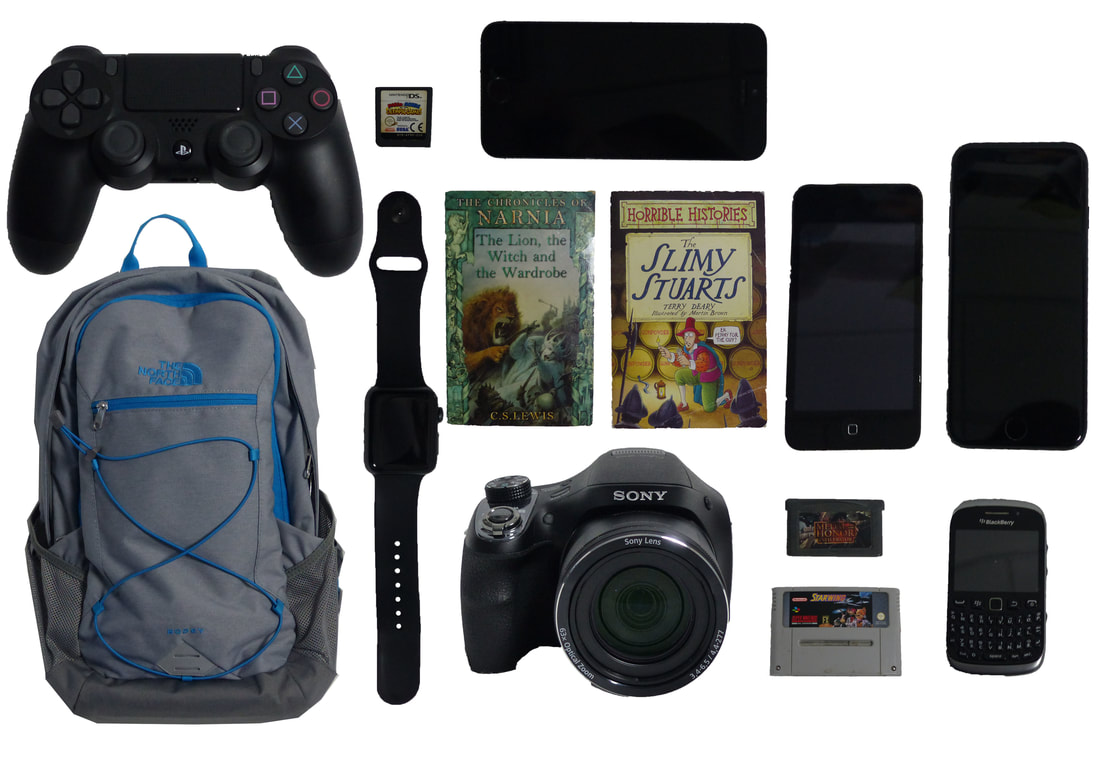
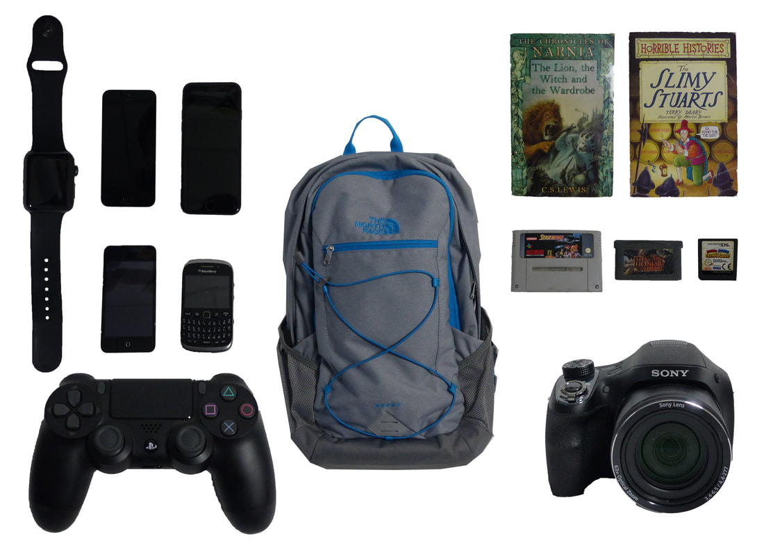
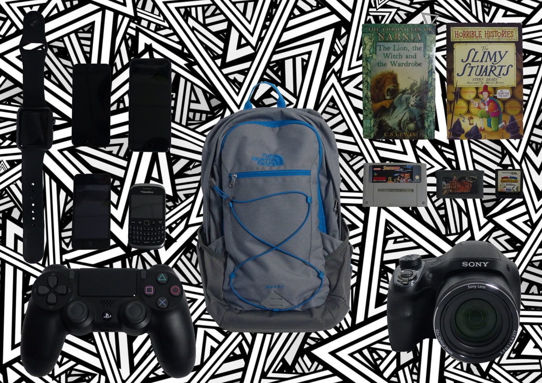
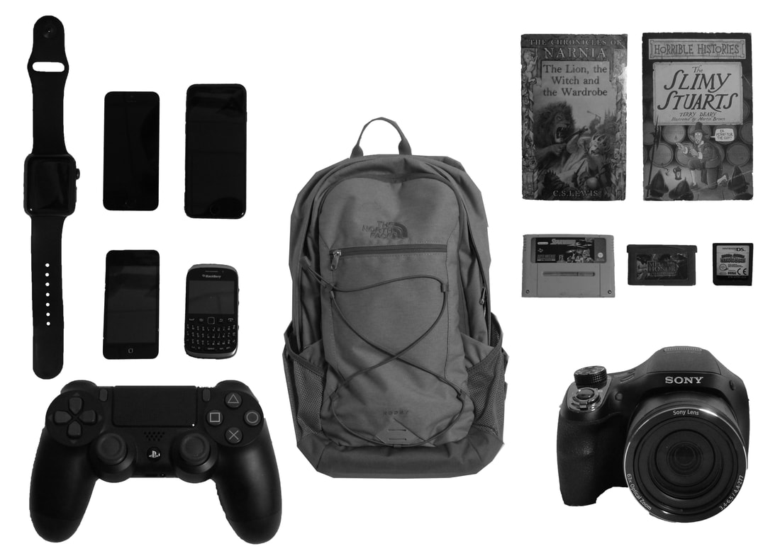
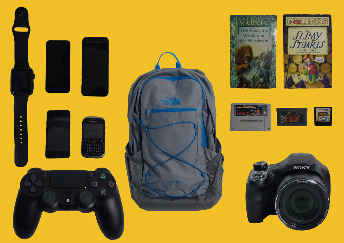
Here is the group of photos from my work that uses different backgrounds. Also on one image I used the black and white tool just to add a different look.
This is the work that I have produced during this project. I have taken many different types of images by placing the objects on the image which I believe are in a good format. I then thought that I could create an image which is successful using less items. I also decided to change the background to many different things such as, a different colour other than white, a pattern, a background from many different albums and also made one image black and white.
Picture Frame work
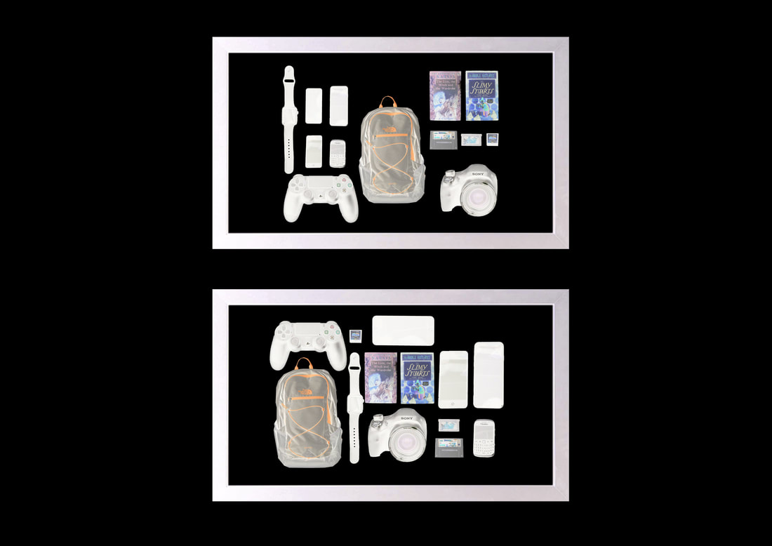
I tried to use many different techniques that make my work look more creative and to do this I have to use the invert tool along with the marquee tool to select certain areas. I used this to create different sizes of shapes to make my work look unusual.
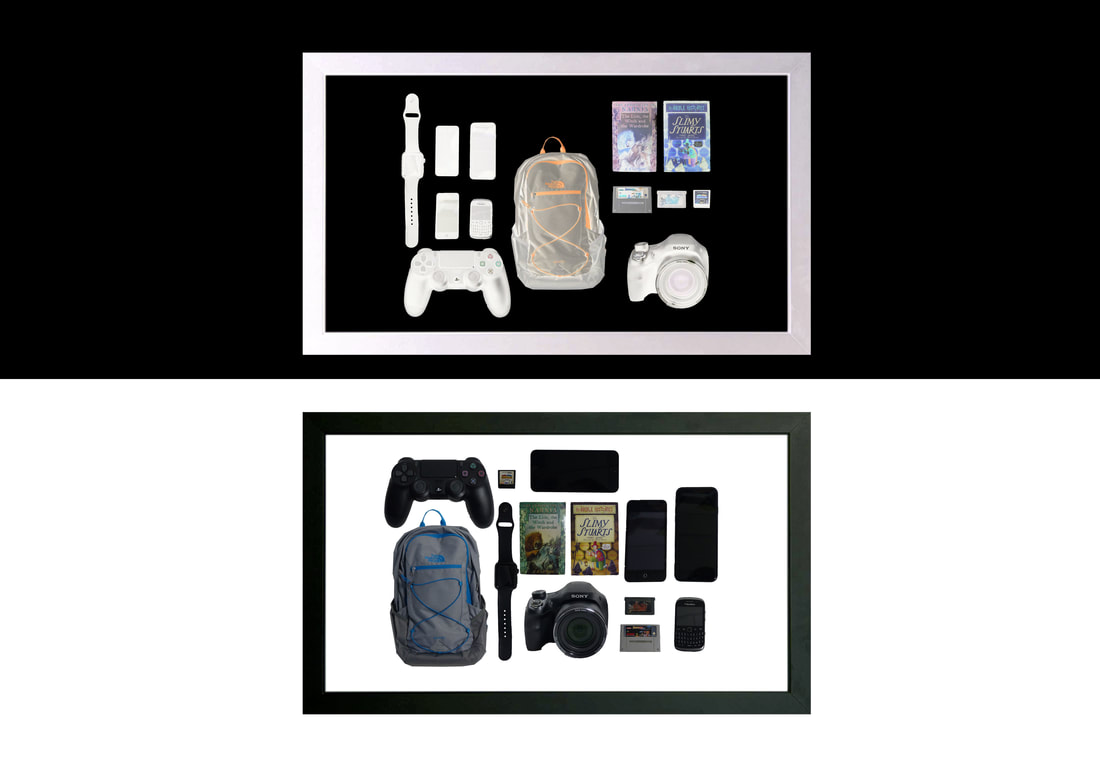
Here is a few images that I have put into a presentation style by putting them into picture frames which makes the image looks really professional. I have then inverted the colours on the image in varies ways which are displayed above.
Identity: A Photographic Study - My Final Presentation
Initial ideas
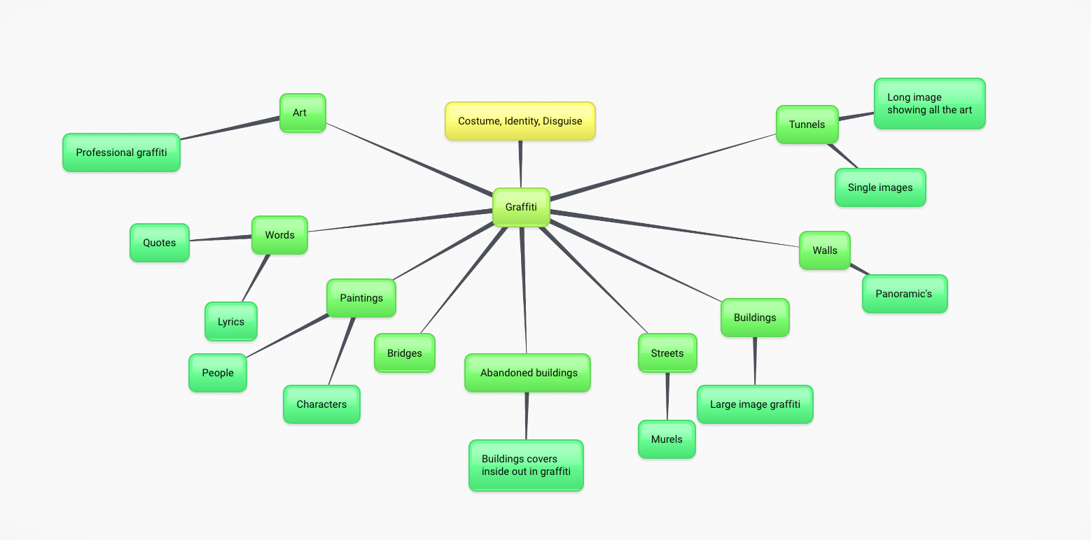
I have chose to do Graffiti as I think that there is many different ways I could take this. I believe that Graffiti links to identity as when people do graffiti, they do it with how then want to do it and their work can show the personality and identity.
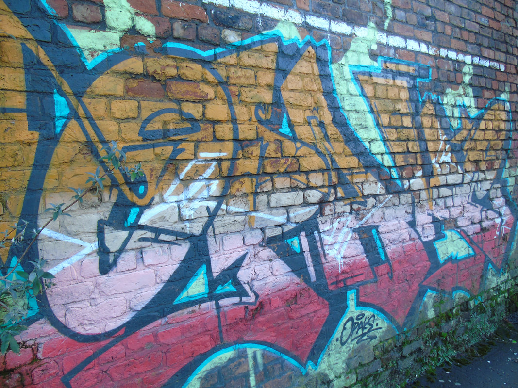
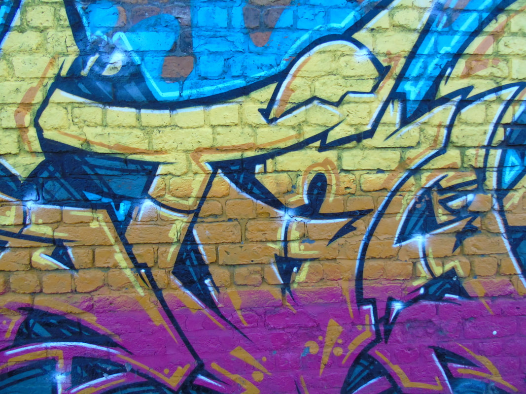
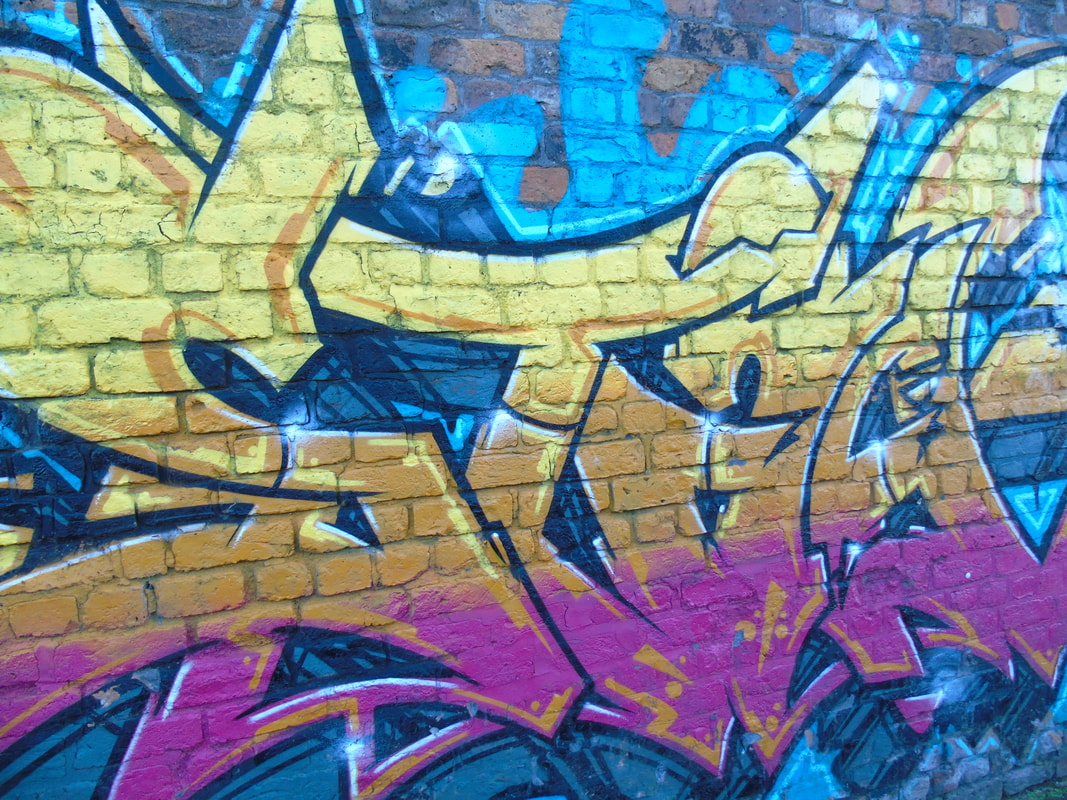
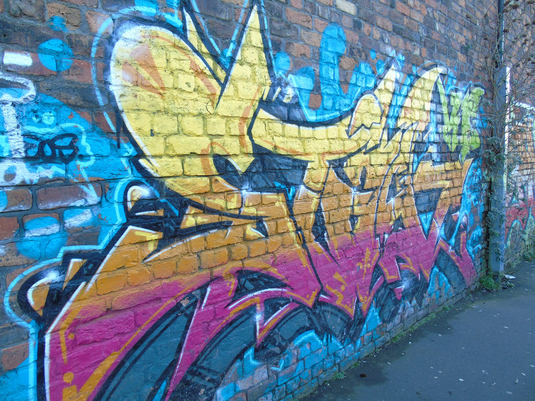
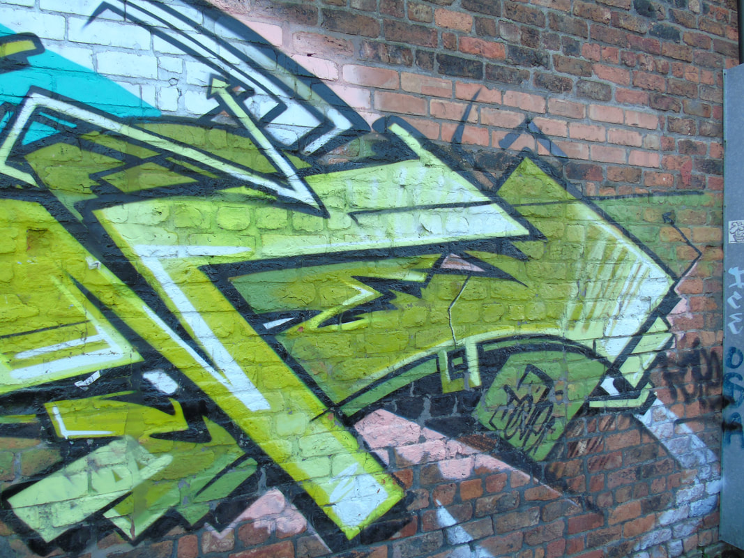
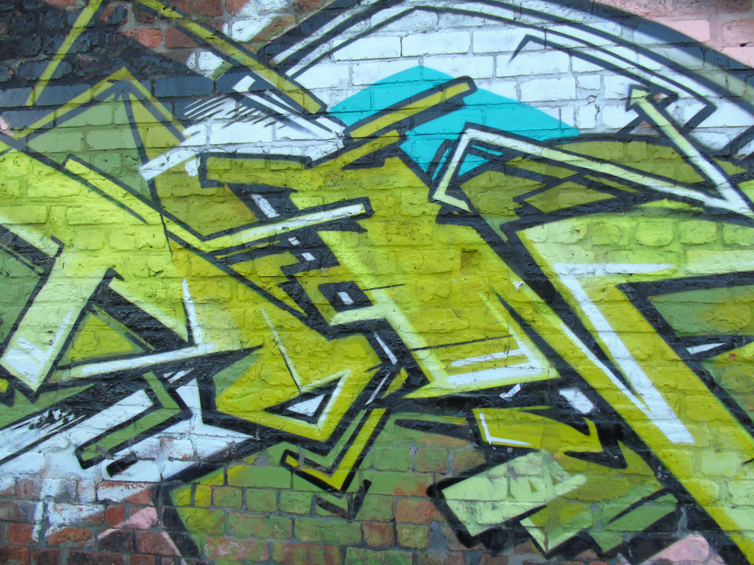
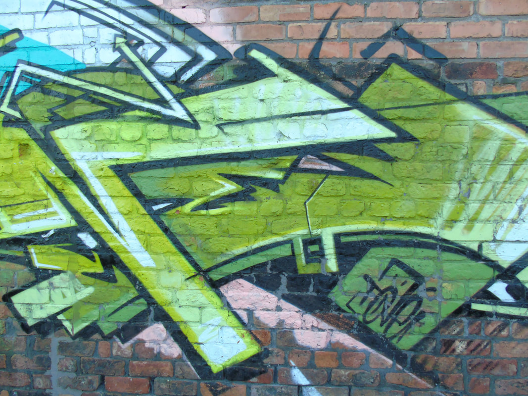
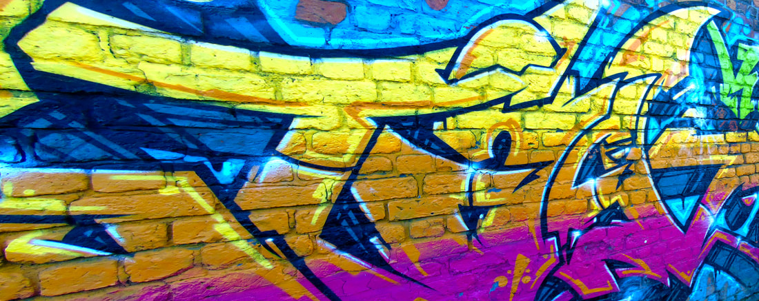
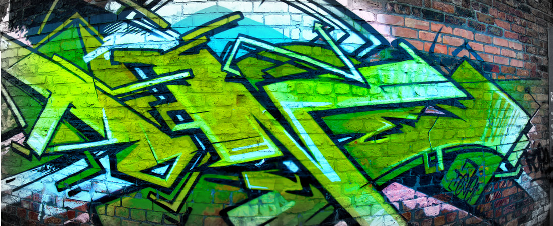
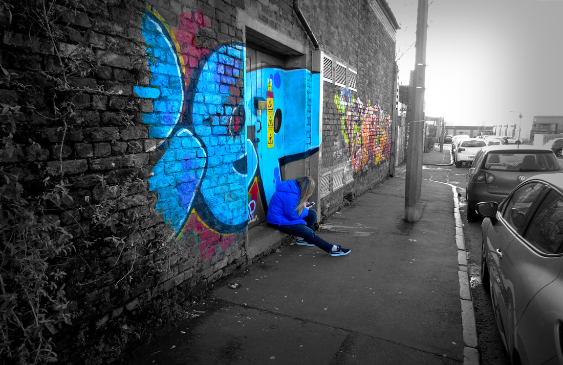
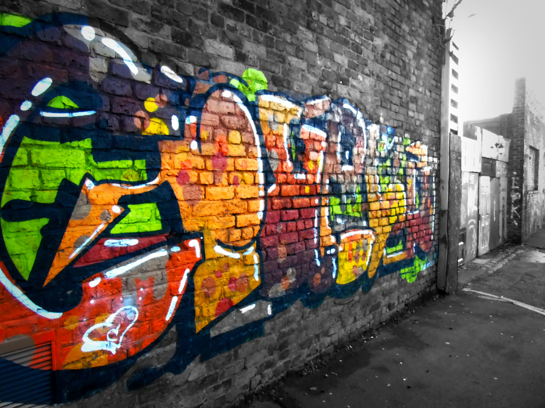
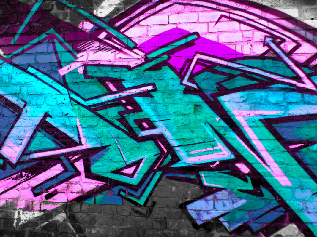
Research of Graffiti
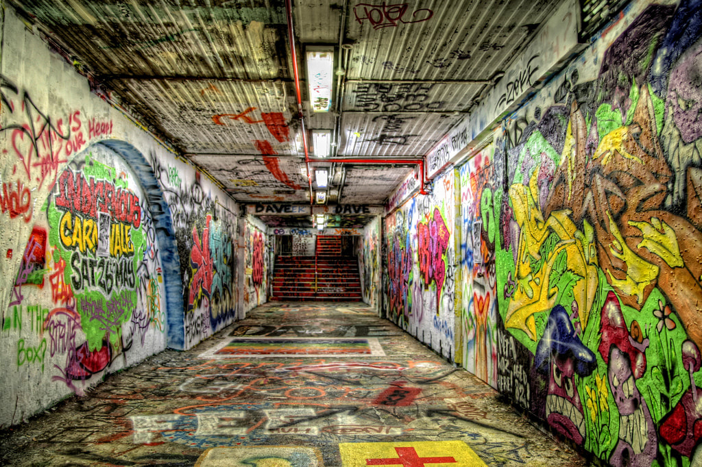
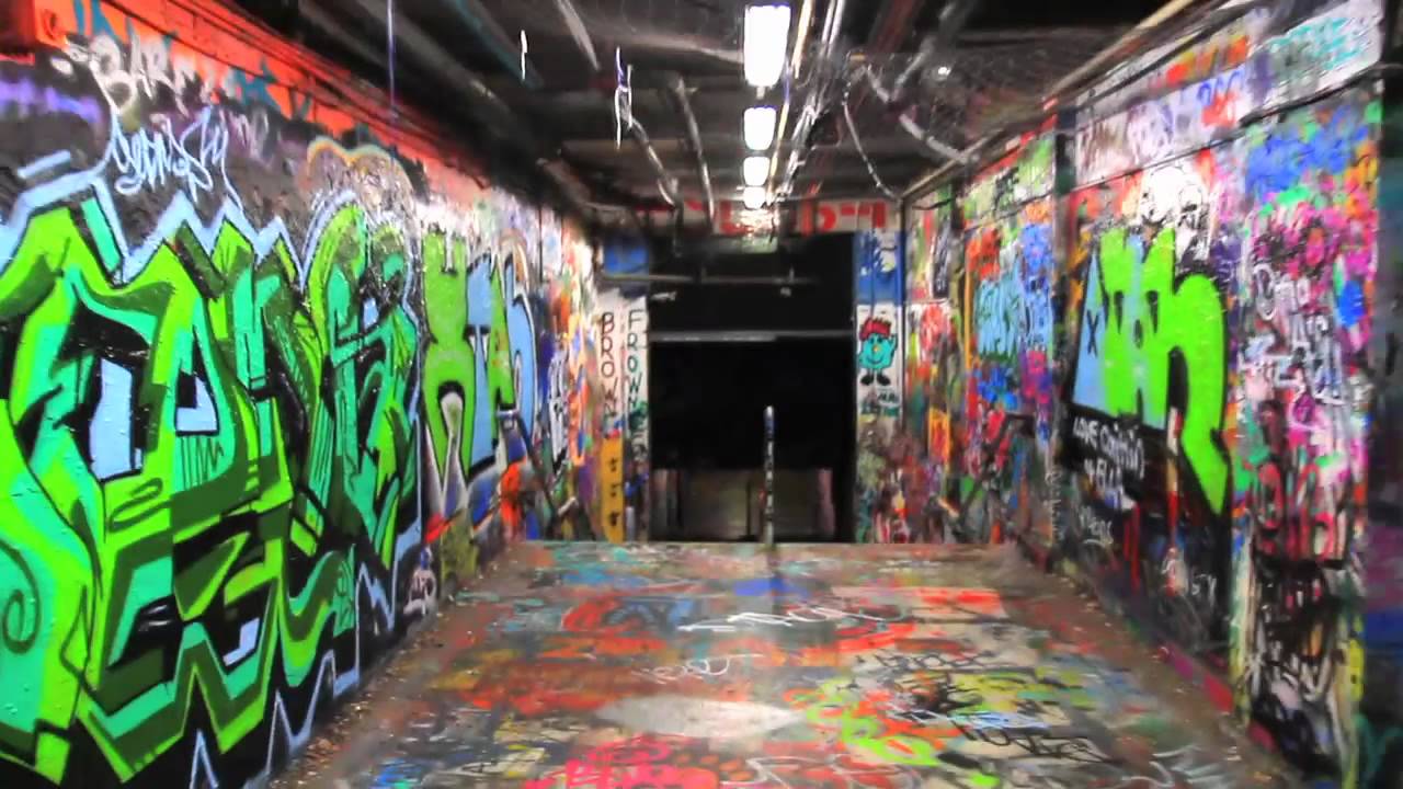
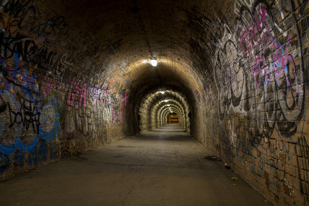
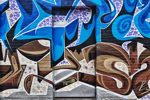
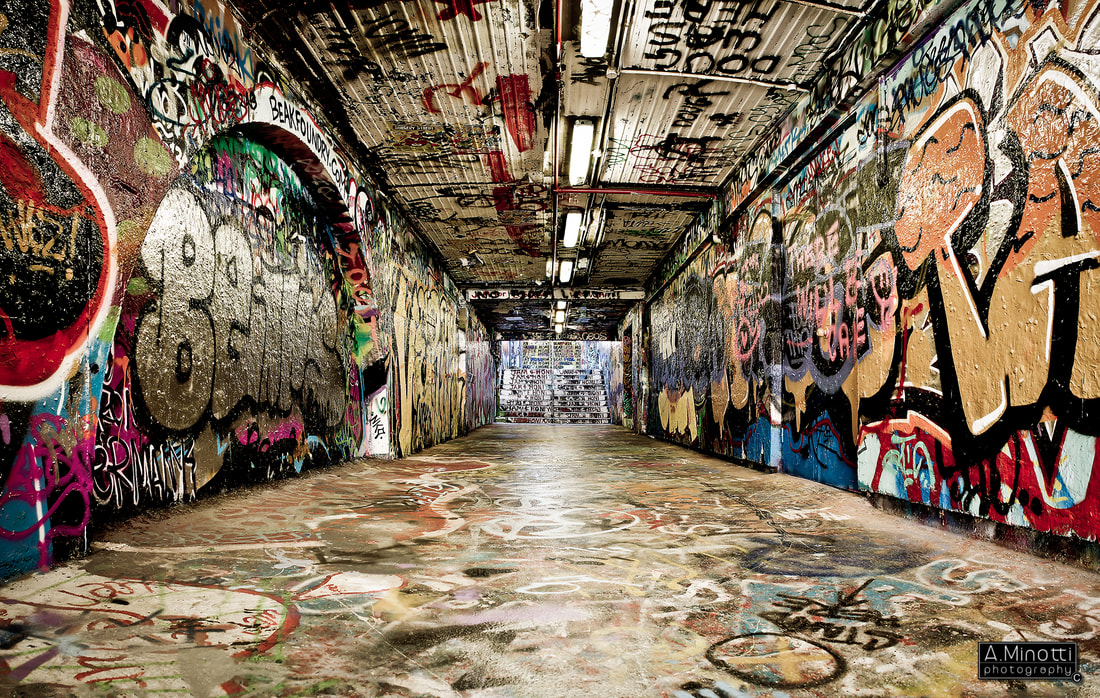
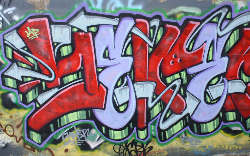
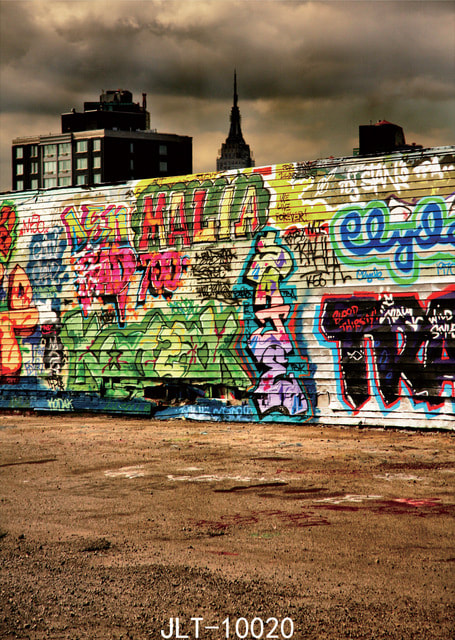
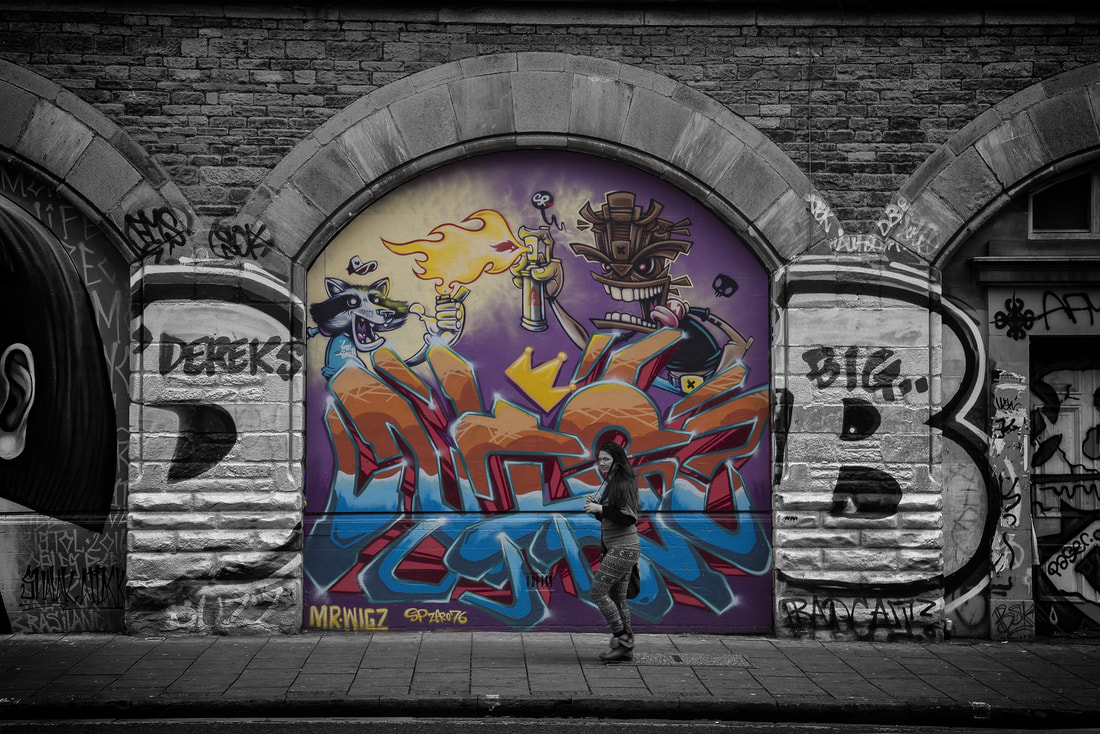
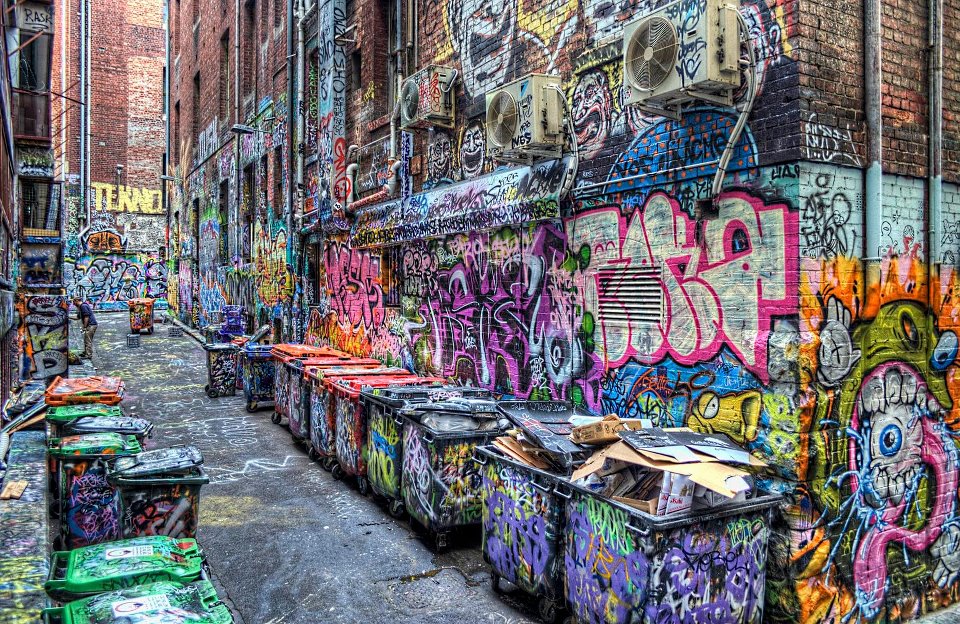
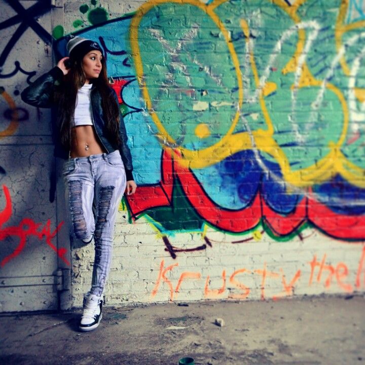
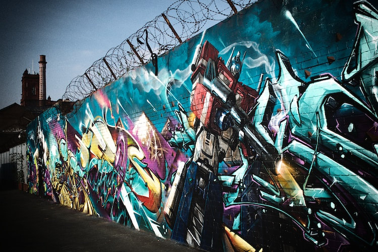
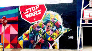
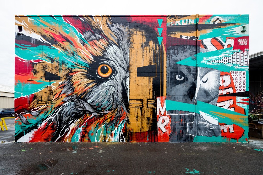
Here are some images that have inspired my work and I hope replicate these images but maybe put my own style of imaging onto them to show my photography skill.
David Russell
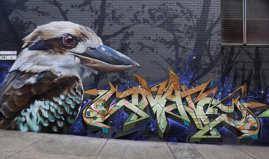
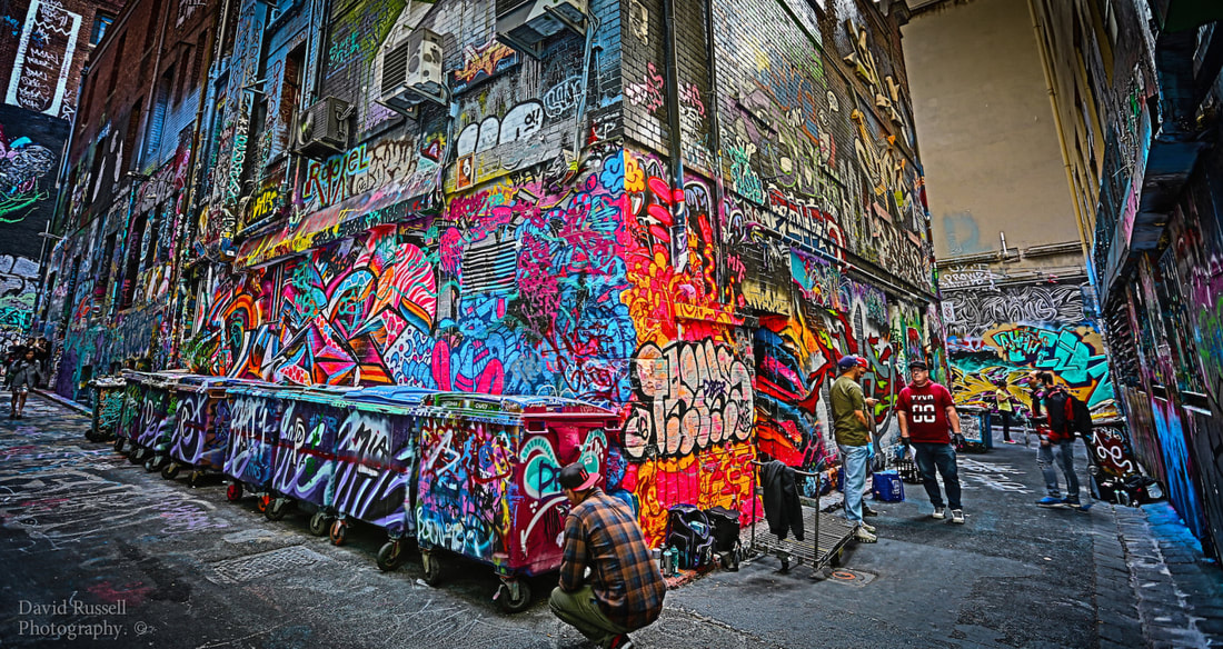
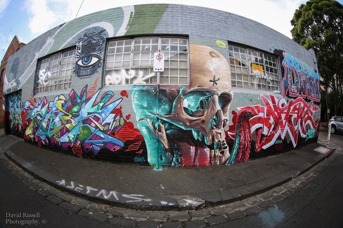
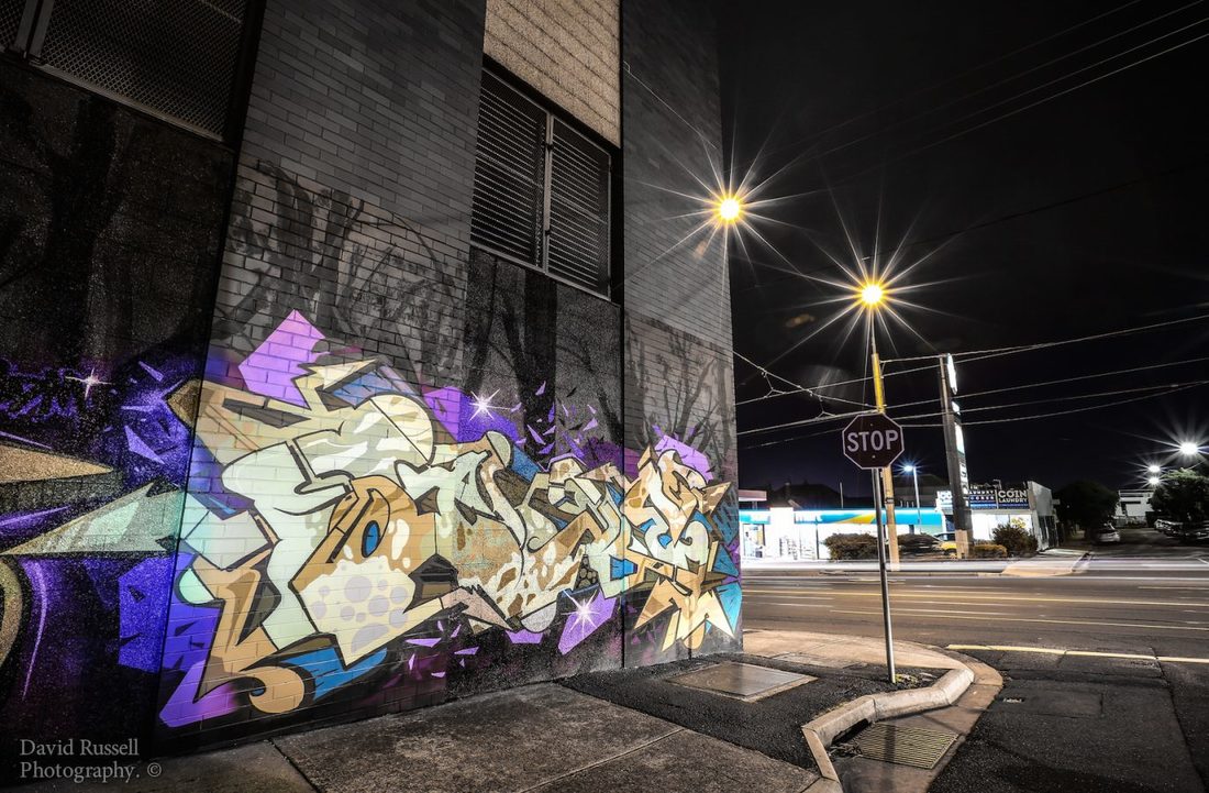
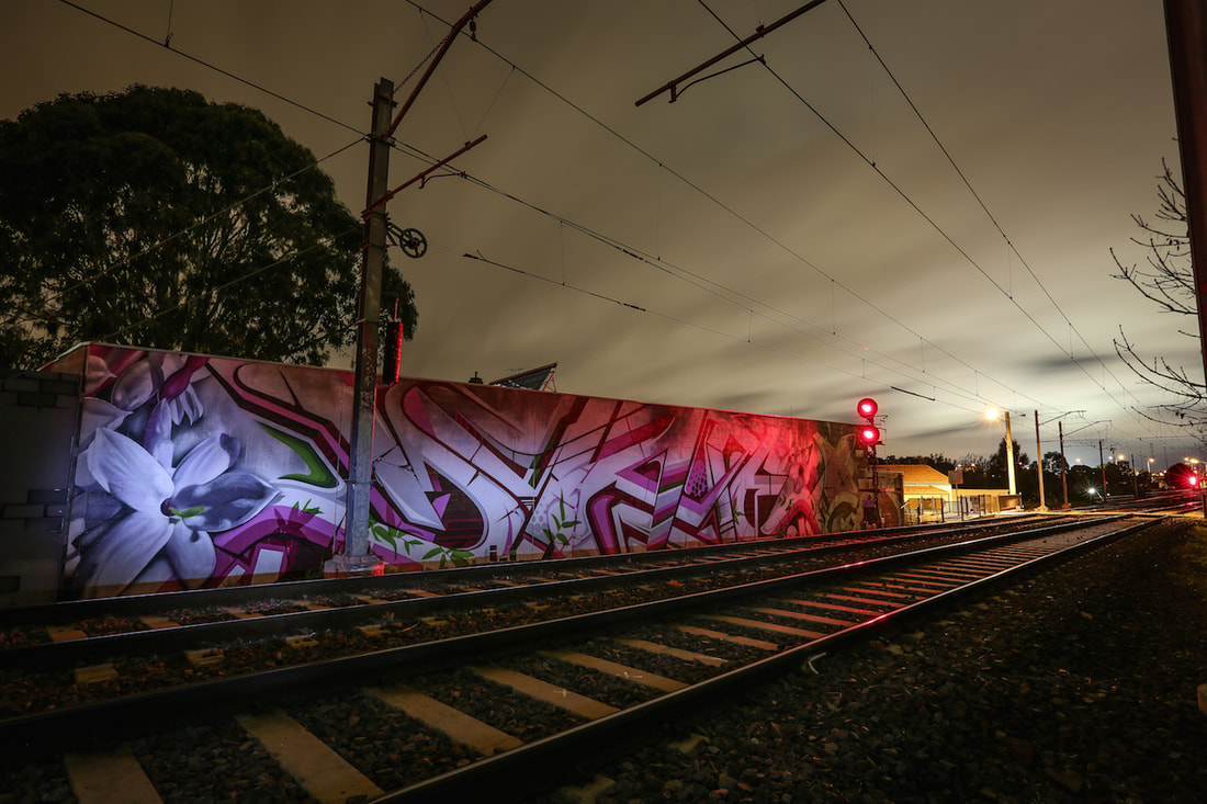
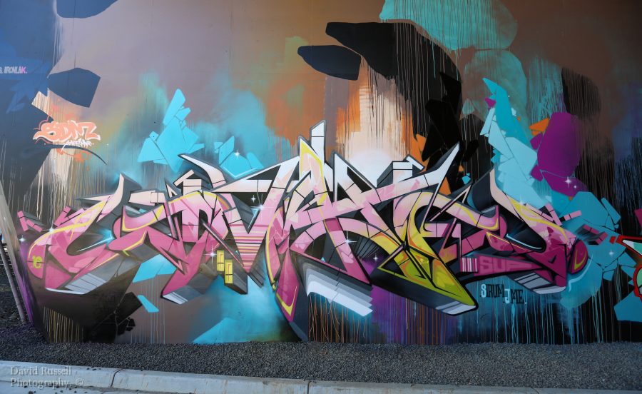
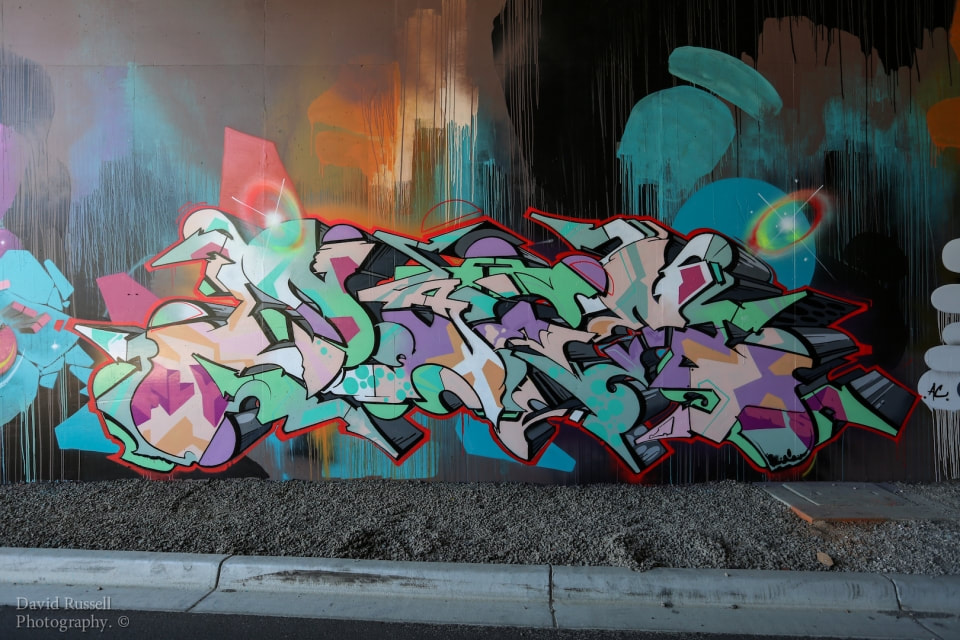
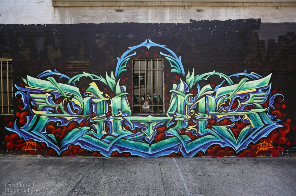
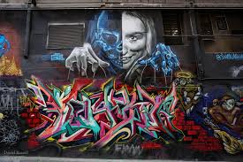
David Russell is a graffiti photographer and looks at how graffiti can show the identity of the artists as they show the artists passion and creativity. David Russell lives in Australia and does most of his work in his home town of Melbourne. David is an active member of the Invurt.com crew. David enjoys photographing and showing the world the beautiful street art in Melbourne as David sees the devotion that the artists have to decorate Melbourne in stunning graffiti art. Invurt is a website that provides information on street, urban, illustrative and genre defying, nu-contemporary art to readers around the world. In his work, the is different styles and different settings as some are taken during the day and some are taken in the night. This gives a real variation in work and combined with different graffiti art creates a huge collection of styles. I suspect from observing David's photographs that he does some small edits to increase the already high standard of his work. I suspect that he does this by selecting the graffiti using the quick selection tool, and then adjust the saturation of the graffiti to bring out the colour of the graffiti. This makes the colours more in your face and eye catching. I assume that along with this, he also does a simple edit to the whole image by adjusting the levels which changes the contrast in light and dark in the image and also changes the shadows. These to techniques combined with the high quality of photographs already taken mean that his work is of an exceptional standard and obvious to see that he is a pro photographer and an expert is his field of work in street photography. I hope to capture the essence of his work in my work as it is truly inspiring. The comparison between my work and David's will first depend on the quality of graffiti art in Liverpool that I can find and also how much or how well I am able to edit the photographs that I take. I am really looking forward to this project as I have a real passion for going out and taking photos of my city and especially art in the city which can range for the art of architecture to the art of street art such as graffiti.
Initial images
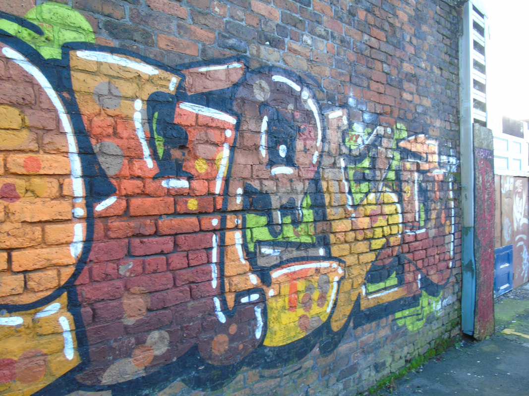
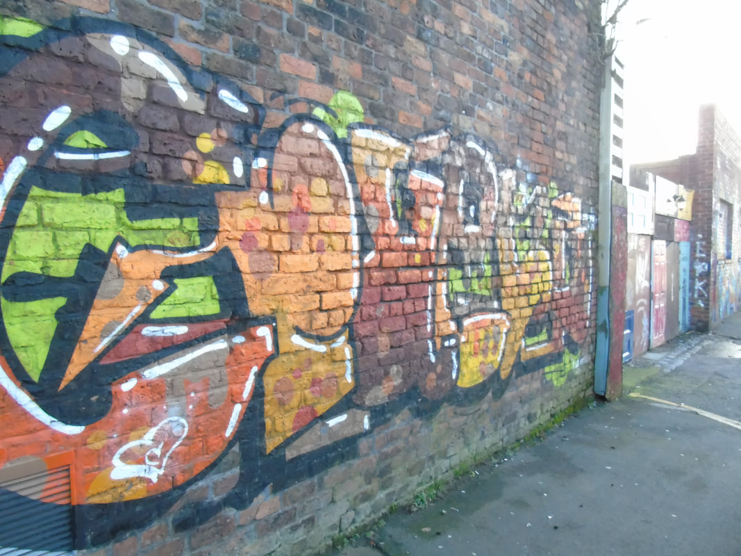
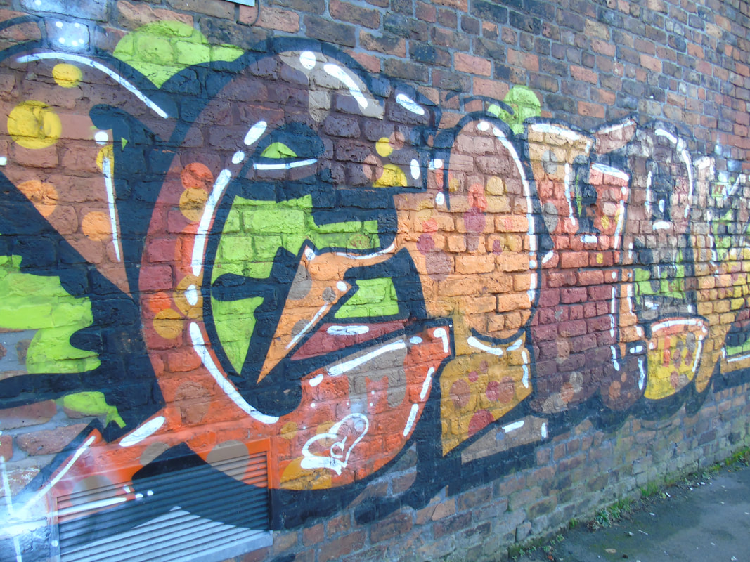
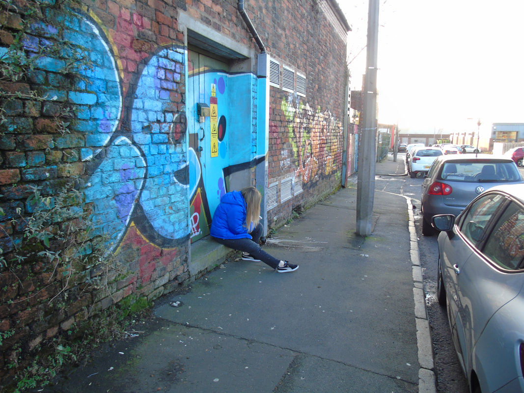
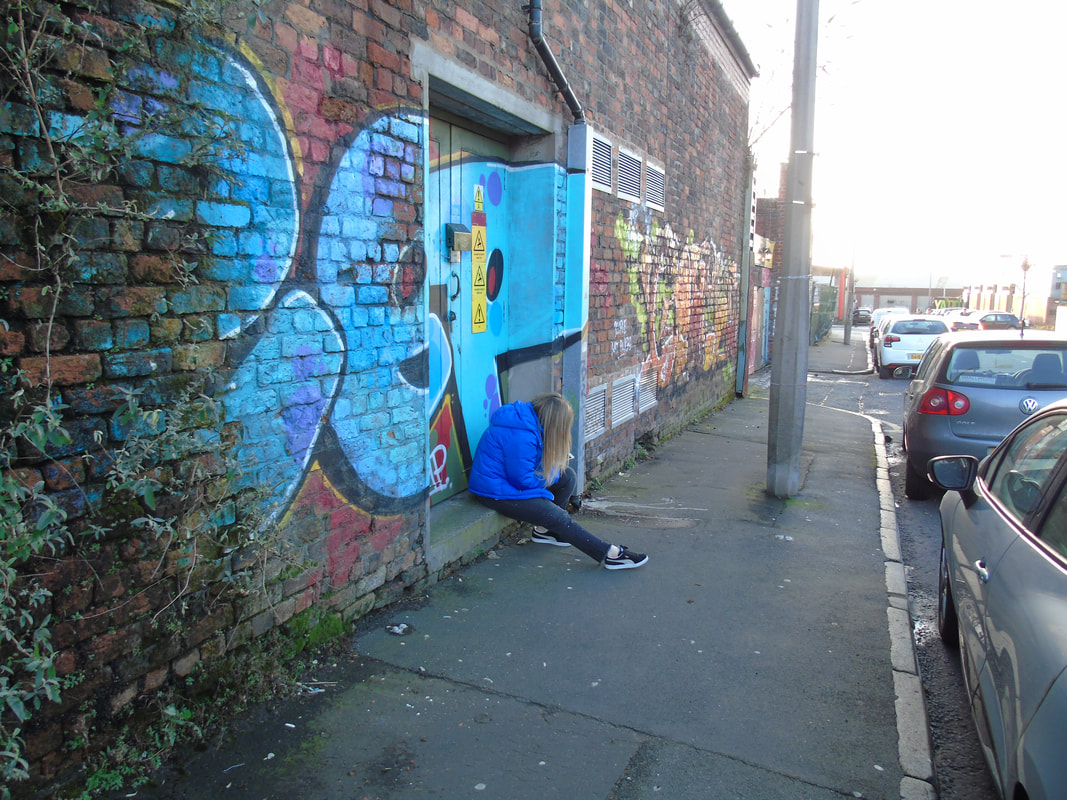
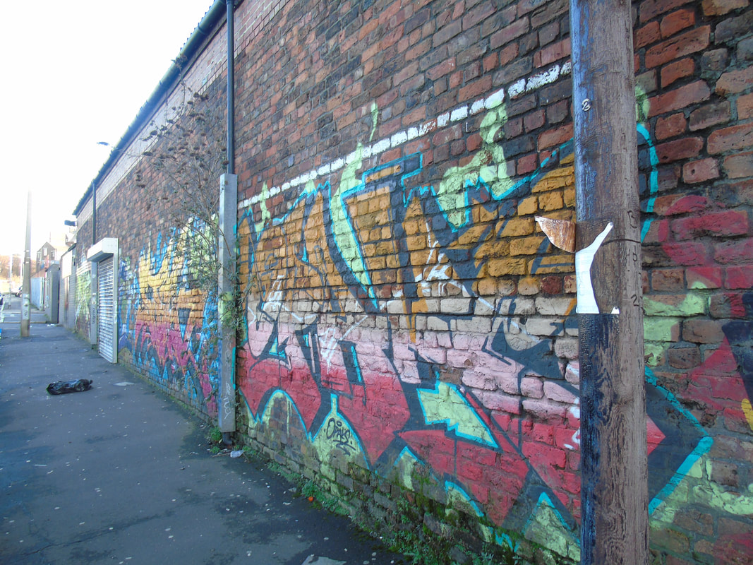
Here is the initial photographs I took in response to this project of graffiti. There is a mix of two collections of photographs as the the first set of images (which are at the bottom) weren't very good and therefore I went out to make more photographs.
This does not contain all of my work as I didn't want the gallery to be too long and just look boring due to possible repetitive work.
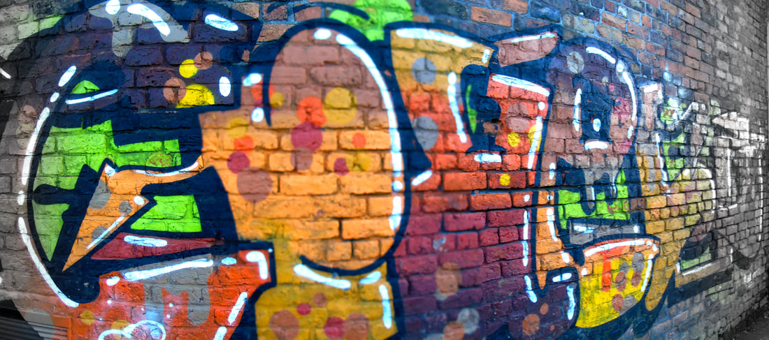
Edited work using Photoshop
Here is the first set of images that I edited from the raw images that I had. The original images were boring and not very interesting and therefore lead to these images above being below standard. Because of this I took it on myself to go out and take some more photographs that would look better.
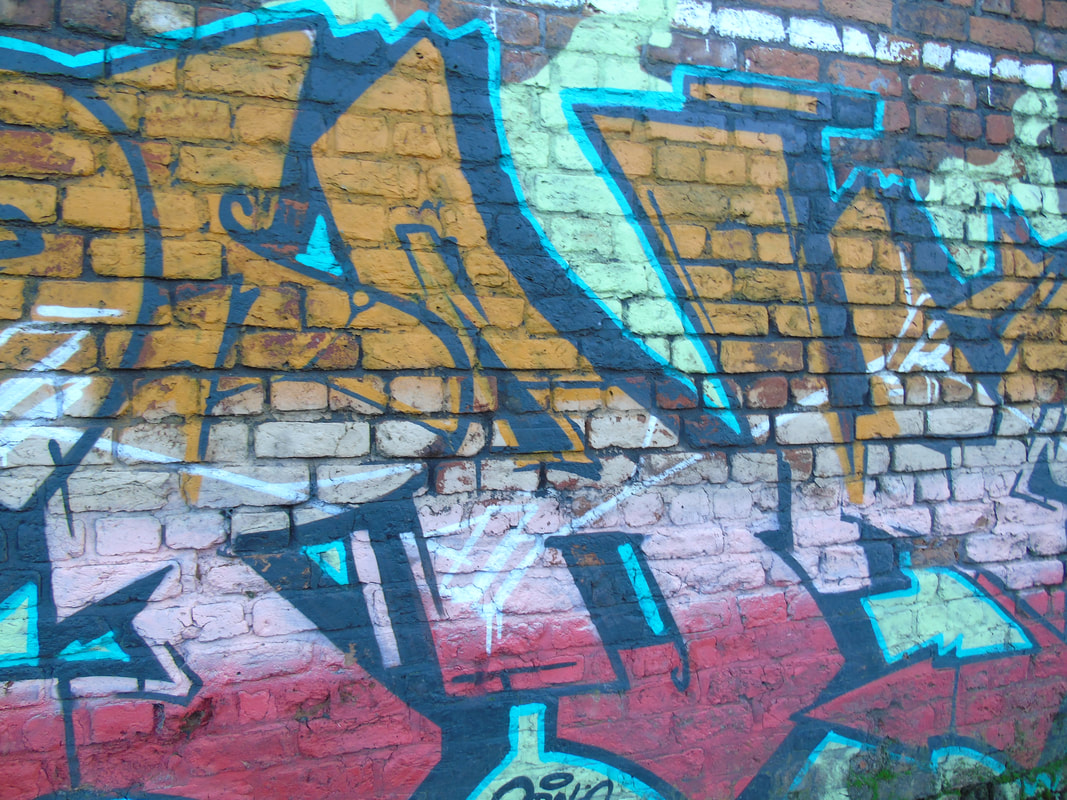
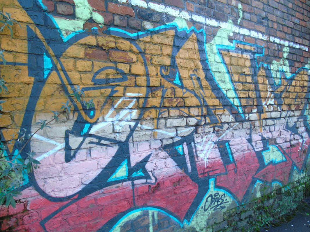
Here are three images edited in different ways to create an collection as there are some similarities. The top row of images have the basic editing in them of adjusting the levels. I also wanted to bring out the colours of the graffiti so I adjusted the saturation and vibrance of the images. The row below these images are the same images but another layer of editing. This layer was the addition of a black and white vignette to the image. I thought this would create a slightly different look to the images and could work well.
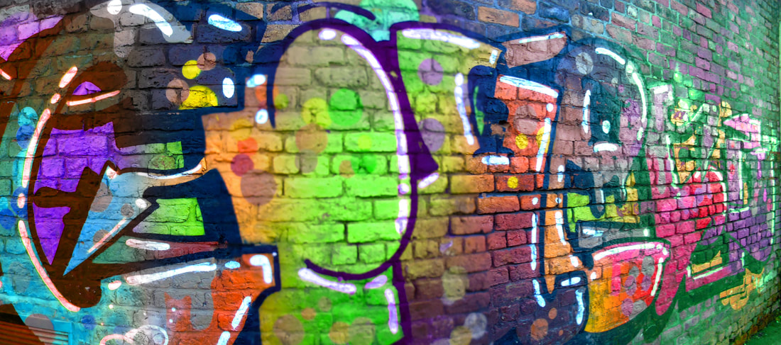
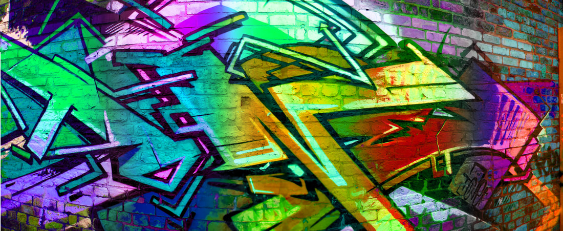
Here are the same images from above but a bit more advanced editing. For these images I used the first row of images as the base layer. I thought that the images could use more colour in them so I used the marque tool to select a section of the image; I then feathered this section. With this section I changed the colour by using the Hue/Saturation tool to change the hue. I did this all the way along the image and choosing different colours to change to. I believe this worked very well as I really like the colours and intensity of the colours.
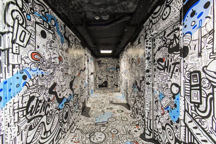
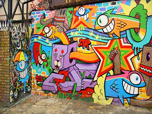
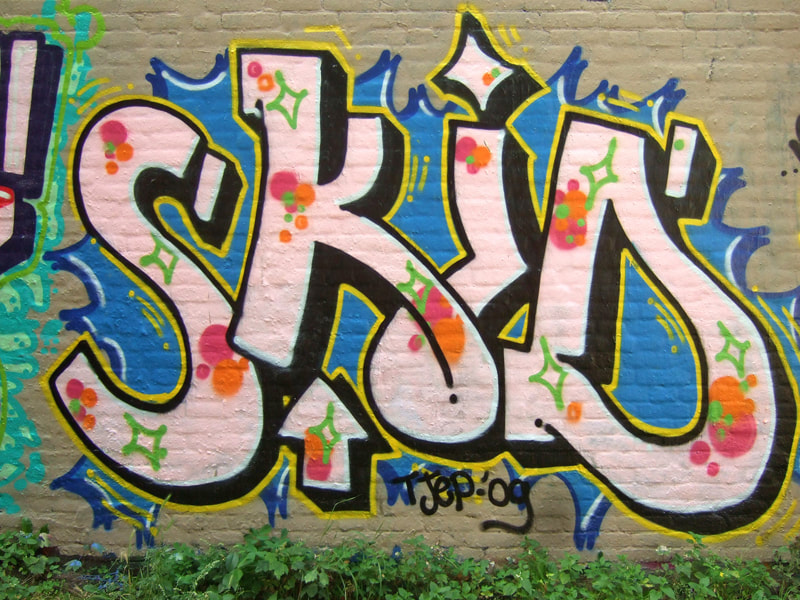
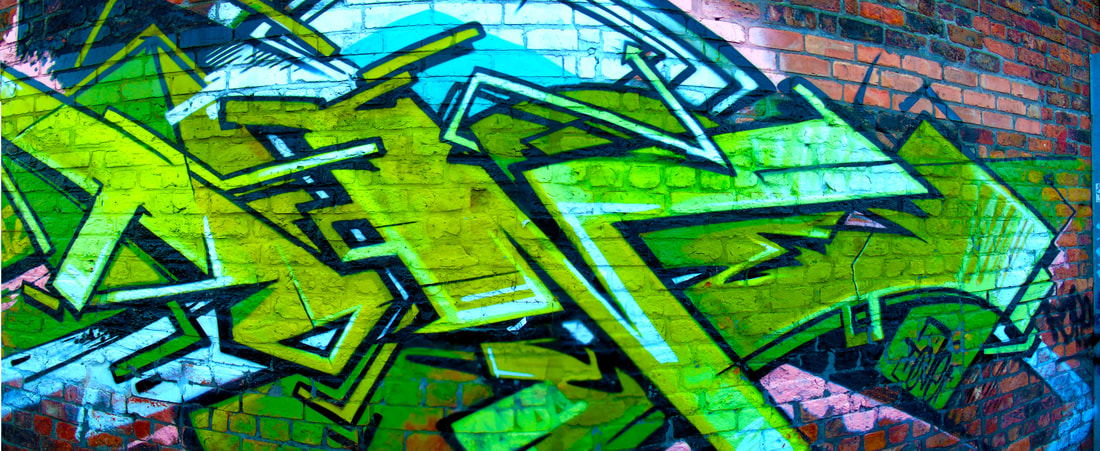
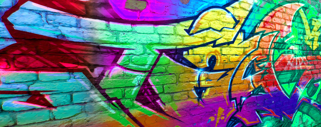
This small gallery shows different styles of graffiti and art and shows that they are clearly done by different artist but all have high standard of work.
These images are a collection of different editing styles and work together to create a successful collection. I used techniques from simply adjusting the levels and vibrance to turning the image black and white and masking out the colour of the graffiti. I used another technique of posterising the image which makes the whole photograph looks like it has been made using graffiti.
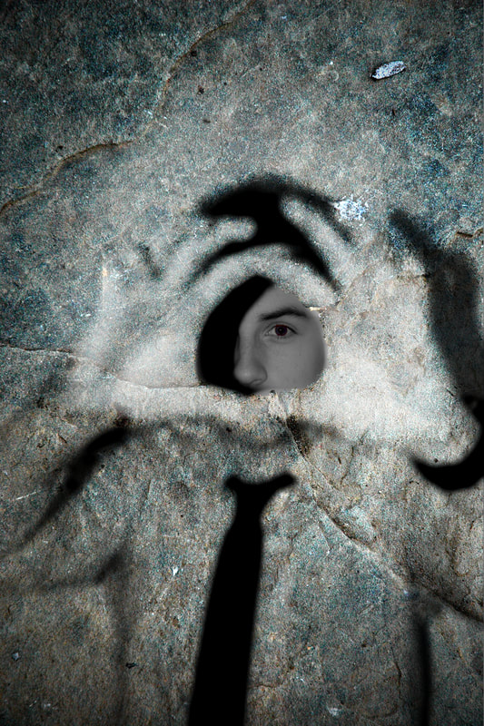
Costume and Masks
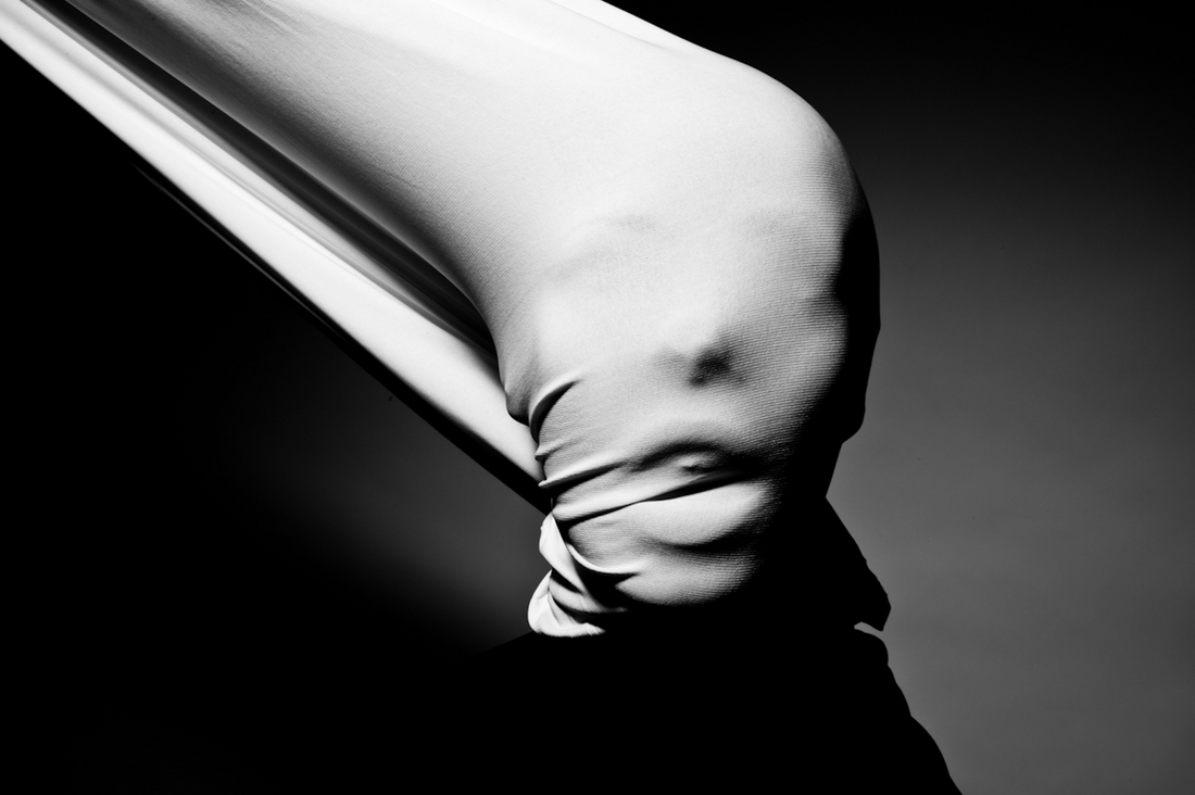
Initial Ideas
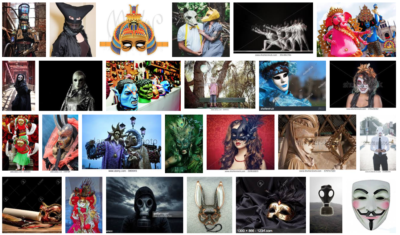
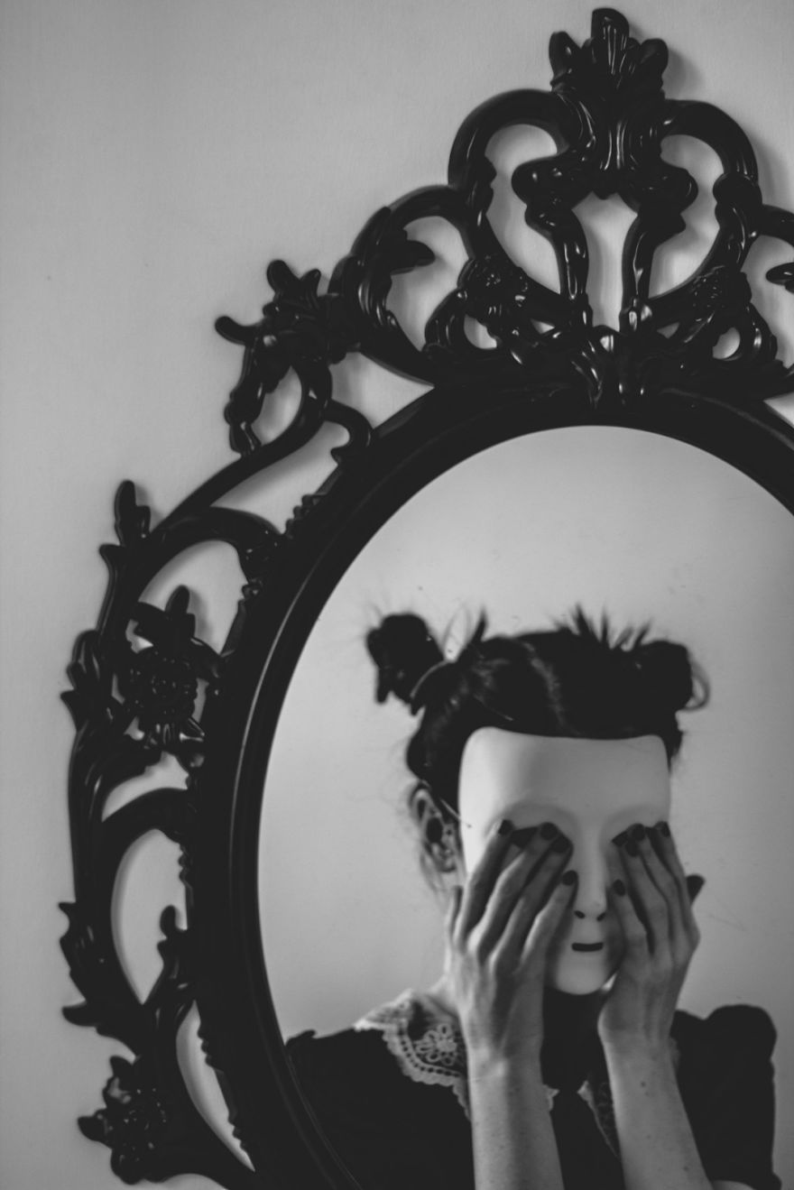
I like the range of different types of masks as there are animals masks, religious ones, party ones and gas masks. Also these masks add different effects to the each image, as the gas masks add a bit of terror, other masks add the effect of fun like ones from parties. All mask photography share the same theme that being mystery as you never know who's behind the mask. I will use similar images like these in my work as all I need to do is get a mask and make a model pose in certain ways to gain a successful image.
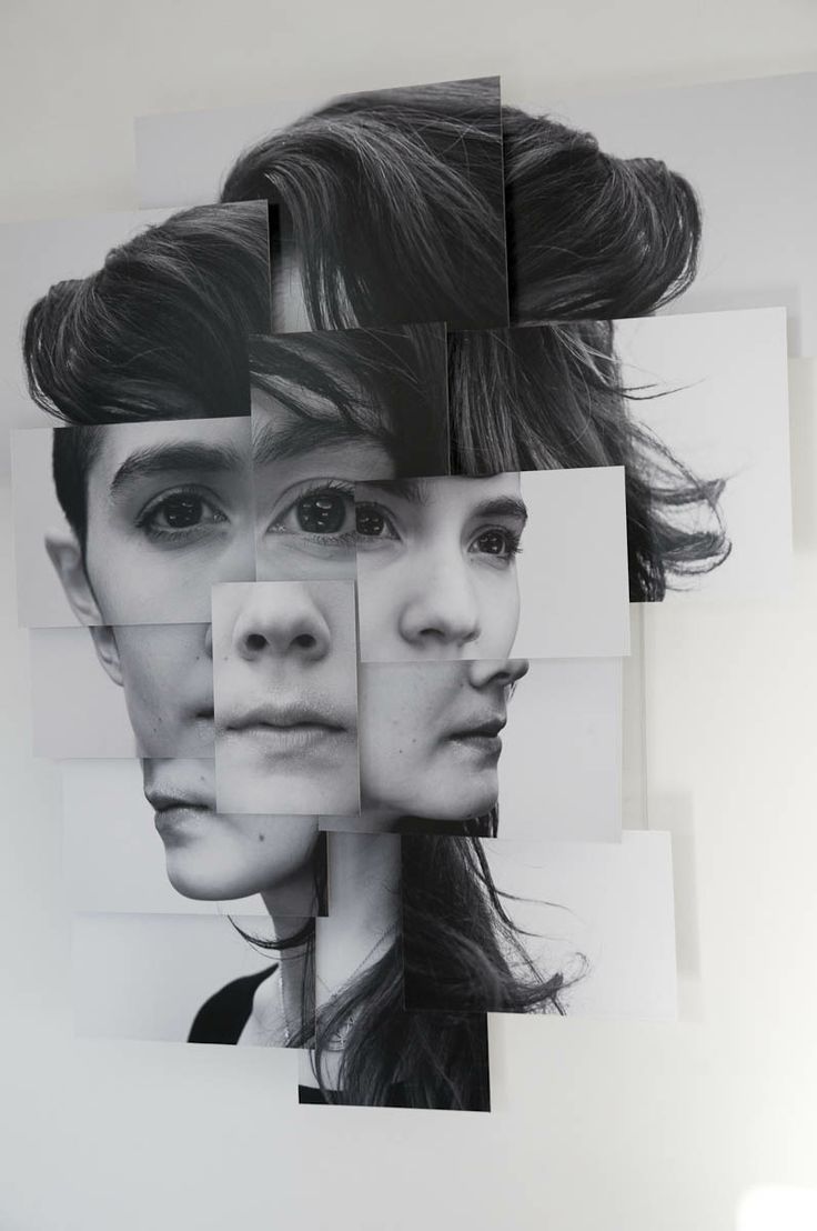
Phyllis Galembo
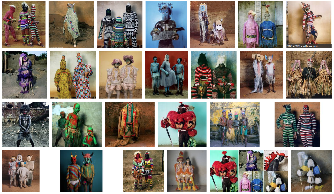
These images are really interesting as they look like homemade costumes and normally two people in the image wearing the costume. The costume covers the subjects from head to toe disguising the subject and making the images mysterious. In some of these images, the subjects also wear masks which again look homemade. These are very interesting and simple to do as I can take any costume and mask and show that my work has been inspired by this photographers work.
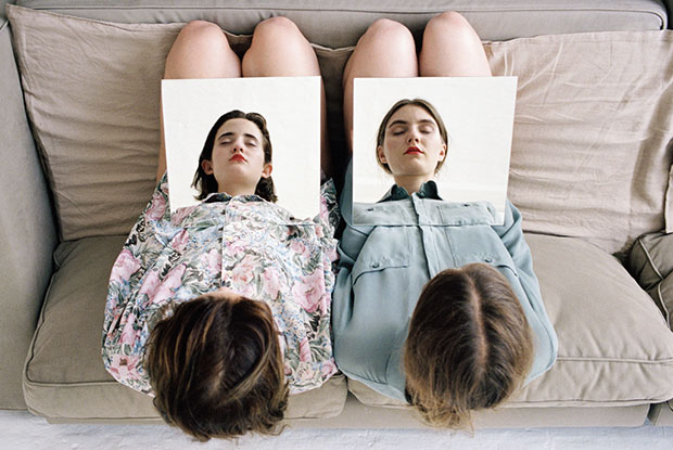
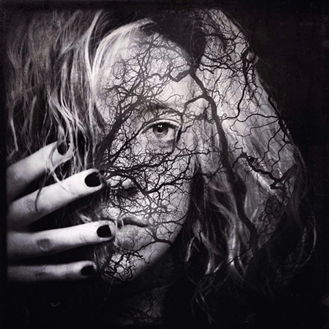
Laura Williams
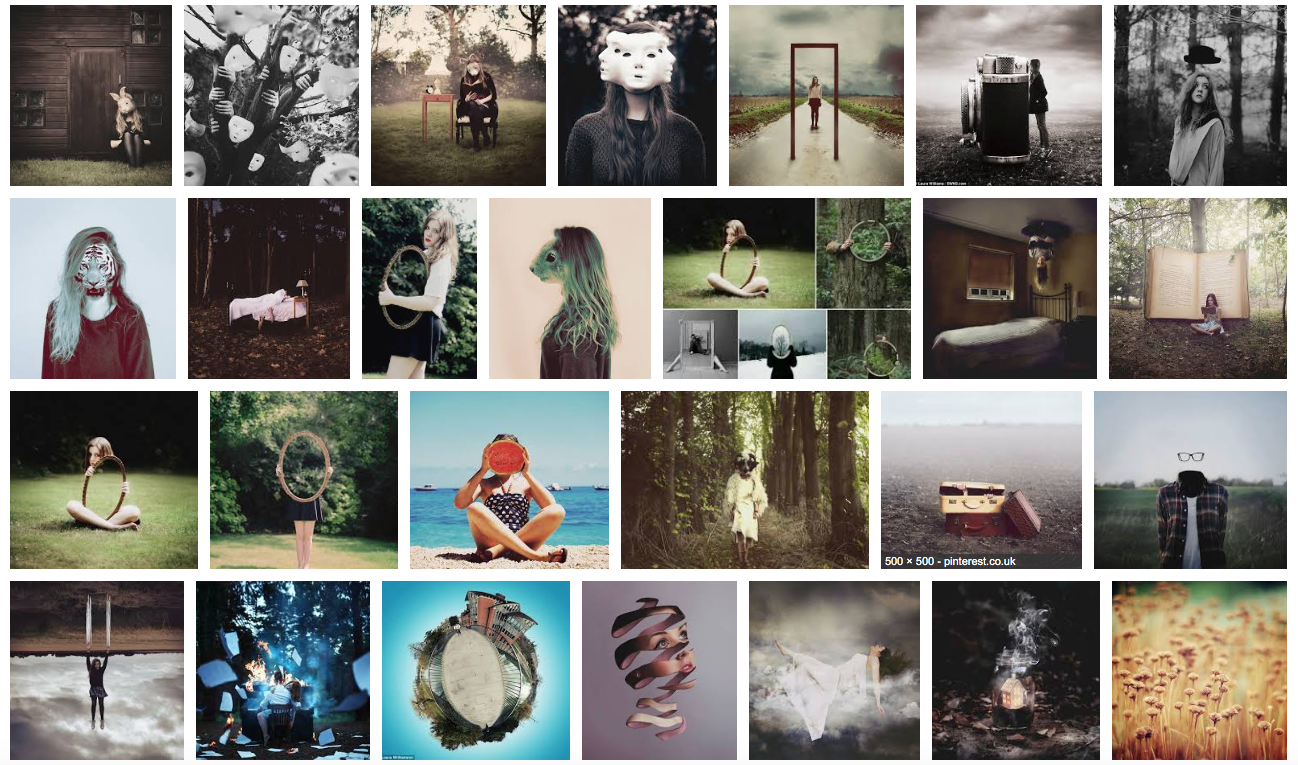
The photographer Laura Williams uses surreal photography and blends it with mask photography to create weird and unusual effects. Examples of her work are her using white masks and making the subject of the image stay still more do different poses and the blends the images together to make a creepy and odd effect that makes the image really cool. Also she likes to use animals in her work to blend the faces of the different animals and put them on a persons face. Then she adjusts the colouring of the image to make it even more unusual. I think these images are really interesting and I believe that I can achieve the same standard of work. To replicate this work I can uses a white mask and like her make the subject change their poses and then blend them so that it looks similar to Laura's. I could do this multiples times using different poses. I could also do the images were she puts animal faces on human bodies. I would do this by taking photographs of animals and then blend it onto someones face. Once done I would slightly adjust the colouring of the image.
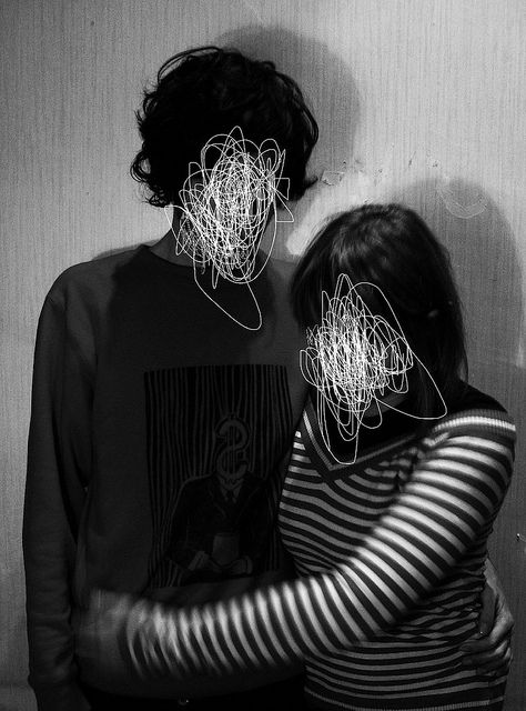
My Own Ideas
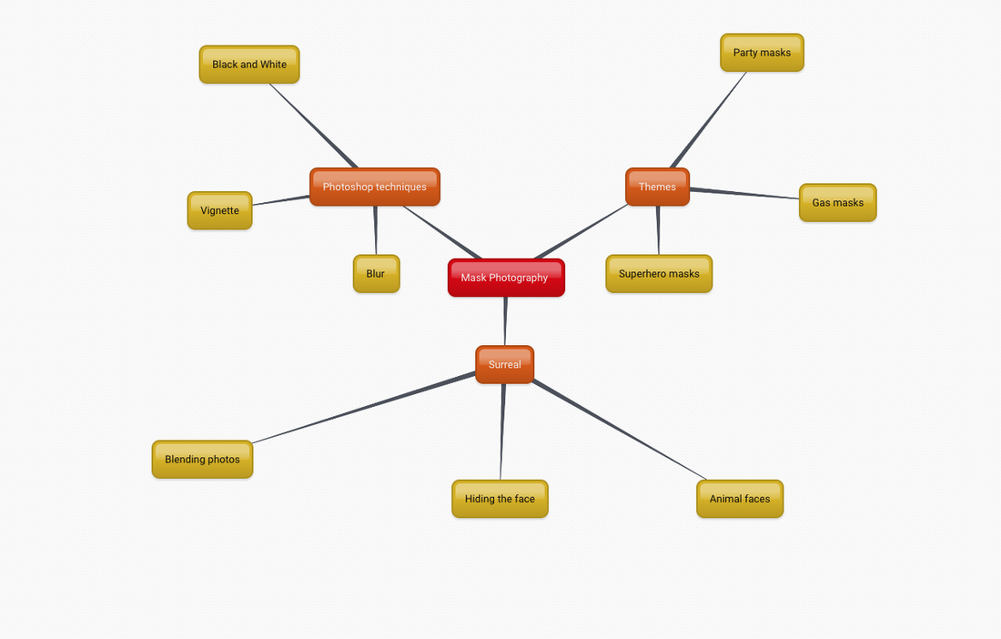
This is a mind map to show the ideas that I have and the directions that I am thinking of taking this topic in. I will attempt all of these ideas and try and do it to a high level. I believe mask photography can be really fascinating and how you can use different ideas and not just using a mask, as you can use clothing and body parts to mask the face which is a different to what is normally thought of by masks.
What I am going to do next
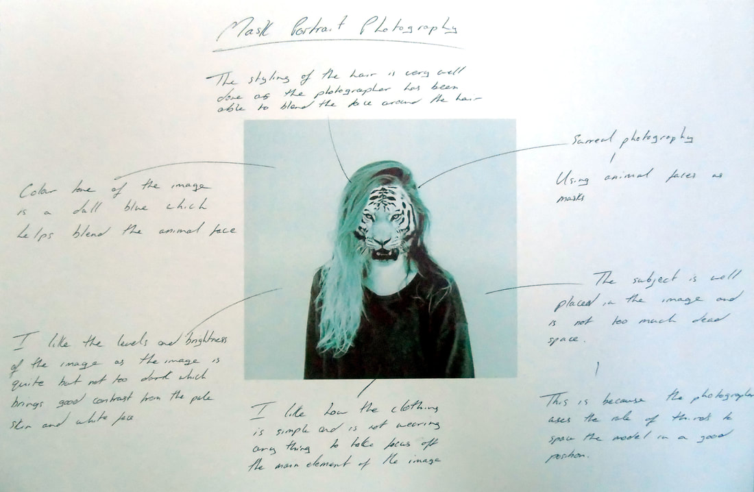
Here is an image from a photographer that I liked as it was really unusual. I have deconstructed the image by saying what I like about the image and how the photographer has made the photo successful.
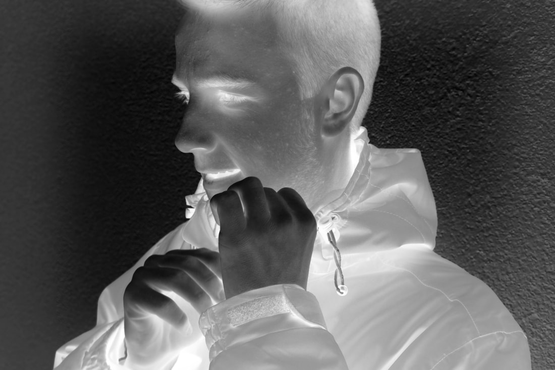
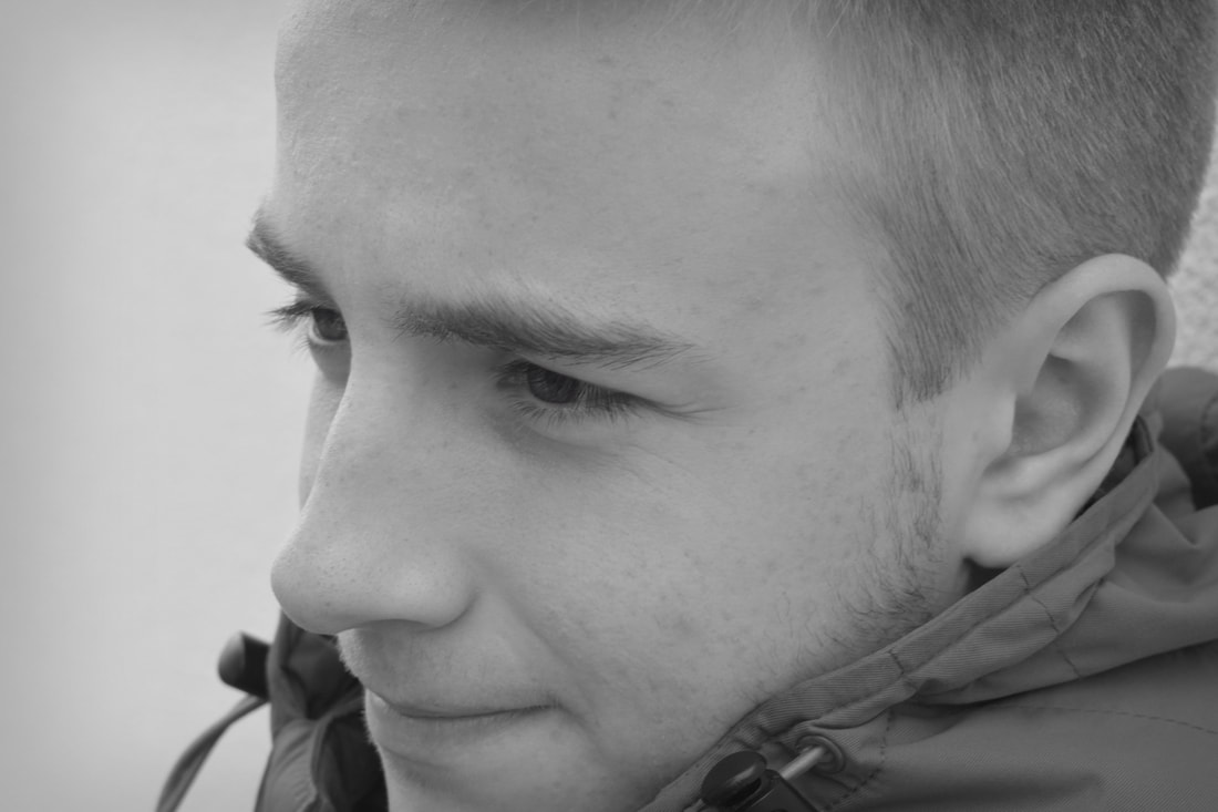
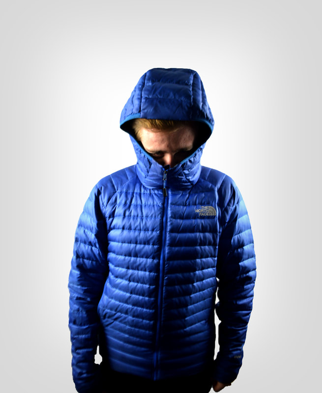
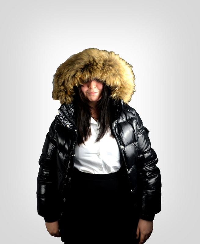
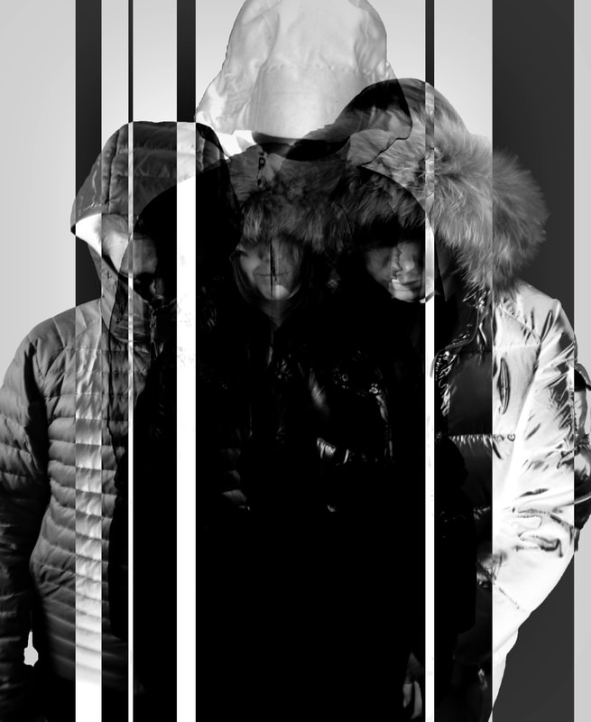
First Response - Mask/Hide the Face
Raw images
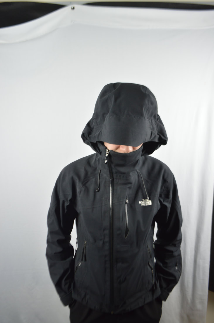
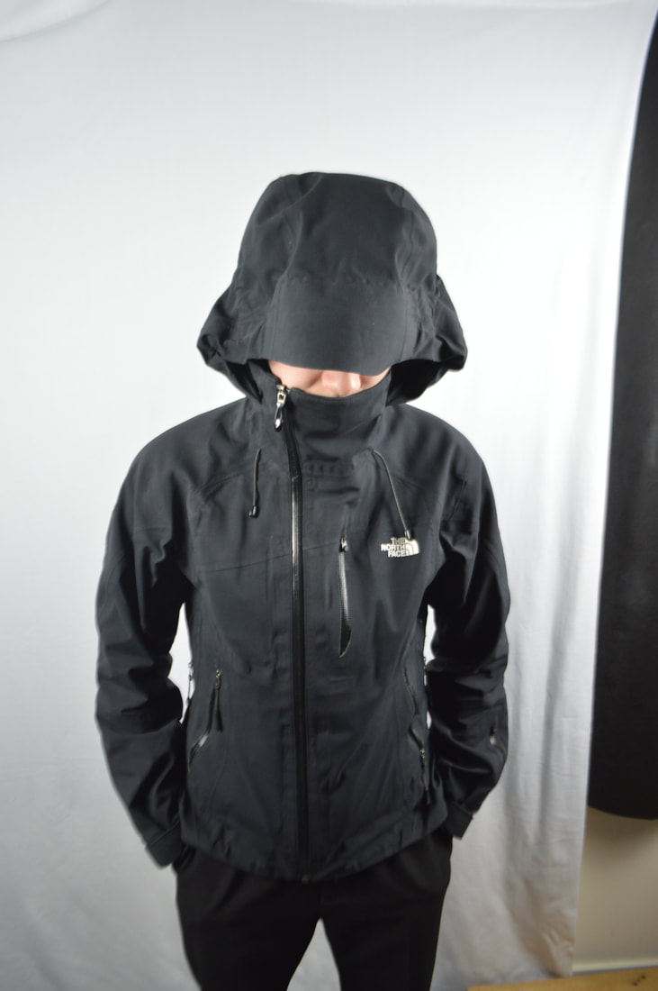
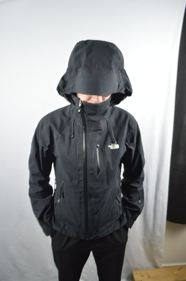
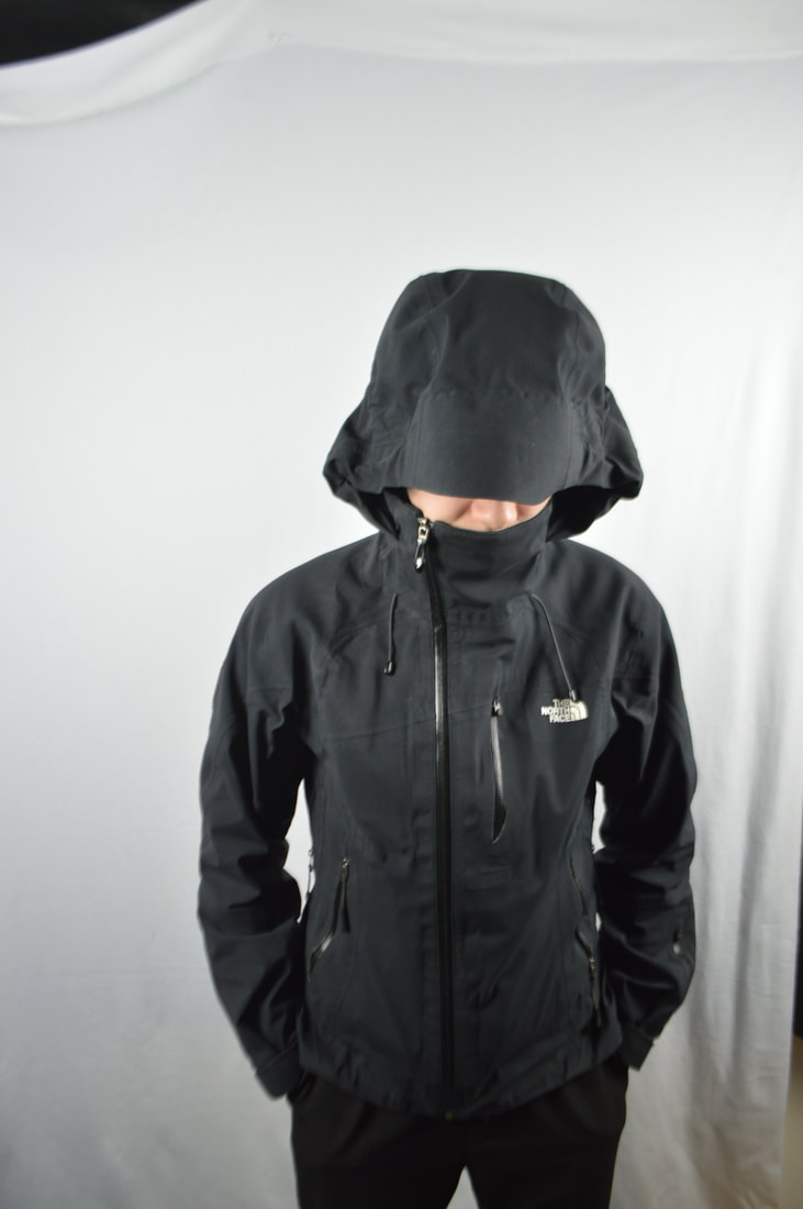
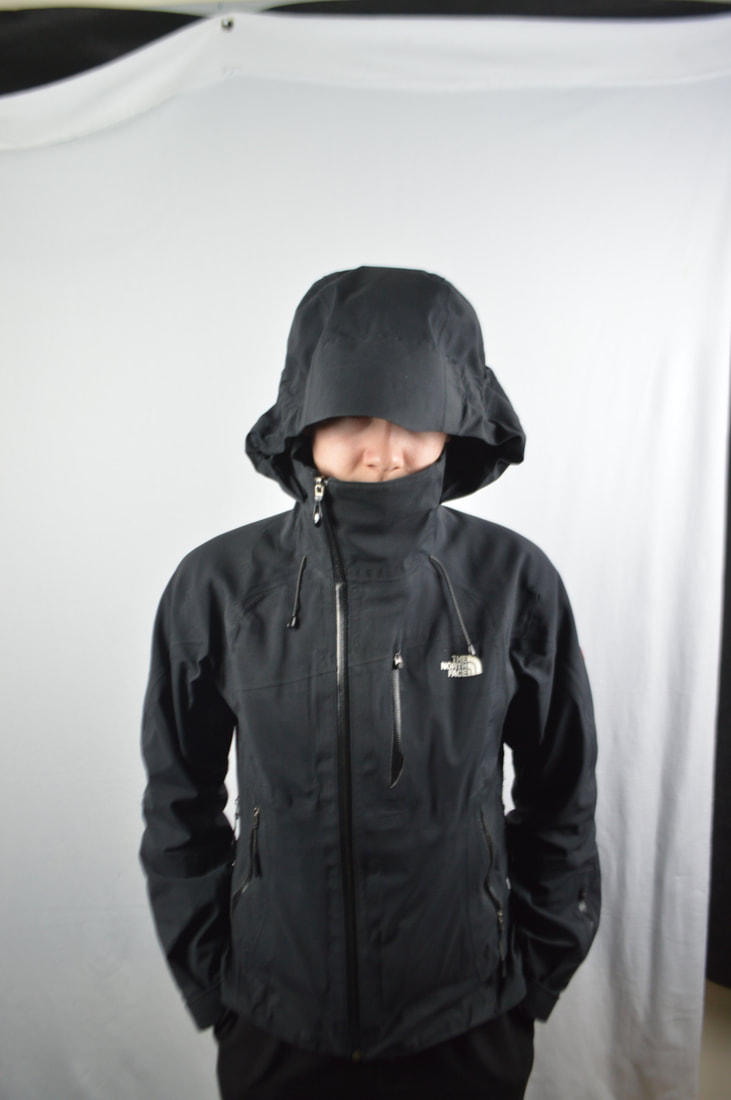
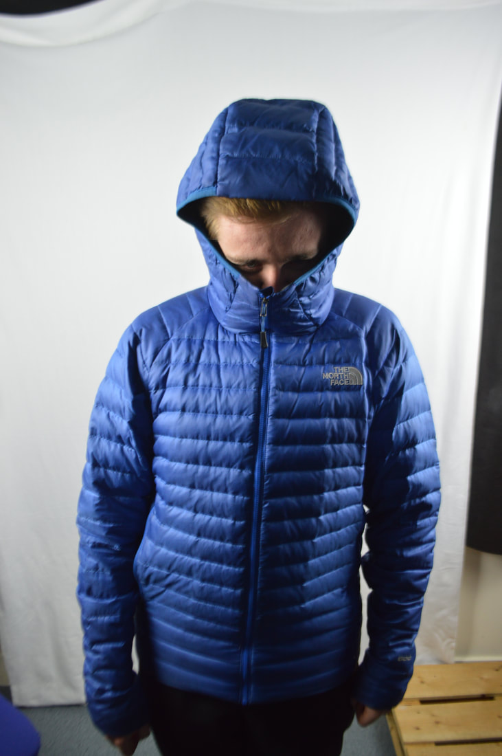
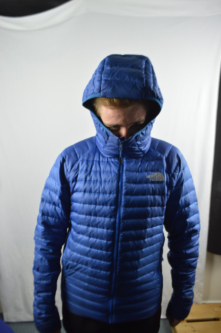
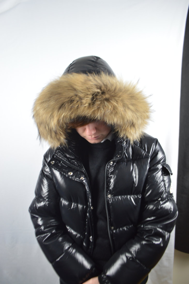
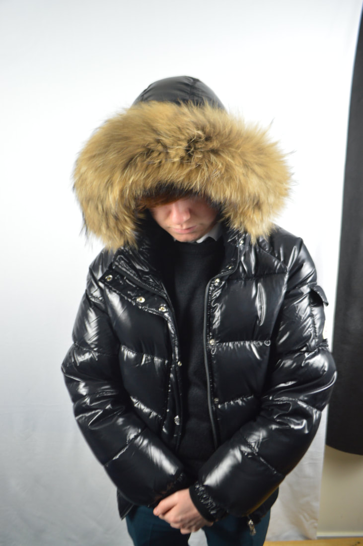
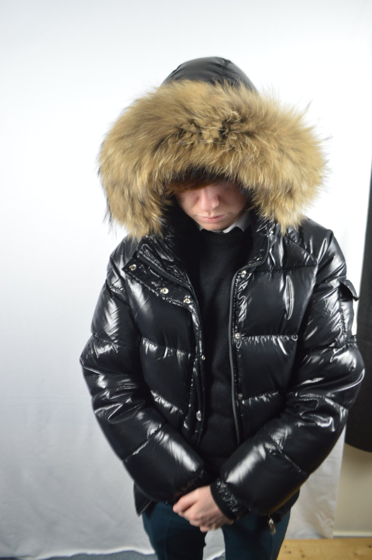
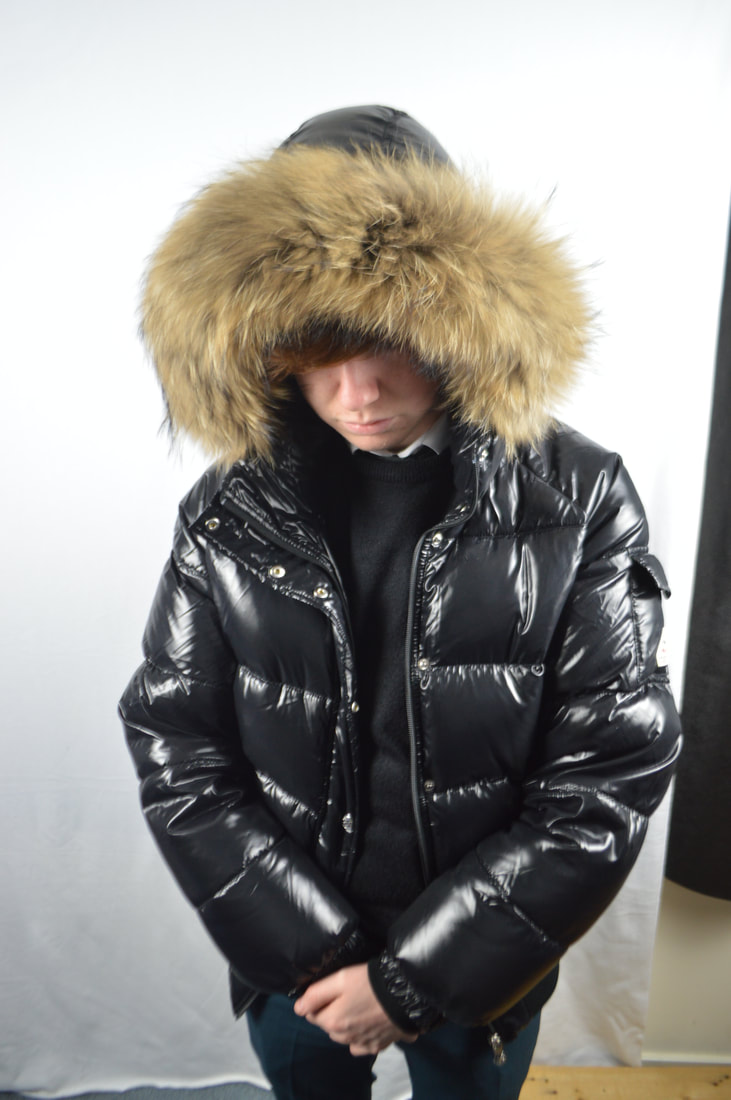
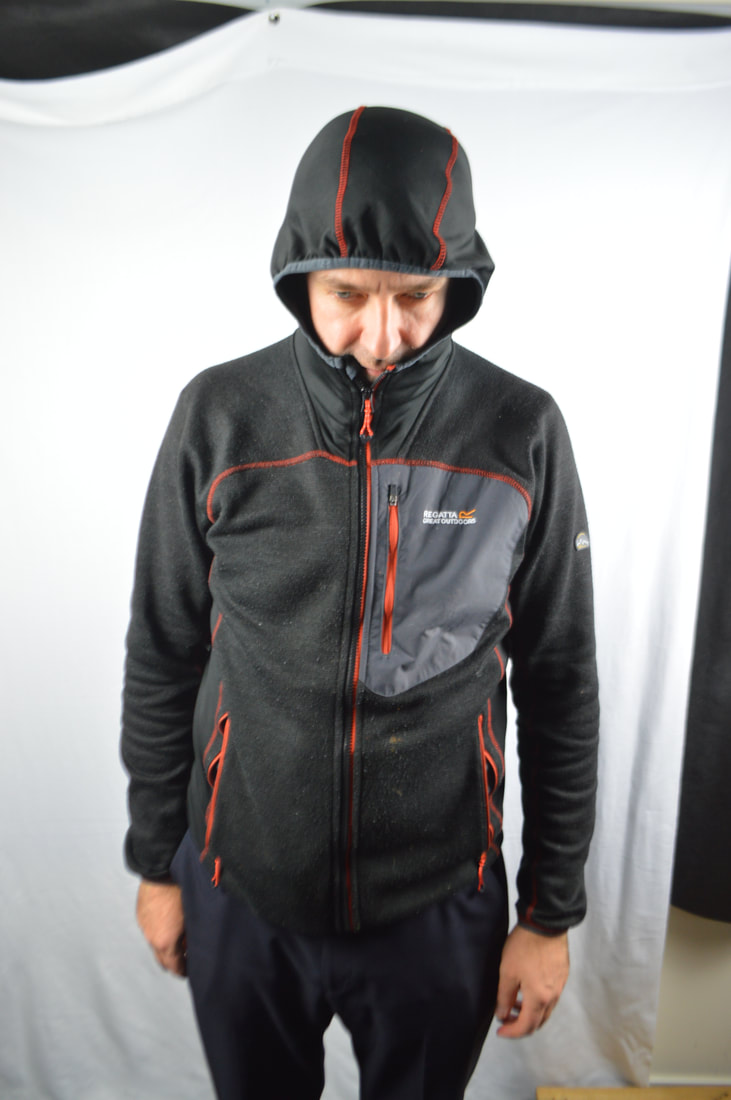
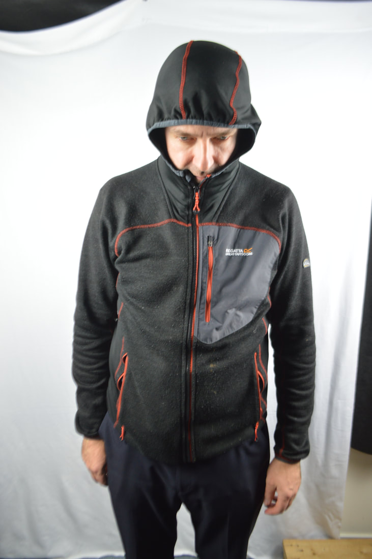
Here are the images that I started with from my first response as I was using the coat hoods to mask the faces. I think this is will be a different way of looking at masks that will be unusual but I'm unsure whether this will be successful. These images aren't the best of my work by I'll try and redeem these images by using some photoshop techniques.
Edited Images
Here is a few edited images that I picked from the images above. I simply adjusted the levels and added a vignette to each image as I didn't want to over edit as I was not experimenting yet. These simple images aren't of the best quality initial as there is not much I have done to them however I could use blending techniques to put each of these images together. After a simple edit, I don't believe that the redeem as worked just yet as I still think the each image is of pour quality.
Experimentation using Photoshop
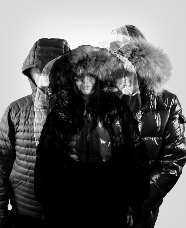
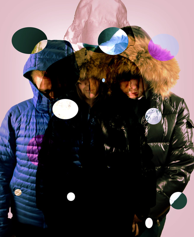
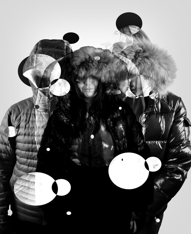
Here are images that I have experimented with by blending each photograph of a person and then I decided to use different techniques to experiment and see whether they would become successful or not. I used the quick selection tool to select certain areas of the images to invert them so that it adds a weird effect to improve the quality of the image. I believe that these images are fairly good and could possibly be used as an album cover for group, however this is not what I am trying to achieve and therefore I will have other attempts to make a successful range of images for Mask and Costume. I am really not impressed with this response and I will redeem the work with my next response which I'll see if using an actually mask and see if that can be successful.
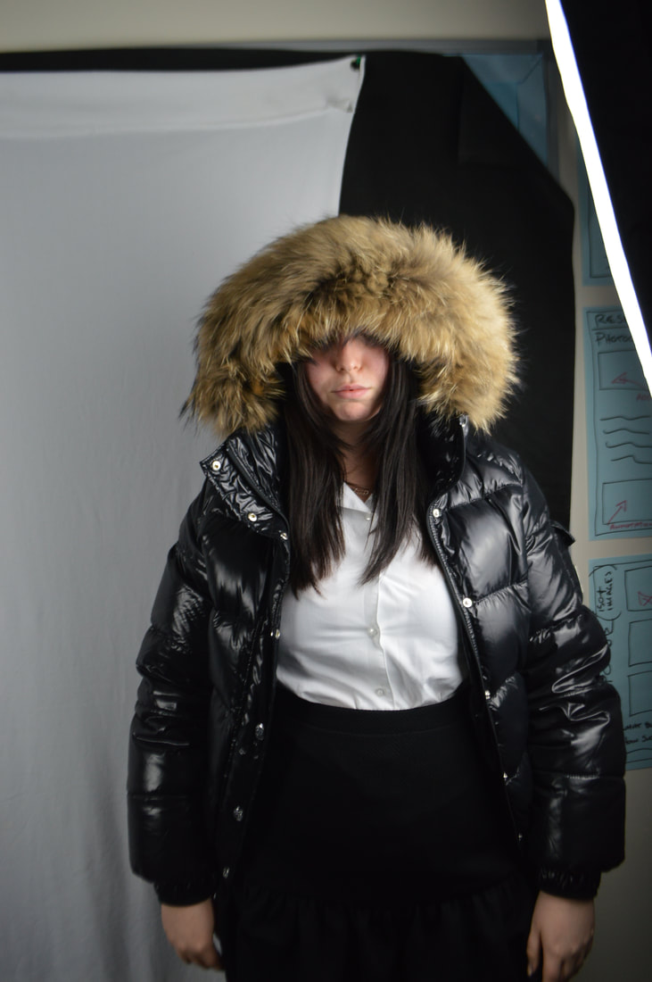
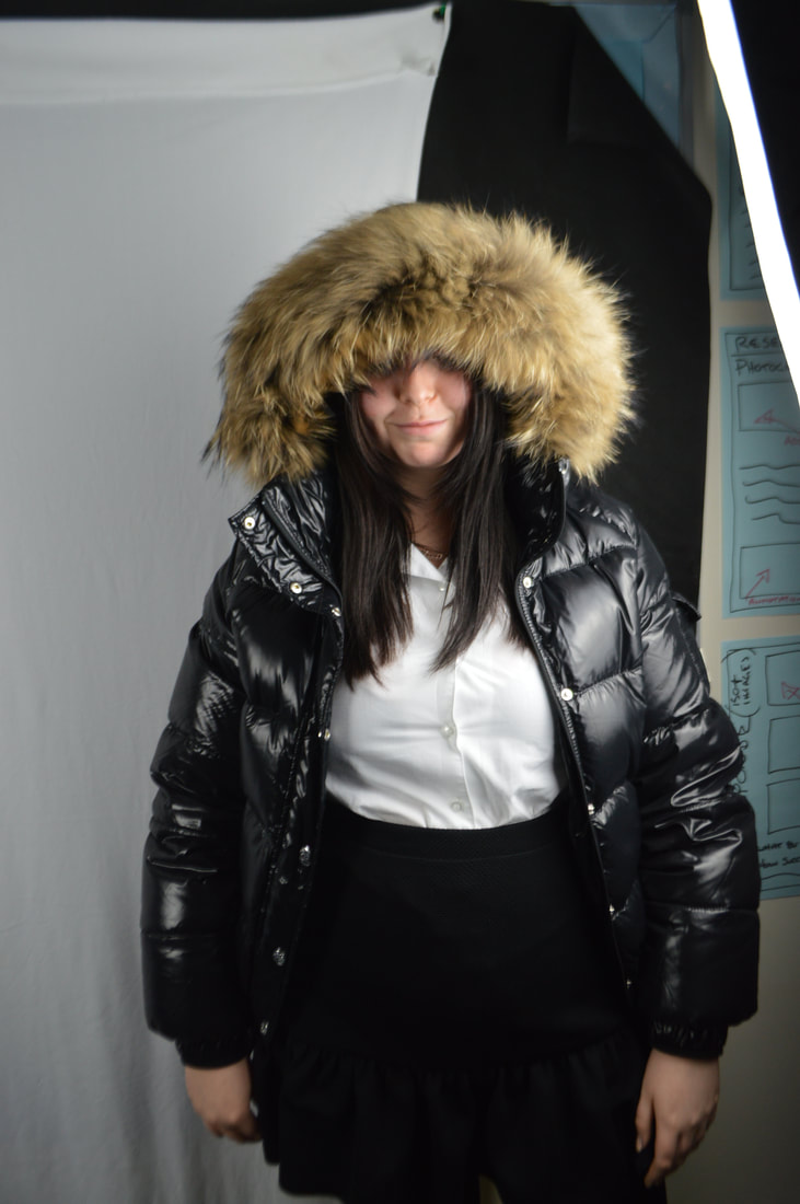
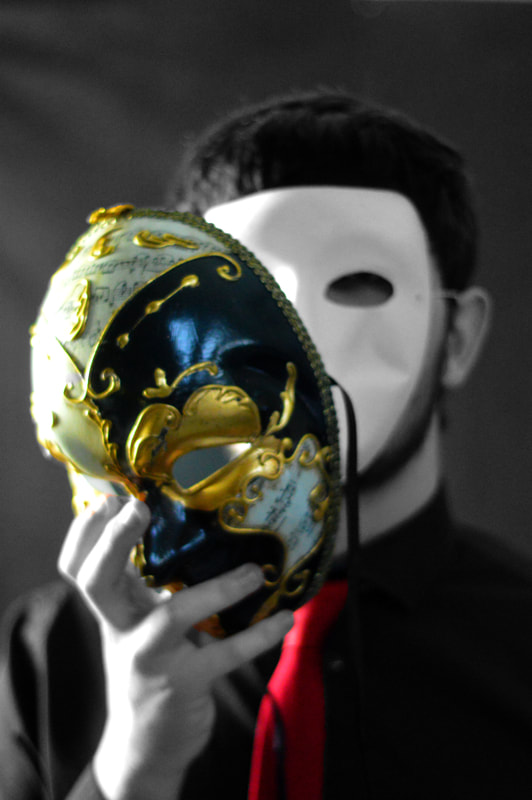
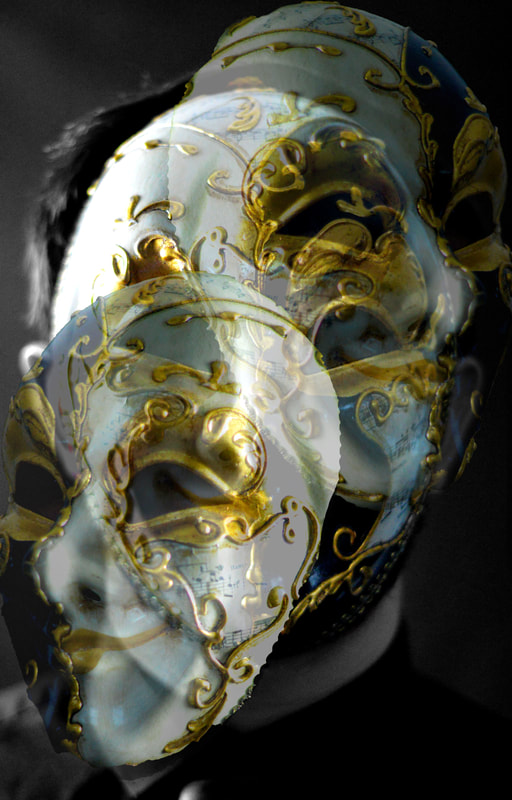
Second Response/ Use of Masks
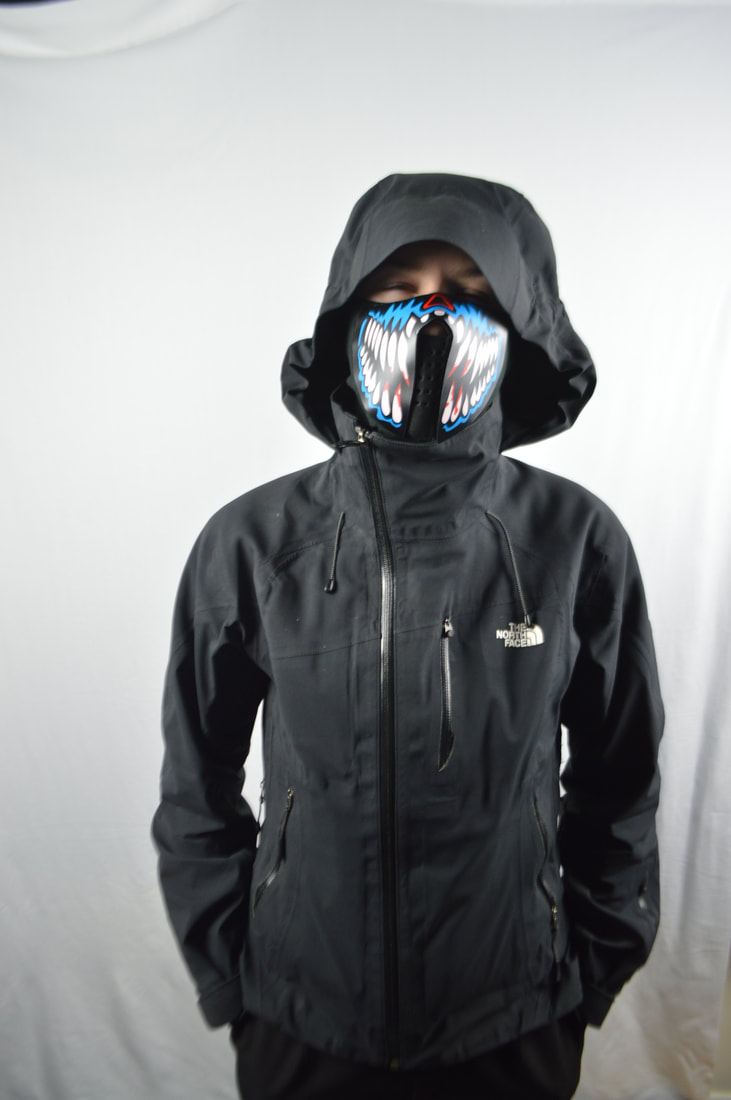
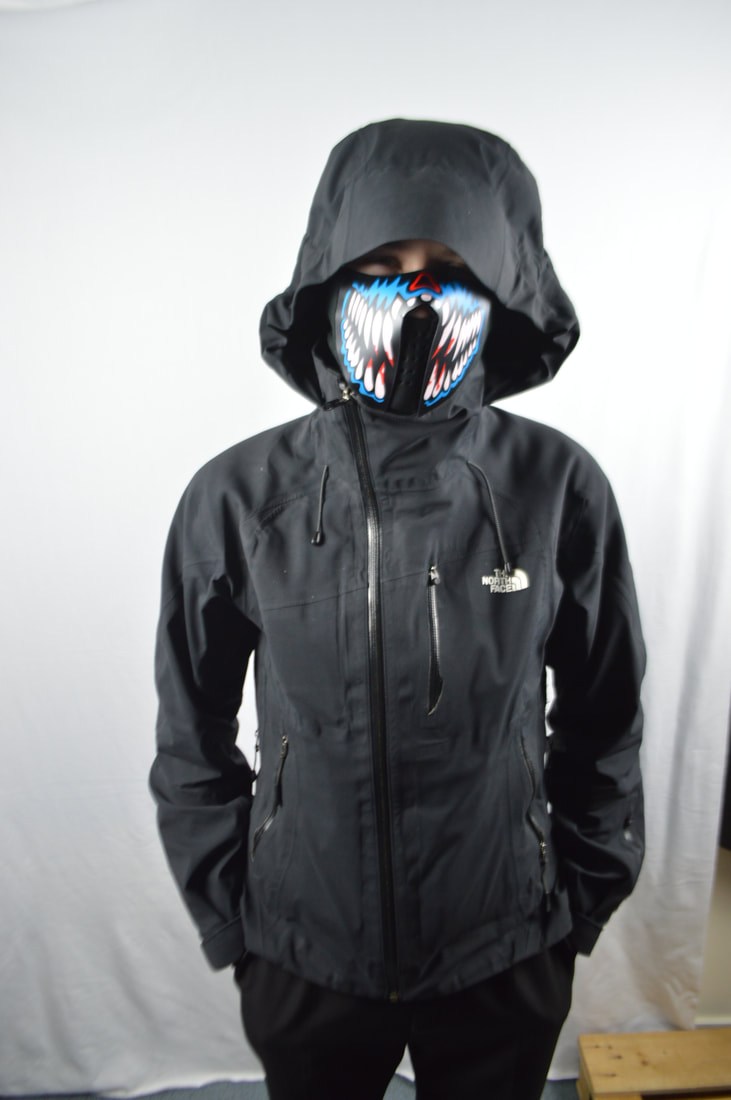
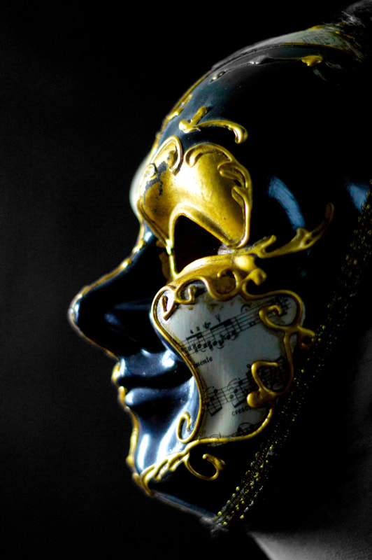
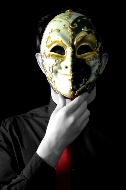
Initial Images
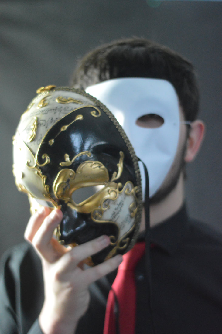
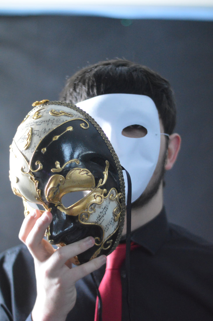
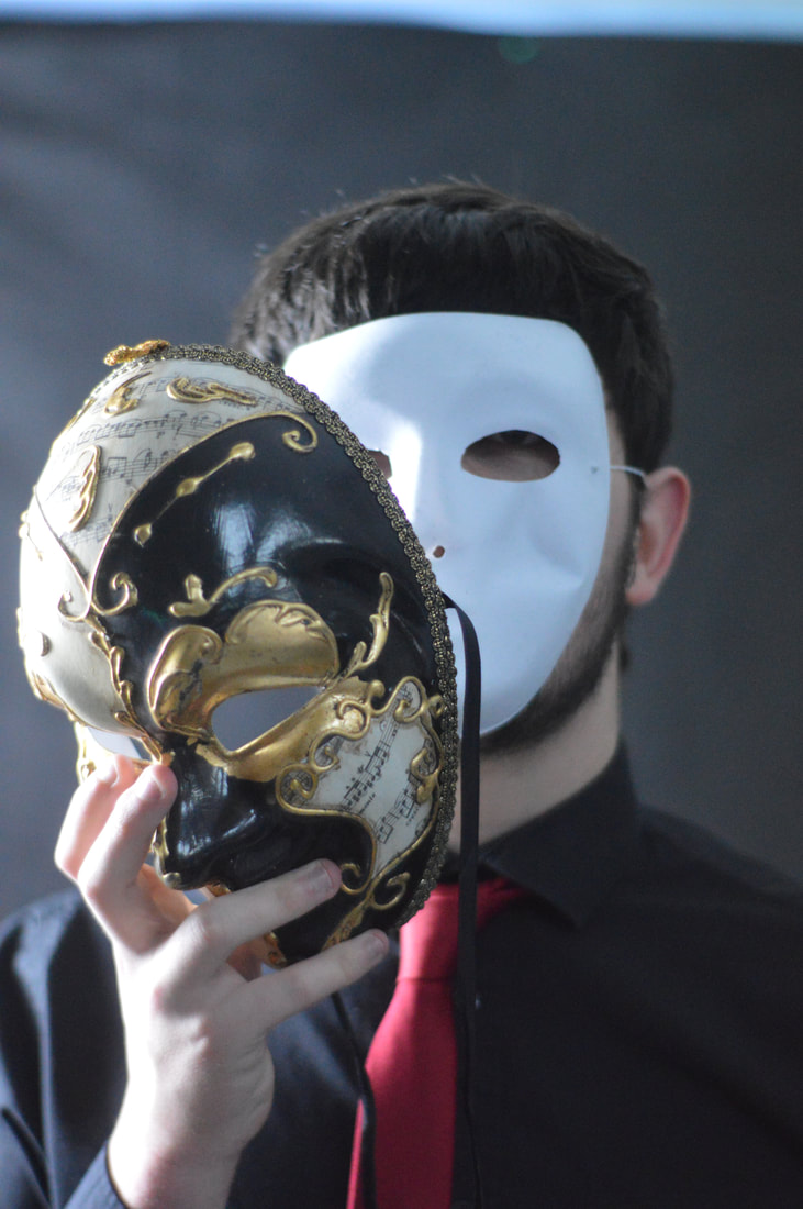
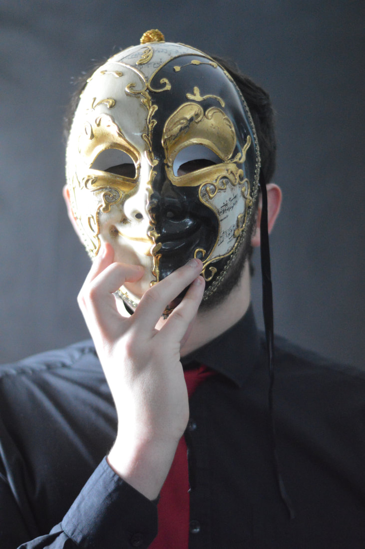
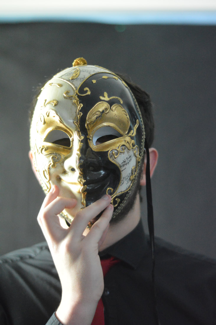
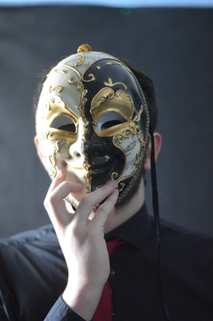
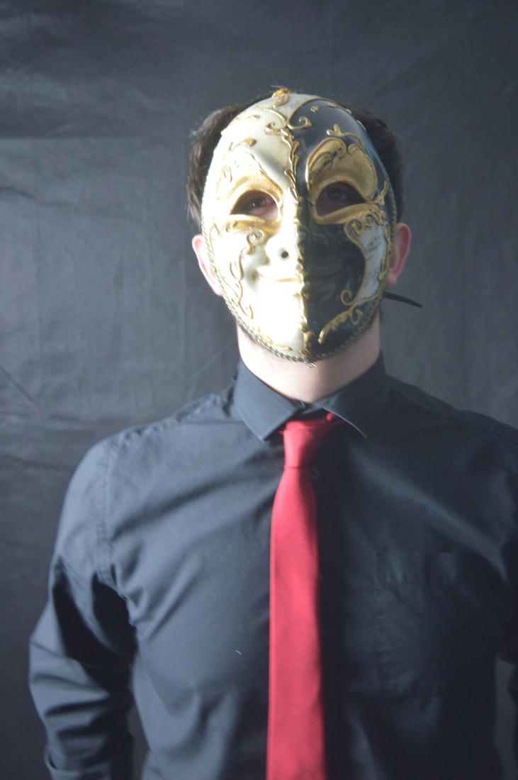
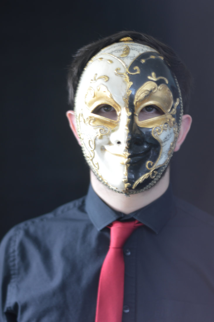
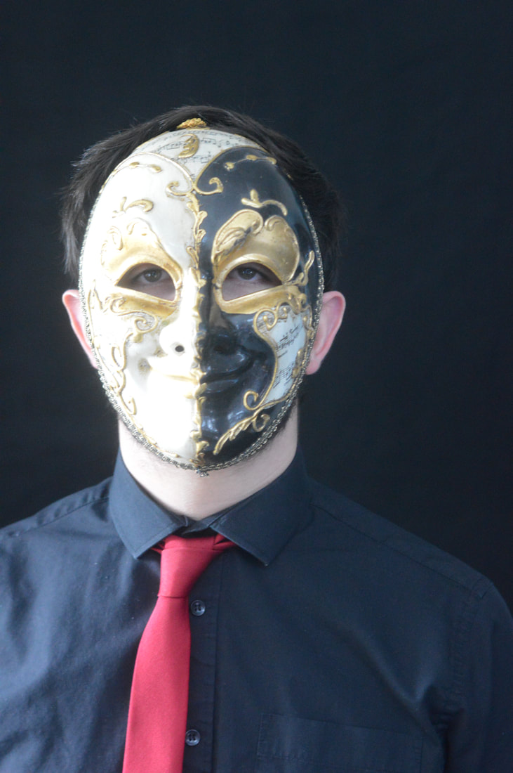
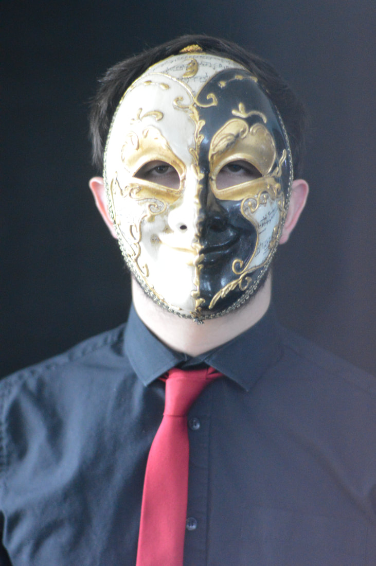
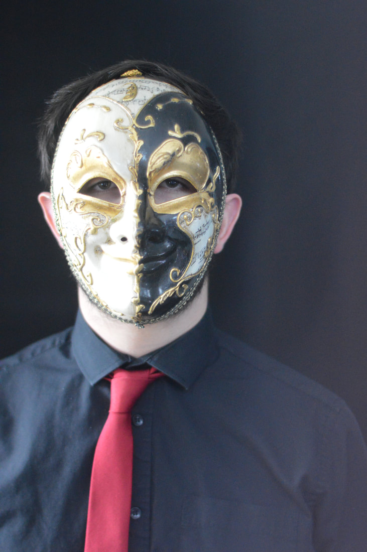
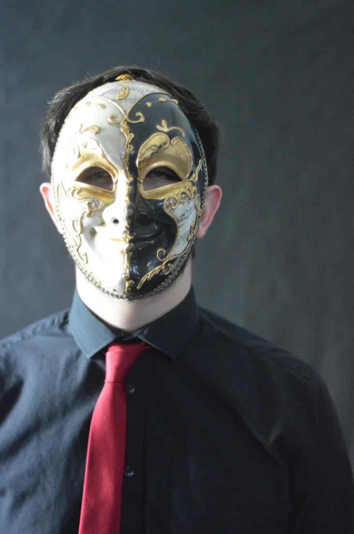
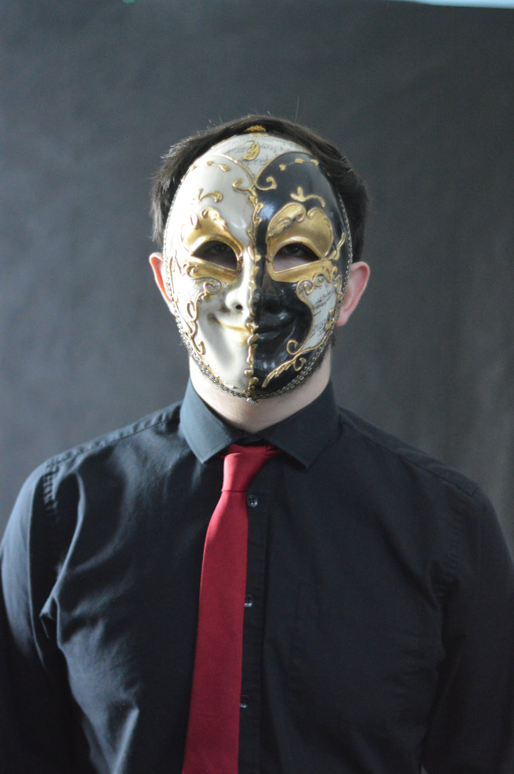
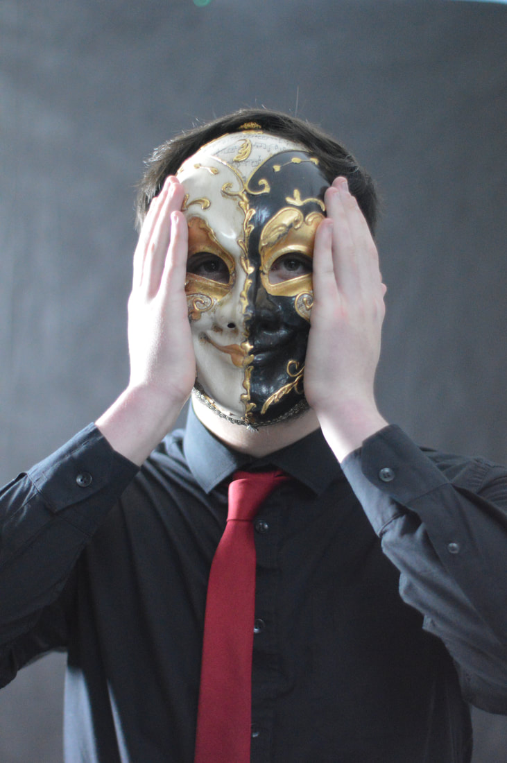
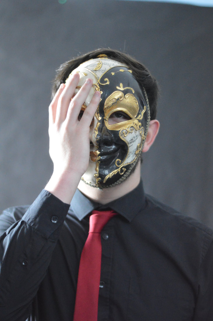
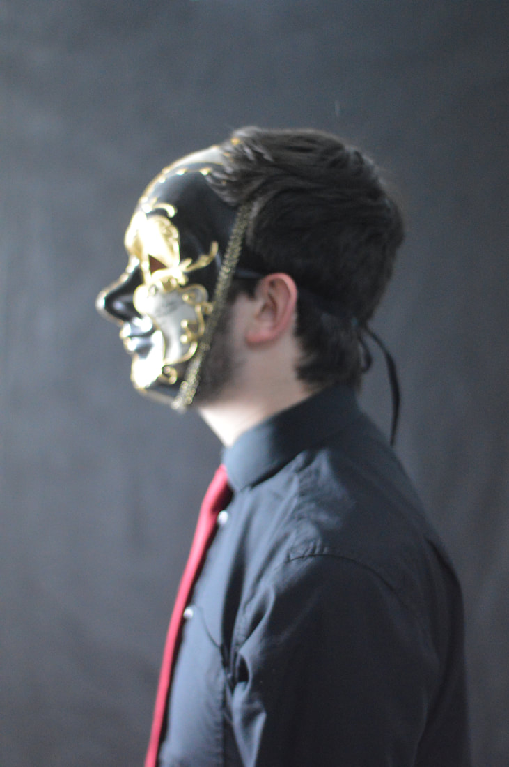
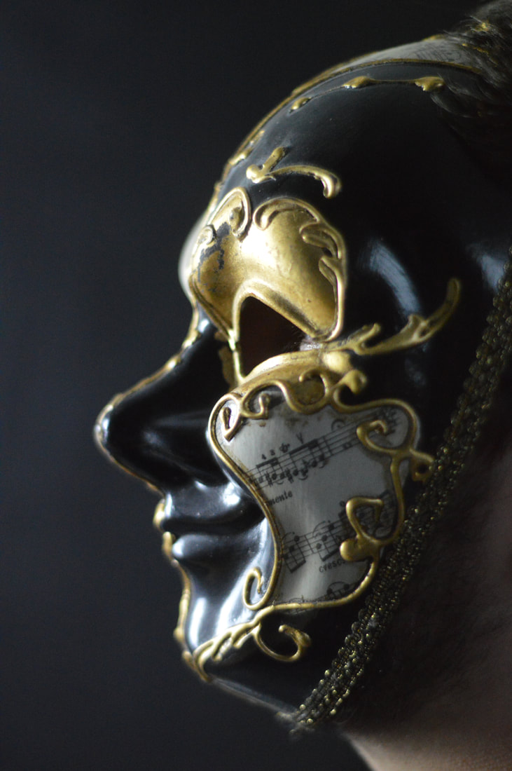
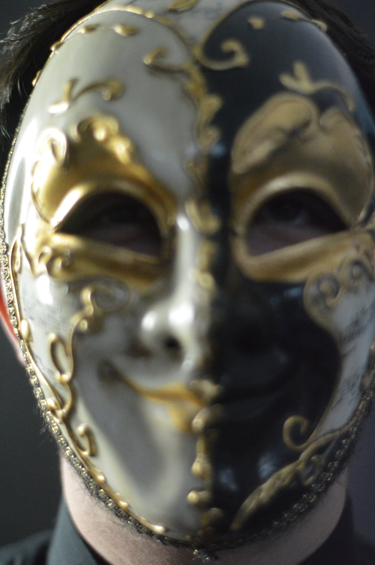
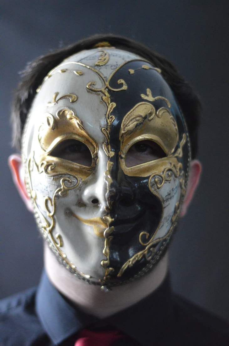
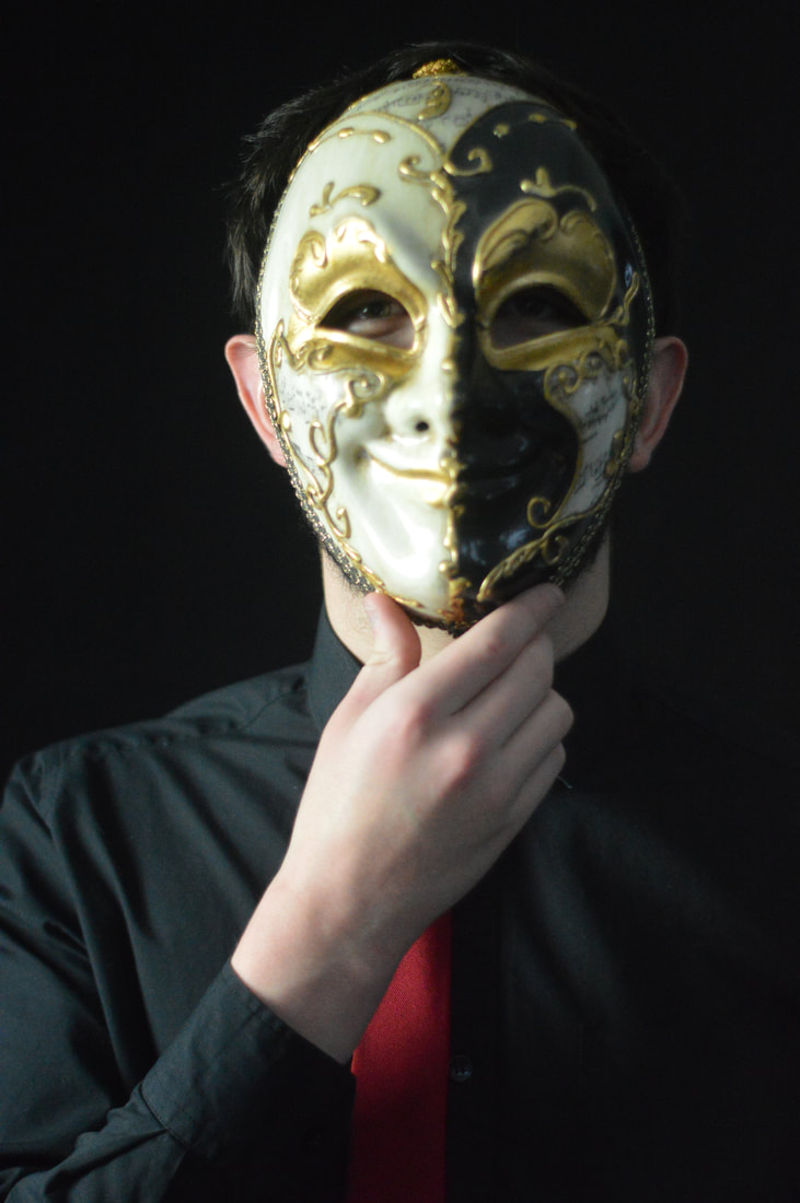
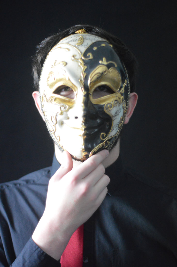
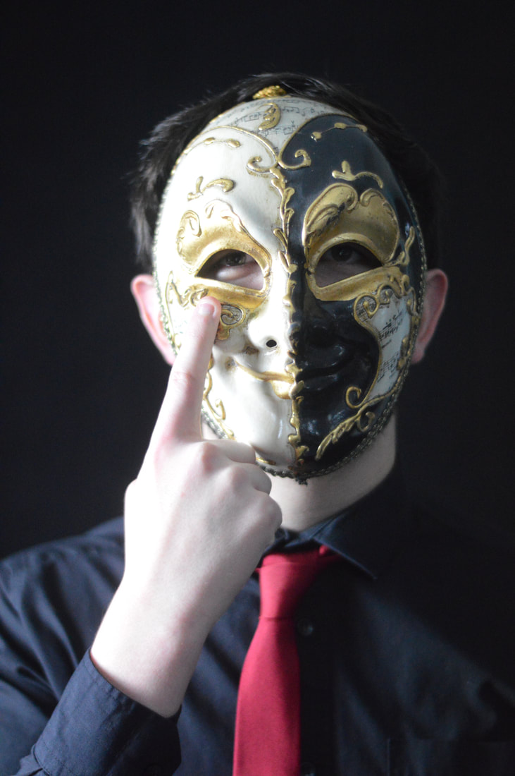
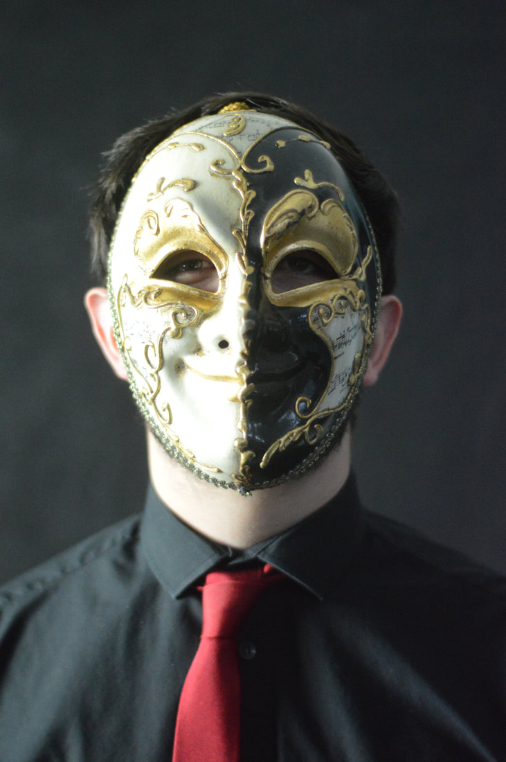
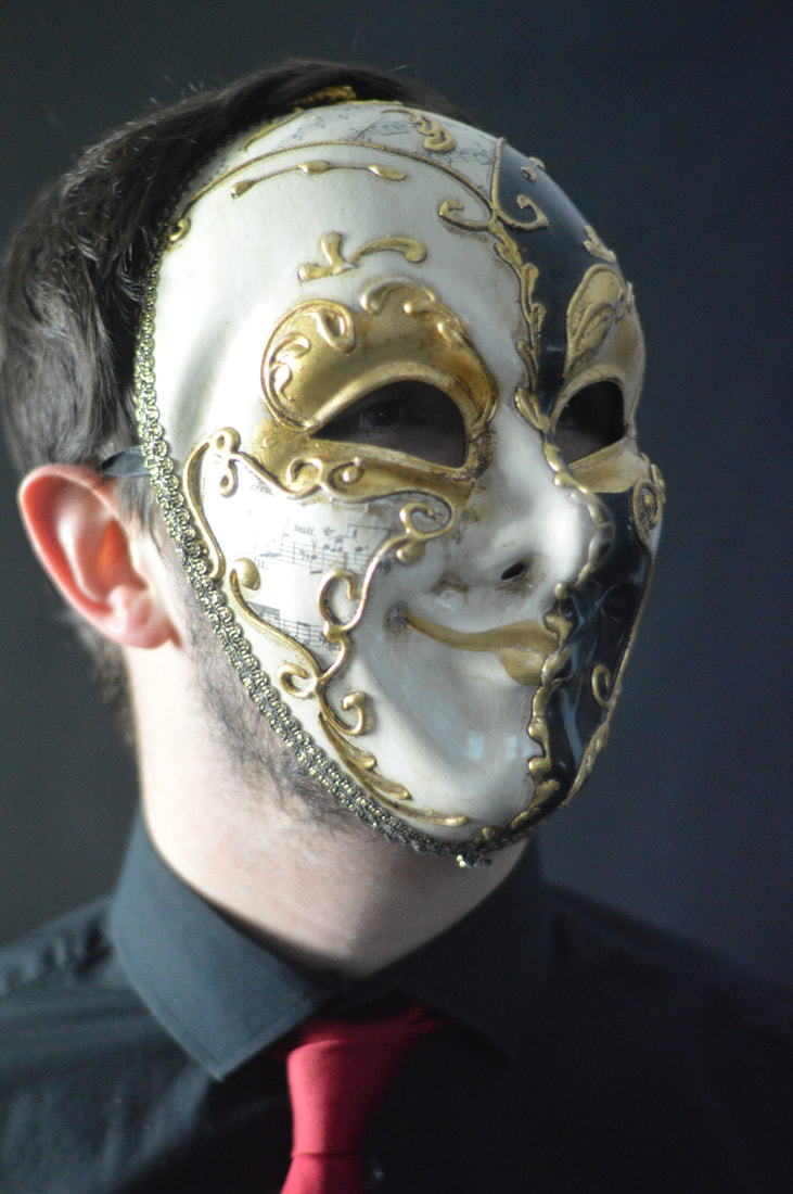
Here are the raw images to my second response where this time I have chosen to use an actually mask from these images as this is another way to mask someones face. I believe that this response will be more successful then the previous one as the design of the mask is really interesting and it looks good on someone. This set of images is also a lot simpler than the first response and I think there is more possibilities for different photoshop techniques.
Edited Images
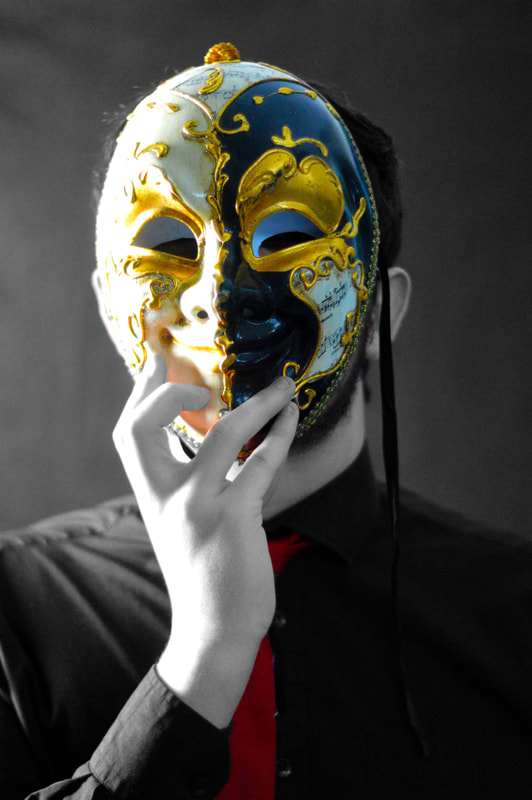

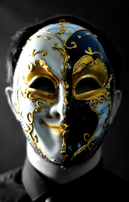
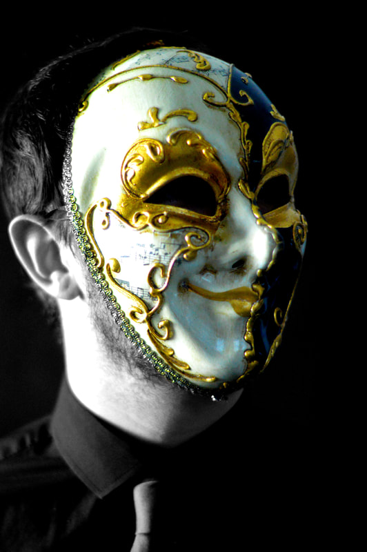
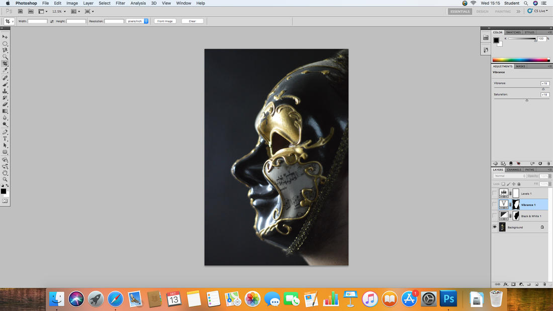
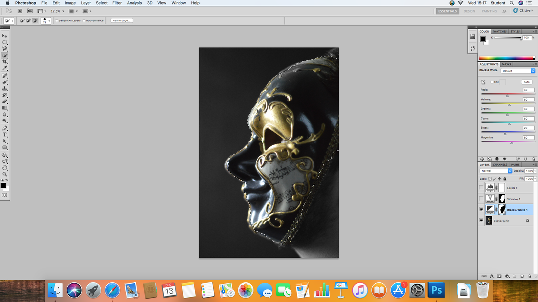
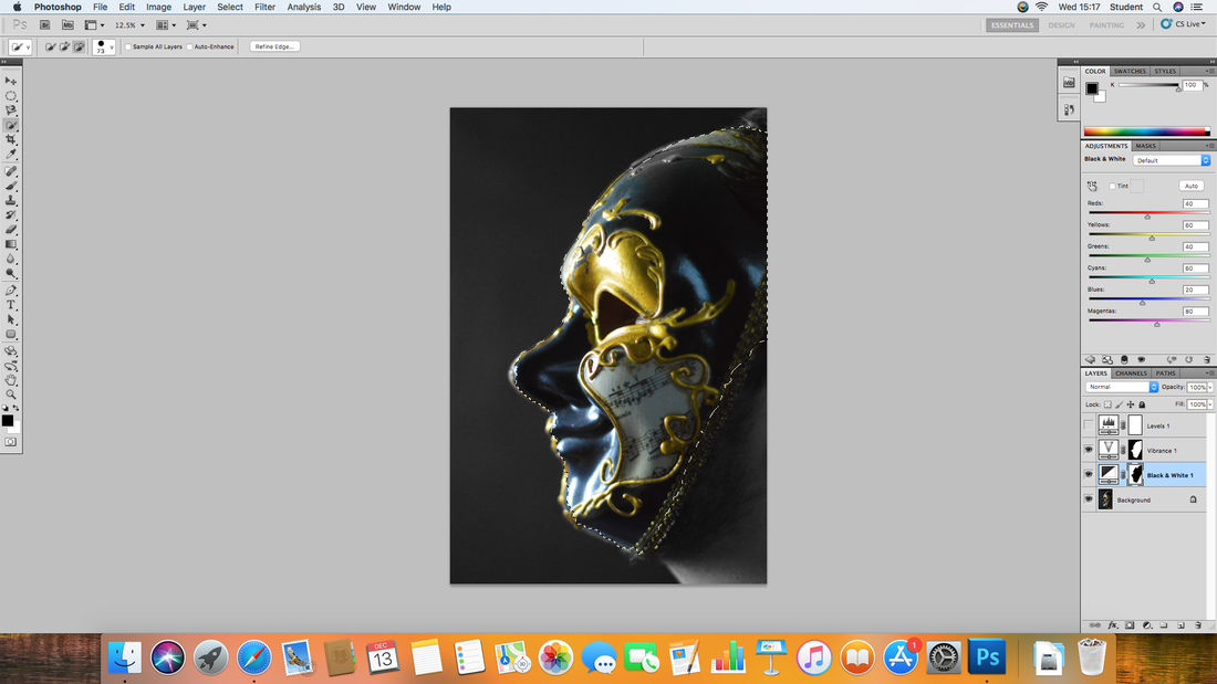
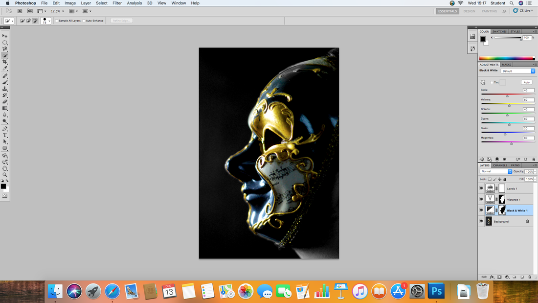
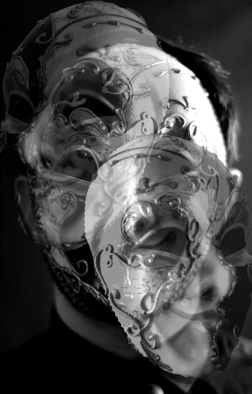
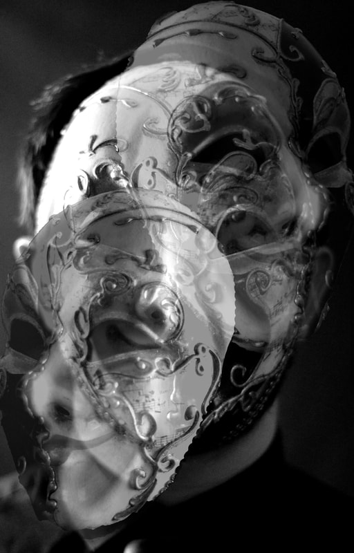
Here is are my edited images where in each image I turned the image black and out. I then masked out the mask and any other colour in the photo. I then decided to increase the vibrance and a little bit of the saturation to intensify the colours of the mask. I then adjusted the levels to make the background even darker to allow the brightness of the mask to come through. I like this work a lot more than my initial response as this is a lot more creative and interesting. This is because of the contrast in the light due to the black background. Also the colour of the mask and the mask itself made the images a lot more engaging.
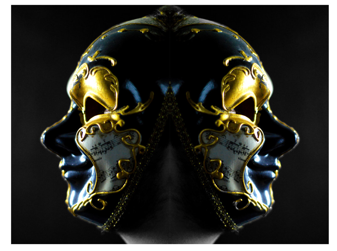
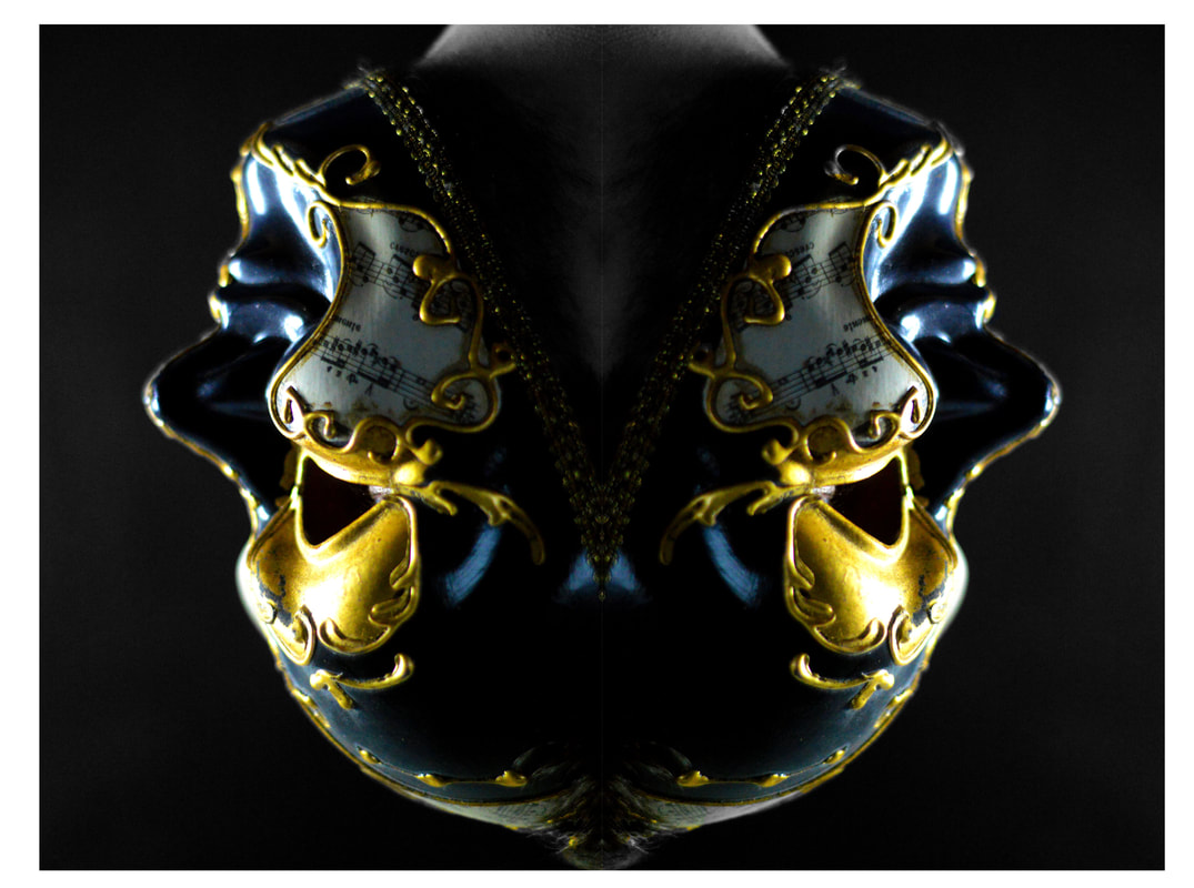
Here are some of my edited images and I did in a different way and I believe that this different technique was really successful and the light that is on the mask really brightens the mask up and the blackness of the background brings it out even more. I also really like how I decided to display my work as I thought that flipping the image and blending it together with itself made a really impressive image. The flip in the horizontal worked really well as well especially when next to the normal image. Also to show the actually images individually better, I made them full frame at the top and bottom of the combined image. This worked really well and I am proud of this work.
Development of work
First, this is the initial image that I will edit.
I turned the image black and white but masked out the mask so that I can still the colour.
I then upped the vibrance of the mask and adjusted the saturation a bit.
Finally I adjusted the levels to darken the back ground and make the mask stand up more.
Experimenting with Masks
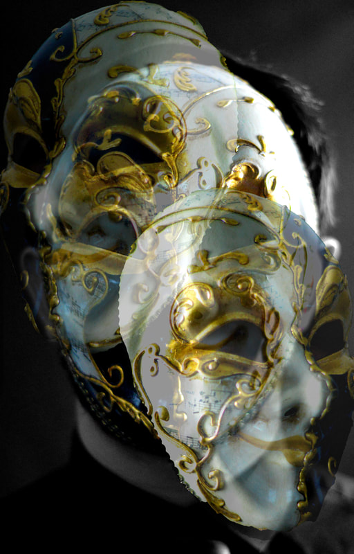
Here is a few images that I experimented with as I blended multiple images together to gain a weird effect that includes multiple masks. I then also turned the images black and out to see what the images would look like. I was pleased with the turn out of the black and white and therefore thought I'd include them in my work. I think that this worked really well and I really like flipping images and comparing them to their original image. I also like turning images black and white and therefore wanted to do both. These images may also be seen as disturbing due to the many masks blended together. This is a successful image as any photograph that makes the view feel something is a good photograph.
Final Presentation
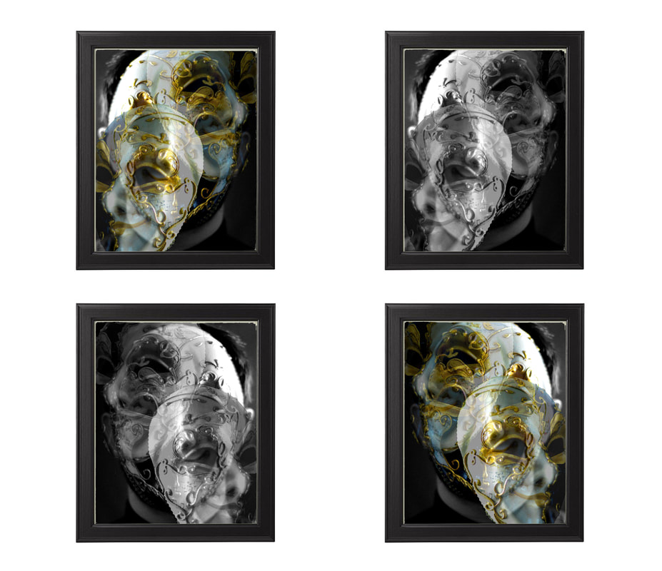
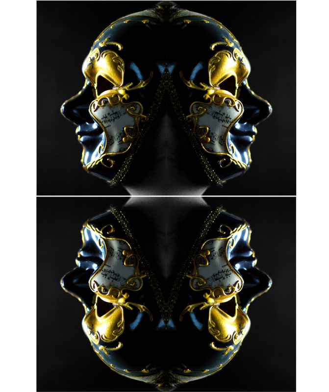
Here is my final presentation of images where the first set of images few I put my experimental images in frames to make them look more presentable. With the next set of images, I took one image that I had already edited and then flipped the image and placed the two masks back to back. I thought this looked really good and thought I should do the same for it but with the images upside down. I then realised if I put both of these images together, it would look really impressive and therefore decided to do it. I then set out these images on this webpage like this as I believe that they are presented so that all photos compliment each other. As I believe that this is my best set of work in this project, I have therefore decided to use this as my final presentation and by presenting them in photo frames which are spaced out in a certain way as it shows off the images well.
Conclusion to Work
Since I started the project of Identity: A Photographic study, I have development my photography skills in many different ways and have gained a new understanding of the different styles and techniques using photography. I have further developed my photography skills of portrait photography as I have shown many different styles from Rankin destroy to Jim Golden collections. I have learned that identity can be shown in many different forms and that this can be the same for many different aspects of photography.
The work I enjoyed doing the most was the Graffiti work and also using the Masks. I really enjoyed doing the Graffiti work as I found the patterns and colours used by the Artists really capturing and that because there is bright colours, the potential for different Photoshop edits is high as I was able to change the colours and blend some together creating a spectrum of colour.
I enjoyed using the Masks in my work as I found that they can be seen in many different ways from creepy to being used as a party item. I was also able to use the Masks to create different angles and create different styles of images. My favourite part of using the Masks was being able to edit the photos I obtained in many different ways and really being able to show my creativity when using photos of high quality.
I am glad that I did this project as I have been able to further extend my knowledge and ability in photography which can be used in the future using any project that I set myself to do and because of the skills gained, I will be able to do the work to a really high standard.
Bibliography
Famous Photographers - This website includes information about Rankin and his work: http://www.famousphotographers.net/rankin
Rankin - This website includes the biography of Rankin: http://rankin.co.uk/biography/
Jim Golden Studio - This website includes the biography of Jim Golden: https://www.jimgoldenstudio.com/About-Jim/1/
Phaidon - This website includes information about Jim Golden and his work: http://uk.phaidon.com/agenda/photography/articles/2013/august/21/jim-goldens-still-lifes/
David Russell Photography - This website includes information about David Russell and his work: http://davidrussellphotography.com.au/
